How to Become a UX Designer

User Experience (UX) design focuses on creating products that provide meaningful, relevant, and enjoyable experiences for users. A UX designer creates the actual products that provide those meaningful, relevant and enjoyable user experiences. Think of your favorite app or website—a UX designer played a big part in bringing it to life. Are you the type of person who enjoys questioning how things work? Do you enjoy putting yourself in another person’s shoes to see how they might question how something works? Curiosity and a love of problem-solving are two of the key traits most UX designers possess; if you possess both and are interested in learning more about how to become a UX designer, read on. 

UX Designer Responsibilities

The UX designer role is broad and dynamic. Formal education in UX design can be highly beneficial, though many UX designers come from other fields, including graphic design, psychology, and web design. The variety of backgrounds helps contribute to a diverse array of valuable perspectives on UX. A lot of people compare what we do in design to art. While I can understand the correlation, design and art are very different. Art is more of a self-fulfilling affair. Design? Design is a science—we solve problems with the work we do!

A few of the key responsibilities of a UX designer role include:

User Experience Research

UX research involves understanding user behaviors, needs, and motivations through various research methods. This includes qualitative research, which involves interviews with users of a product and observing them perform specific actions using that product. It also includes quantitative research, which uses surveys and measurable analytics to validate or invalidate predetermined goals. Let’s walk through some of the other facets of UX research below.

Mixed method research combines both qualitative and quantitative approaches for a more comprehensive understanding of a product’s usability and the sentiment users have about a product.

Competitive/market analysis helps to identify industry trends and user expectations based on what a product’s competitors are already doing.

Research synthesis
involves combining data from research you’ve conducted to form an understanding and inform others of the work that needs to be done to improve a product.

Problem scoping defines the boundaries of the work that needs to be done and creates focus areas for design teams to solve.

Feature prioritization determines which features are most important to users and helps design teams tackle work in a way that organizes the level of effort any task may take against the impact it may have on the users.

Lastly, empathy mapping and persona development help create more detailed profiles of a product’s target uses to guide design decisions.

Learn How to Become a UX Designer at Flatiron

Learn More


Interface and Experience Design

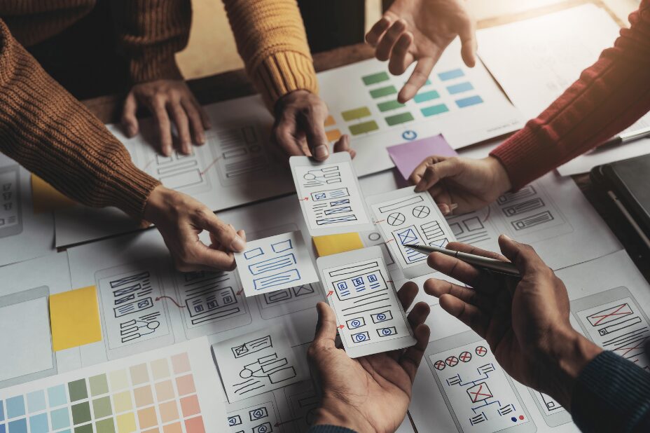
UX/UI product design encompasses the creation and refinement of digital product interfaces and the thoughtful implementation of an overall satisfying user experience.

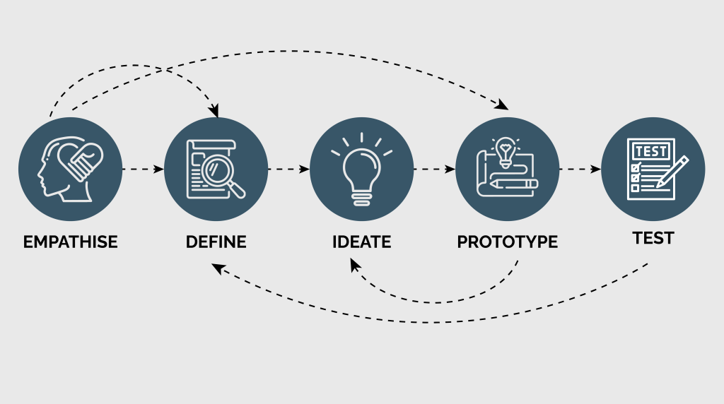
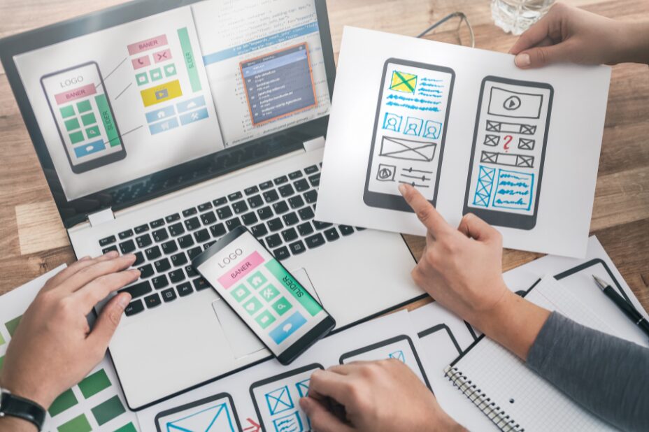
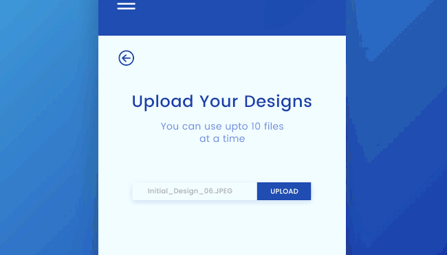
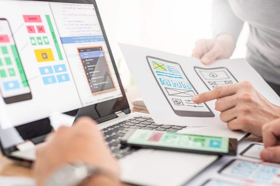
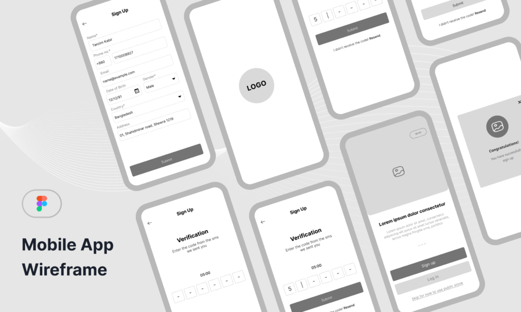
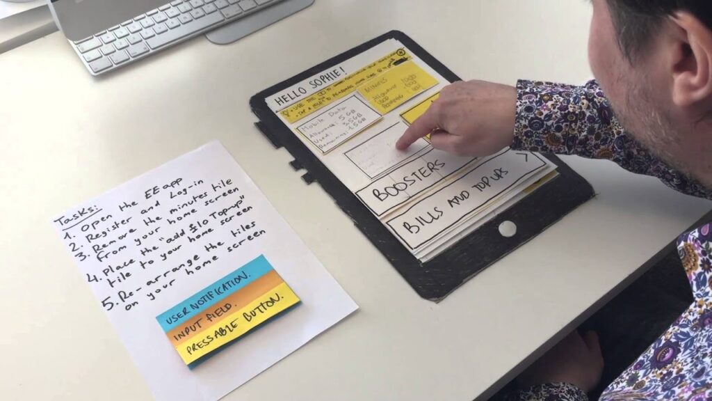
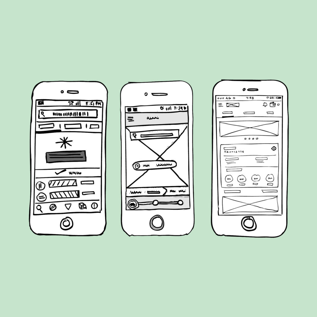
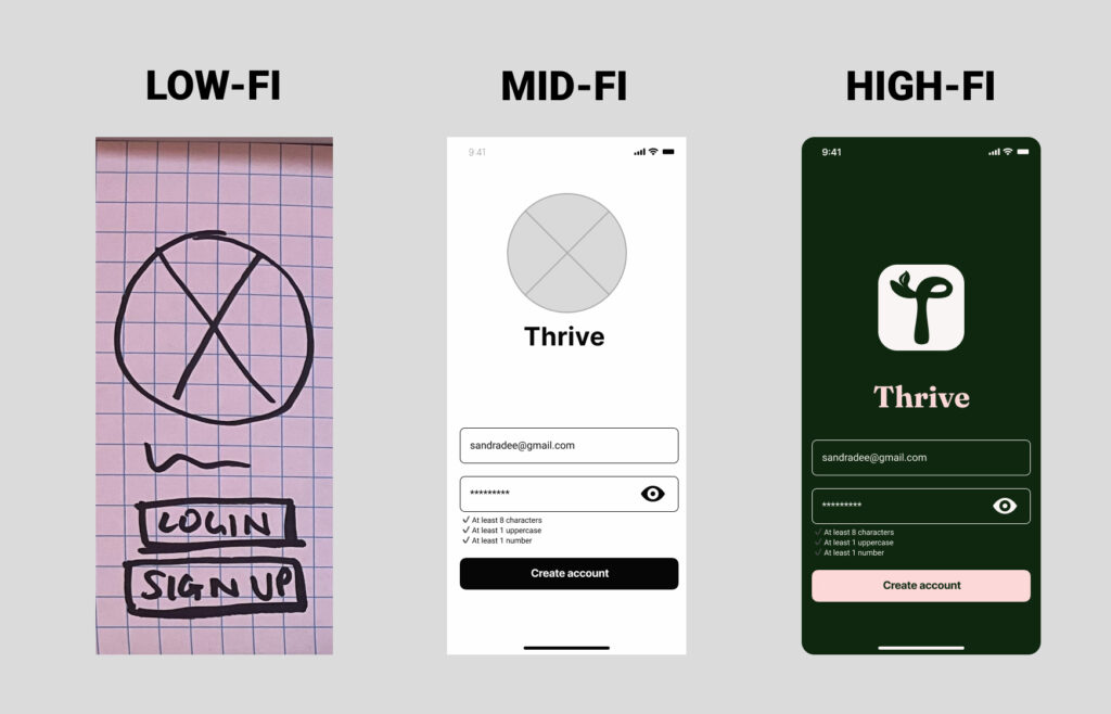
Every project starts with ideation and wireframing, where product designers brainstorm ideas and create low-fidelity sketches and various prototypes of potential solutions to resolve the established problem statement.

Once product designers have a solution, strategic decisions around typography and color selections come next. Both ensure that the text and layout are readable, visually appealing, and accessible to users of all types of abilities or any lack thereof. Other facets of the design process include the below.

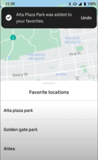
Developing an information architecture and navigational structure for a digital product helps to organize content in a way that most logically suits a user’s mental model and makes it easier for users to find what they need within a product.

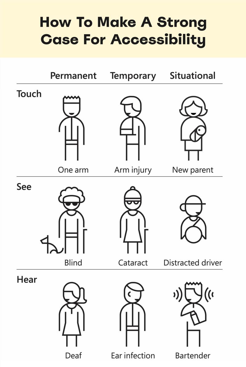
Heuristic and accessibility audits check for usability and again ensures the design is accessible to all users. Multi-device responsive design ensures the interface works well on various devices.

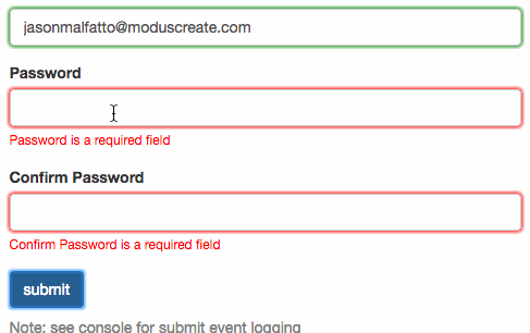
Usability testing may happen at multiple stages during the design process and after the product’s launch to gather feedback from real users on ways to improve the design’s usability, and functionality, or recommend potential stylistic changes.

Throughout each of the iteration cycles noted above, it is important for a UX designer to develop and maintain their design library. A design library is a collection of standards explaining the design intent behind stylistic choices around color, typography, and grid structure, as well as creating reusable components and supporting documentation around the appropriate times to use these materials.

Presenting Work

 Designers are required to be master storytellers—particularly when it comes to talking about our work. When done correctly, every single element of a design has been meticulously thought over, debated, and ultimately decided upon.

Presenting design work involves effectively communicating these design decisions and the eventual outcomes they’ll have. Sometimes, designers may even need to deliver a presentation showcasing designs to stakeholders to gather feedback on work. And ultimately that work usually ends up in a portfolio where our work remains curated to demonstrate skills and experience to potential employers.

At the end of the day, A UX designer is the bridge between a business and their customers. Designers have to be fluent in both business goals and user expectations. 

UX Designer Salary and Career Outlook

A career in UX design can be a promising path filled with opportunities for those who are passionate about making technology both functional and enjoyable for users. 

According to May 2024 data from ZipRecruiter, the average salary for a UX designer in the United States is around $106,224 annually, with starting salaries above $53,000.

Also, according to a report by the U.S. Bureau of Labor Statistics, employment for digital designers in the United States is projected to grow 16% from 2022 to 2032, faster than the average for all occupations. This growth is fueled by the continuous demand for digital user experiences that are more accessible, engaging, and effective.

So as you can see, there is a robust job market for those who are interested in learning how to become a UX designer. Next, let’s look at both the technical and soft skills needed to succeed in the field. 

Flatiron Has Awarded Over $8.6 Million in Scholarships
Jumpstart a career in UX/UI Design at Flatiron

Learn More

UX Designer Skills

UX design careers require a certain set of soft skills and technical skills to succeed. Let’s look at soft skills first. 

Soft skills for UX designers

  • Empathy: Understanding user needs and feelings is crucial for creating designs that resonate on a personal level.
  • Creativity: Divergent thinking helps in ideating original solutions that enhance user satisfaction and lead to conversion on a desired action.
  • Problem solving: The ability to address design challenges with effective solutions is essential.
  • Communication: Clear verbal and written articulation of design concepts and user needs to team members and stakeholders is key. Superb communication skills are especially important for remote work environments. 

Technical skills for UX designers

  • Google Workspace tools: 
    • Google Forms: For gathering quantitative feedback data
    • Google Sheets: For organizing and storing feedback data
    •  Google Docs: For writing research reports
    •  Google Slides: For presentations to peers and business stakeholders
  • Sketching:
    Necessary for roughing out initial design concepts. You do not need to have a mastery of drawing for the sketching phase of a design project.
  • Figma and FigJam:
    Figma is a collaborative design tool and it is where UX designers spend most of their time. Wireframes and prototypes are built using Figma. Any exercises like card sorts, diagram building, or feature prioritization done collaboratively with users or colleagues who are non-designers is generally done in FigJam, a collaborative whiteboard tool.

Mastering UX Design

With the right combination of education, tools, and networking, you can position yourself as a top contender in a rapidly growing and changing tech industry. Let’s touch on some of the other needs for launching and succeeding in a UX design career. 

An interest in human psychology and behavior

A foundational understanding of the psychological and behavioral process behind what drives user interactions helps UX designers create intuitive design patterns. Two books I recommend on these topics include:

A strong UX design portfolio

Unlike other fields, designers have to display that they are capable of executing work at a proficient level. Demonstrating your design process and a project’s final outcomes in a well-curated portfolio is crucial to landing a job in UX.

UX tools and technology

Proficiency in tools mentioned in the Technical Skills section of this article, plus Notion, Zoom, and survey tools is critical for even the simplest of UX designer tasks.

Networking and professional development

Building a professional network and continuing to develop your skills are vital aspects of a UX design career. Attend industry meetups, participate in online forums, and join professional groups to discover invaluable career advancement and continuous learning opportunities. 

Learn How to Become a UX Designer at Flatiron School

If you’re a problem-solver who wants to learn how to create user-centric products, consider enrolling in Flatiron School’s Product Design Bootcamp. You’ll learn the necessary skills to launch a rewarding and fulfilling career in UX design through hands-on projects and deep dives into the latest technologies and problem-solving techniques used in the industry. Take the first step towards your future in UX design by applying today or booking a call with our Admissions team to learn more.

Design for Good: Exploring Sustainable Design

In Part 1 of our Design for Good series, we peeked behind the curtain to look at the dark side of design to learn how to avoid bias in design. In Part 2 we looked at social impact design to learn how to create more inclusive and accessible products. Here in Part 3 we’ll address environmentally sustainable design projects and understand how to make products with sustainability top-of-mind. 

We’ll also tie all three parts of our Design for Good series together by addressing how traditional education, specifically in the design industry, could use a bit of reform. Reform to avoid bias, engrain social impact design, and teach how each of our design projects essentially become sustainable design projects.

What is Sustainable Design?

Digital experiences are not exempt from environmental costs. Sustainable design projects have real benefits. The vast networks needed for simply reading an email, browsing a website, or streaming a show potentially involve smartphones, computers, TVs, Wi-Fi routers, network stations, and data centers—each consuming electricity. A one-hour video call produces 150 to 1,000 grams of carbon dioxide according to a study by Purdue University. But what does that mean for us as designers? 

“Designers have historically benefited from progressively faster internet and more powerful computing capabilities, which paradoxically leads to the creation of more energy-intensive digital products and websites.” – Tom Greenwood, Sustainable Web Design

As product designers, our aim is to craft sustainable, eco-friendly design projects. How? By designing online products with an emphasis on sustainability and minimizing carbon emissions primarily by prioritizing reductions in energy consumption.

Measuring Our Impact

Measuring sustainability in other industries is generally fairly straightforward. For cars, we can measure miles per gallon. For buildings, energy per square foot. But in the digital world, it is nearly impossible to measure the amount of CO2 produced by a web product. 

While we can’t measure the fumes coming out of the exhaust pipes of our laptops, we can measure:

  1. Data transfer through the use of kilowatt-hours per-gigabyte (kWh/GB) as a metric of energy efficiency when measuring the amount of data transferred over the internet when a website or application is used. This provides a great reference point for energy consumption and carbon emissions. As a rule of thumb, the more data transferred, the more energy used in the data center, telecoms networks, and end user devices.
  2. Carbon intensity of electricity (known as ‘carbon intensity’) is a term used to define the grams of CO2 produced for every kilowatt-hour of electricity (gCO2/kWh). And without getting too technical and political about the way we produce energy in each country—some energy sources are cleaner than others.

    While we can’t always choose how that energy gets sourced, we do have some control over where we choose to host our projects.The decision to build a data center in Texas, which as of 2022, produces the most renewable energy, vs. building that same data center in Delaware with zero renewable energy solutions, could make a significant difference in CO2 savings.

Flatiron Has Awarded Over $8.6 Million in Scholarships
Begin an education in data analytics at Flatiron
Learn More

Designing a Low-carbon Digital Future

Every designer’s worst fear is leaving something out. We have a bad habit of over-designing, creating far more solutions to problems that are increasing further down the edge case checklist, simply because we’re afraid of missing an opportunity or frustrating the user. There’s also the social pressure of having to say “no” to our colleagues who suggest ideas. Implementing a minimalist approach is hard. It involves a degree of ruthlessness to cut things out and say no to ideas that can’t be justified. It requires us to not give every idea and every piece of content the benefit of the doubt, but instead to say, “If in doubt, leave it out.”

I often tell my students, “At some point in your design process, your mentality should shift from an additive process to a subtractive one.” By questioning every detail and thinking critically about how to use product design for social good, we can reduce the emissions of the products we design, and make them more effective for users and businesses. 

Credit: Microsoft

Steps to Take for Achieving Sustainable Design

  1. Consider the environmental impact
    Think critically about how each design decision affects the product’s environmental footprint. By reducing unnecessary features, you can lower the emissions associated with your digital product. Embrace minimalism in your design. Avoid over-designing and creating solutions that address every possible edge case. Aim for simplicity and clarity in your product.
  2. Start with an additive approach
    Begin your design process by brainstorming and incorporating all potential features and ideas. Don’t hold back during this initial phase; consider every suggestion and possibility. Get divergent.
  3. Evaluate necessity and justification
    For each feature and piece of content, ask yourself if it truly adds value to the user experience. Can you justify its inclusion based on user needs and business goals? If in doubt, leave it out.
  4. Be ruthless in cutting unnecessary elements
    Implement a degree of ruthlessness in your decision-making. Prepare to say “no” to ideas. Focus on what is essential for the user experience. I like to say that we should play KerPlunk with our designs. Remove one piece at a time—the goal is to see how much you can remove before it all goes KerPlunk!
  5. Iterate and refine
    Continuously iterate and refine your design. Solicit feedback from users and stakeholders to identify areas where you can achieve further simplification. Use product design as a tool for social good. By streamlining your design, you can enhance user experience and contribute to a more sustainable future.

Revisiting Design Education

The curriculum of the past

Design education has needed a bit of reform. Traditionally, students learn to identify the works of the traditional design greats—Michael Bierut, Paul Rand, Milton Glaser, etc.

I was admittedly one of those people who could easily rattle off Massimo Vignelli’s preferred list of fonts. Looking to the past is often a great way to learn from the successes of others, and I leveraged that astute knowledge of other designers’ work when discussing my pedagogy during my interview to work at Flatiron School. However, our program director at the time politely noted that all the people I had named were predominantly white men. He asked me if I could demonstrate any work created by designers of color. 

At that moment, I froze! I teach the impact that Aaron Douglas had on the Harlem Renaissance in the 1920s. I also teach the Goldblatt Department Store experience designs created by Leroy Winbush, where he was the only black employee. And I also teach Joy Cho, who was named one of Time’s most influential people on the internet—twice. But still, I froze in the moment, because a hole in my pedagogy had been identified. A hole that needs filling quickly, by not only myself but systemically as an entire industry.

Aaron Douglas

Aaron Douglas

American painter and illustrator (Credit: Biography.com)

Leroy Winbush

LeRoy Winbush

American graphic designer (Credit: AIGA)

Joy Cho

Joy Cho

American designer, blogger, and author (Credit: Oh Joy!)

The curriculum of the future

Our audience as educators deserves to learn a diverse perspective about bias, social impact design, and sustainability—and one they can connect to and associate with. Who cares about Massimo Vignelli’s preferred list of fonts when there’s a whole world of design out there that isn’t being taught? Design education should incorporate personalized learning with a range of influences and identities that will enable our design graduates opportunities to create work with cross-cultural perspectives, design for users who aren’t like them, and create a future generation of products with the planet in mind—while also preventing those with marginalized identities from feeling “othered.”

As an educator, vulnerability is important. Instructors cannot and do not know everything. I often tell my students, “I’m not an instructor because I did everything right—I’m an instructor because I did everything wrong; I want you to learn from those mistakes.” 

Teachers discussing their own experiences of marginalization and bias can help build rapport with students and reinforce the power they have to transform the outcomes of their work through product design for social good. As we continue to strive for a more sustainable future, we need to teach and encourage our students to think more mindfully about the planet we inhabit. Ultimately, as an educator, I enjoy doing this to give our design graduates opportunities to reshape what the future of design could look like and help guide them toward positive impact design careers.

Where Do You See Your Future in Design?

In the words of Paula Schrer, “Everything you read is designed. Anything that is a sign on the street is designed.” And I’ll go one step further by saying that everything we touch, even in the digital world, is designed. 

This field will evolve. It will change. In my brief but experienced 10+ years career in design, I have watched the industry evolve around me drastically. And I think that’s why I love it. Because it evolves, there is always something new to learn.

If you’re on the hunt for a career in positive impact design or want to learn more about what it takes to work in an industry that keeps evolving in truly innovative ways, Flatiron School’s UX/UI Product Design Bootcamp might be just the ticket for you. Flatiron’s program is designed for those with zero design knowledge and those with some. In a matter of months, students gain an education that fully prepares them for a career in the industry. Schedule a quick 10-minute call with the Flatiron Admissions team to learn more.

Design for Good: Exploring Social Impact Design

Social impact design is an important part of any maker role, whether you’re an artist, engineer, or a craftsperson. We’re all designers. And as designers, we need to think about how product design for social good leads to both a better experience and larger revenues for businesses.

In Part 1 of our Design for Good series we looked at bias in design (and how to avoid it). In Part 2 we will explore social impact design. We’ll gain an understanding of how to make designs that are accessible and inclusive for everyone. We will also look at how to gain stakeholder interest in investing in social impact design.

Inclusivity and Accessibility = Social Impact Design

Inclusivity and accessibility, also known as social impact design, focus on valuing the diverse experiences and identities of people. This involves understanding and helping those who face difficulties in their lives, whether disadvantaged, underprivileged, or otherwise challenged. Inclusivity and accessibility enrich the design process, leading to solutions that are more effective, more empathetic, and equitable for all—including the organizations that prioritize social impact design in their day-to-day work.

The following sections explore the essential components of social impact design—identity, marginalization, allyship, cultural sensitivity, socioeconomic inclusivity, and accessible design. Each of these components illustrates how inclusive and accessible practices can significantly enhance the societal benefits of design projects.

Identity

When we talk about inclusion—and by extension, exclusion—we must be aware of the countless aspects of identity found in a person’s gender, age, race, socioeconomic status, sexual orientation, health, and more. 

Our identities shape how we show up in the world, and in many cases, how we’re perceived and treated. Inclusive design acknowledges these diverse identities and strives to create products, services, and systems that are accessible and relevant to a broad spectrum of people.

For instance, designing user interfaces with larger buttons that are friendly to older adults. Or if you are designing a music streaming platform, creating playlists that feature prominently Asian-Indian, LGBTQ+, or Hispanic artists. These are a few practical ideas for honoring and advocating for more diverse identities and to use product design for social good.

Fenty Beauty: Exclude No One Campaign
(Source: Fenty Beauty)
Fenty Beauty: Exclude No One Campaign
(Source: Fenty Beauty)

Marginalization

Marginalization occurs when certain groups are systematically disadvantaged by the prevailing norms or structures in society. This can manifest in many forms, from racial and gender discrimination within a product to the overlooking of individuals with disabilities or those from different socioeconomic backgrounds. Social impact design seeks to curb these systemic biases by consciously making design choices that empower marginalized groups. 

Empowerment could involve creating products that are more affordable and accessible to low-income communities or ensuring that digital platforms are usable by those with disabilities. Recognizing marginalization in design means understanding that some groups have historically been excluded from the conversation and actively working to bring them into the fold of your work as a designer.

Source: Nexcess

Flatiron Has Awarded Over $8.6 Million in Scholarships
Our Access, Merit, and Women Take Tech scholarships can help make your career change a reality.
Learn More

Allyship

Allyship is about actively advocating for and supporting those who face oppression or marginalization, not just acknowledging diversity. This requires an ongoing commitment to learning, listening, and self-reflection, in addition to a willingness to challenge existing prejudices and power structures. Allyship in social impact design might involve using the products we design to highlight issues affecting marginalized communities. Alternatively, it could mean prioritizing accessibility and inclusivity in design, even when it’s not the most convenient or profitable path. It’s about creating spaces where diverse voices are heard and influential in shaping the outcomes of a product.

Source: Gymshark

Cultural Sensitivity

Cultural sensitivity in social impact design involves understanding and respecting the cultural contexts in which a product or service will be used. This means moving beyond stereotypes and assumptions to gain an authentic understanding of different cultural norms and values. Designers should be mindful of cultural nuances, seek to understand them, and incorporate them without appropriating or being disrespectful. Designing for cultural sensitivity may involve anything from avoiding culturally insensitive imagery and iconography or ensuring that language and messaging are legible, understandable, and appropriate for diverse cultural groups.

Socioeconomic Inclusivity

Socioeconomic inclusivity in social impact design addresses the disparities created by economic status and ensures that products, services, and systems are designed with an understanding of the varied economic realities of different users. This could mean developing more affordable versions of essential products or designing services that are accessible to people without access to advanced technology. 

The United States Department of Justice recently sued Apple for monopolizing smartphone markets, alleging that Apple maintained a monopoly by restricting developers and limiting access to critical resources. One part of the DOJ’s accusation is that Apple has created a market where they are uniquely able to alienate their customers. They allege that Apple does this by implementing a less user-friendly experience when interacting with non-Apple products.

Johnny Harris, an independent reporter in collaboration with the New York Times, reported on the complexities of the American tax system, describing it as “somewhat of a scam.” This over-complexity has created an incredibly lucrative $10 billion industry. Companies like TurboTax, which recently pulled their misleading “file for ‘free'” advertising campaigns, have capitalized on this complexity. The campaign promised a “free” online tax filing service that, in reality, wasn’t at all free. This complexity enables these companies to collectively exploit a system that arguably should be straightforward and cost-free, given that paying taxes is a mandatory duty for all Americans.

Accessible Design

Universal design, also known as accessible design, is a framework that prioritizes creating products and environments usable by everyone. This approach minimizes the need for adaptation or specialized design for any individual. This approach leads to solutions that benefit a wide range of users, including those with disabilities, and promotes an inclusive environment where everyone has equal access and opportunities. 

According to the Centers for Disease Control and Prevention, “Up to 1 in 4 (27%) adults in the United States have some type of disability.” With over 40 million people with disabilities in the U.S., that represents a significant loss of traffic, customers, and audience for organizations whose designers choose to ignore accessibility. It also represents an opportunity for designers to reach this untapped market by using product design for social good.

Truly understanding how to use design skills for social impact means creating products that focus on inclusivity and community rather than exclusion.

Target settled a class action lawsuit filed by the National Federation of the Blind (NFB) in 2008 and agreed to pay damages of $6 million
(Source: Target Corp.)

Social Impact Design: Closing Thoughts

As we close Part 2 in our Design for Good series, it’s clear that our role as designers is about so much more than just aesthetics or functionality. We genuinely have the profound power to shape societies and improve lives through thoughtful, inclusive, and accessible design. 

Our responsibility is to ensure that as product designers, we are the voice for our users. We aim to advocate for a broader, more diverse product that includes those who are often marginalized. This user-centric mindset is not simply an ethical directive. It’s a strategic one too, leading to products that are universally usable and inherently more appealing to a larger audience.

Design For Good: A Three-part Series

Remember, the journey toward better design solutions is a long and windy road. Each step we take towards inclusivity, accessibility, and sustainability is a step towards creating a world (or at least a product) that values all its citizens equally. Stay engaged, keep learning, and join us in Part 3 of our series (publishing on May 24). In Part 3 we will discuss the environmental impact of digital designs. We’ll also learn how to make design projects more sustainable.

And be sure to check out Part 1 on bias in design if you missed it.

The Design for Good series is perfect if you’re a:

  • Leader of a design team
    Consider how this blog post series could inspire your team to transform their work into a positive impact design career.
  • Designer
    Challenge yourself to think about these initiatives as a client requirement on every project, rather than waiting for the client to ask for it.
  • Student
    Or, someone looking for design graduate opportunities—use this series to learn more and grow.

Learn UX/UI Product Design at Flatiron School

Our Product Design Bootcamp can put you on an accelerated path to a product design career in just 40 weeks. Schedule a 10-minute call today with our Admissions team to learn more.

Design for Good: Exploring (and Avoiding) Bias in Design

I once led a team tasked with designing a solution where users could purchase a vehicle online. The feature we were designing was a relatively innovative idea at the time, and there was a push by stakeholders to make it more difficult to find some of the critical financial information that customers needed to help them make a truly educated decision about their purchase. 

The Dark Side of Design

My design team was told that we needed to show (but really hide) the massive APR hikes, extensive loan terms, and even the ancillary costs associated with such a major purchase deep within the user interface—a practice known in the industry as a “dark pattern.” The primary target audience of this company was typically minorities, with limited income or poor credit histories, and often, they were making this purchase for the first time with little experience in knowing what to look for when making such a large purchase.

Rather than seizing the opportunity to inform and educate these customers, I felt as though my team was being forced to manipulate the design to capitalize on the customer’s lack of understanding, resulting in users ultimately being burdened by a loan they will most likely never be able to financially recover from. In my mind, this practice felt highly unethical, disguised by a phrase that was said a lot around the office: “We’re doing them a favor by crediting them when no one else would.”

My realization that I was perpetuating “the dark side” of design prompted a career shift towards educating future design graduates about recognizing and avoiding manipulative design strategies and addressing bias in design by helping students obtain positive impact design careers. Designers rarely work alone and therefore don’t have complete control over the outcome of a product—but we can heavily influence and advise stakeholders down the right path.

Design by Definition

We create purpose-driven design by defining the things we make. Sarah Laoyan, writing for Asana, put it best: “The design thinking process is a methodology that helps tackle complex problems by framing the issue in a human-centric way.”

In other words: designers solve problems, and that process is rarely linear. But it’s important to think about the problem we’re solving and the impact that any solution may have on those we’re solving the problem for. 

Interested in UX/UI product design as a career? Flatiron School has awarded over $8.6 million in scholarships to support students in their educational pursuits. Learn about our Access, Merit, and Women Take Tech scholarships today. 

As designers, we confront dozens, if not hundreds, of possible solutions for every problem. The challenges we face are as diverse as the problems our clients and stakeholders present. However, designers must remember that every potential design solution acts on the physical world and should address a real human need. The minute designers forget those two things, a myriad of outcomes could occur—generally with negative results.

The five stages of the design thinking process
Caption: The five stages of the design thinking process
Source:
Neha Siddiqa

Avoiding Bias In Design

Bias in design presents a significant hurdle in the process of ideation and creative thinking. All humans, including designers, are subject to unconscious bias, and it’s far easier to detect bias in others than it is to detect it within ourselves. These biases create perceptual blind spots. Standard linear thinking practices subtly influence our steps toward problem-solving, even though these practices may appear logical and unbiased. 

Even methodologies like design thinking, which encourage open-mindedness, are not immune to the initial challenge of inherent biases that can skew our perspectives and ultimately make their way into the solutions we craft. Design as an industry is highly subjective and poses large opportunities for bias to run amuck, and as we venture into new, innovative territories in purpose-driven design with Artificial Intelligence (AI), Virtual Reality (VR), plus increasingly more sentient design solutions, maintaining an objective standpoint becomes increasingly more important.

Bias is not harmless

Biased design decisions can have far-reaching and often detrimental effects. A notable example is the case of facial recognition technology. Numerous studies, including one by the MIT Media Lab grad student Joy Buolamwini in 2018, revealed significant racial and gender biases in these systems. A dataset consisting mostly of lighter-skinned individuals biased the technology, leading it to misidentify people with darker skin tones, especially dark-skinned women, at significantly higher rates. This bias led to wrongful accusations and arrests, demonstrating a profound lack of equity in technological design and ultimately the application and end-use of that design. The repercussions extend far beyond mere inconvenience, affecting individuals’ lives and freedoms, and exposing deep-seated biases in the tech algorithms.

Additionally, a study in the Journal of the American Medical Informatics Association in 2019 found that many online health resources were not designed with elderly users in mind, employing small font sizes and complex navigation structures. This oversight effectively alienated a significant portion of their target audience—older adults relying on these resources for critical health information. The lack of consideration for the aging population’s needs in digital design hindered access to important health information and perpetuated a form of ageism.

It’s important to note that we can never completely eradicate bias, but understanding bias will go a long way toward revealing our blind spots. And being hyperconscious of it will also reduce the likelihood of our work causing unintentional harm through more purpose-driven design solutions. We have an increasing need for inclusive and unbiased design practices, which necessitates students and working designers alike to consider the positive impact design careers can have. 

Tips for avoiding bias in design

  1. Self-awareness: Acknowledge you have biases, and consider taking an unconscious bias test. Total Brain offers a non-conscious bias test free of cost. 
  2. Gain diverse perspectives: Seek a wide range of opinions to create products that help a largely dissonant world feel a sense of open, welcoming community.
  3. Always ask this question: Am I designing a product for social good or could it perpetuate bias?

Design for Good: A Three-part Series

Understanding how to use design skills for social impact, even just on the surface level, is a bit of a meaty topic that covers a chasm of potential for a shift in mentality. Part 1 tackled the dirty underbelly of the power we truly hold as designers to make our work in product design for social good.

Here’s a look at the other two parts of the series:

  • Part 2 addresses address social impact design with a discussion on making designs that are accessible and inclusive for everyone, and gaining stakeholder interest in investing in social impact design.
  • Part 3 (publishing on Friday, May 24) is a deep dive into some environmental design projects and how we can make our digital work—which is still far from sustainable—more eco-friendly.

The Design for Good series is perfect if you’re a:

  • Leader of a design team
    Consider how this blog post series could inspire your team to transform their work into a positive impact design career.
  • Designer
    Challenge yourself to think about these initiatives as a client requirement on every project, rather than waiting for the client to ask for it.
  • Student
    Or, someone looking for design graduate opportunities—use this series to learn more and grow.

Grow Design Skills at Flatiron

Our UX/UI Product Design Bootcamp offers full- and part-time educational paths for those interested in a career change (or start). You can become a product, UX, UI, or web designer in as little as 15 weeks! Apply today or book a quick 10-minute call with our Admissions team to learn more.

Microinteractions: Small Design Details That Make a Big Difference

Microinteractions are trigger-feedback pairs that occur within a digital interface. They serve as subtle cues that inform users about the outcome of their actions or the current status of the system. From a simple button click to a complex animation, microinteractions have the power to transform user interactions, provide valuable feedback, and reinforce brand identity.

When Are Microinteractions Useful?

To understand when a product might benefit from microinteractions, designers must first understand the general principles of usability and interaction design. Microinteractions are not mere aesthetic additions to a product, but an opportunity to help users learn, understand, and operate an interface.

Keeping system status visible

In 1994, usability pioneer Jakob Nielsen listed 10 Usability Heuristics for User Interface Design that are still used today to measure the usability of digital interfaces. Nielsen’s first heuristic, Visibility of System Status, states that a design “should always keep users informed about what is going on, through appropriate feedback within a reasonable amount of time.”

Users should never be left guessing about what the system is doing behind the scenes or whether their actions have been successfully processed. For example, consider an app that allows users to upload files.

After a user starts the upload process, a progress bar dynamically fills up, indicating the percentage of completion. This microinteraction not only informs users about the file upload in progress, but also reassures them that their action has been recognized and the system is actively processing their request. Keeping the status of the file upload visible helps users feel better informed and in more control.

Error prevention and recovery

No matter how thoughtful your design, users still sometimes make mistakes. Nielsen’s fifth heuristic, Error Prevention, encourages designers to minimize errors by providing useful constraints and defaults, and to warn users when performing an action they might regret.

His ninth heuristic, Help Users Recognize, Diagnose, and Recover from Errors, reminds designers to inform users when something goes wrong by using recognizable visual cues, plain language, and clear instructions for resolving the issue.

Creating a new account can be frustrating if users are left to guess whether their password meets minimum security requirements. Inline validation is an effective pattern for reminding users what corrections they need to make their password a valid one.

As users create and confirm their new password, the form provides immediate feedback on the validity of each input field. If a user enters a password missing required characters or creates a mismatch when confirming their password, microinteractions trigger subtle visual cues, such as changing the border color of the field to red and displaying specific error messages. This real-time feedback helps users correct errors on the spot, rather than submitting invalid entries and having to start the signup process from scratch.

Incorporating Microinteractions in User Experience Design

If you’re looking to add microinteractions to one of your existing designs, here are some steps to take.

Identify the interaction problem facing the user

Start by observing target users as they encounter a problem, and learn as much as you can about the user’s goal, the context in which the issue occurs, and the obstacle preventing the user from success.

Test and iterate

Come up with a hypothesis for what might solve the problem, create a minimum viable prototype version of your solution, and test that prototype with target users. Then, use that feedback to iterate on your solution.

Structure the microinteraction

The first two steps listed above are as true for any UX challenge as they are for microinteractions. However, once you’ve verified that a particular microinteraction helps users reach their goals, it’s time to structure the implementation.

Interaction designer and author Dan Saffer coined the term “microinteractions” in his 2013 book Microinteractions: Designing With Details. In his book, Saffer identifies four necessary components of a successful microinteraction:

  1. Trigger
    What initiates the microinteraction? Triggers are often user-triggered, typically when the user interacts with an interface. However, some triggers are system-triggered, such as a notification appearing when a user receives an email or instant message.
  2. Rules
    What happens once the microinteraction is triggered? The rules should make sense to the user. If the user drags a scrollbar downwards, for example, the user expects page contents to scroll upwards. Any other behavior would feel jarring.
  3. Feedback
    How will the system keep the user informed of what’s happening during the microinteraction? Feedback can be any combination of visual, audio, or haptic (meaning tactile) alerts.

    Providing feedback can be particularly critical to reassure users making purchases online. Imagine nothing happening after pressing a button to submit payment. Did the transaction work? Is my credit card number secure?
  4. Loops and Modes
    Loops determine the duration of the microinteraction, whether it repeats, and whether it evolves over time. Modes are settings that might impact the behavior of a microinteraction. If the user turns on Do Not Disturb mode, system-triggered email or instant messaging notifications should be silenced.

Reflect brand identity

When designing microinteractions, it’s important to know your brand’s voice and tone. How would your product react when celebrating a user’s successful achievement? What language would it use to warn a user about an action that might have negative consequences?

Many companies have created more consistent microinteractions across products by documenting their design, motion, and implementation rules within a design system. For example, Uber uses an animated component called a Snackbar to deliver important status updates such as a user successfully favoriting a location.

Source: Base Design System by Uber

Designers can review the documentation within Uber’s Base Design System to learn Uber’s general motion principles, the specifics of designing a Snackbar component, and guidelines for crafting Snackbar messaging to provide user feedback.

Do You Have an Eye For Detail?

A lot of considerations go into creating a successful microinteraction, including researching user behavior, testing out different design ideas, communicating with developers, and understanding a company’s brand voice. If doing big work to craft small design details sounds like an exciting process, consider applying to Flatiron School’s Product Design Bootcamp.

Not sure if you’re ready to apply? Download the syllabus to learn more about the skills you can acquire in our bootcamp.

And if you are curious about what students learn during their time at Flatiron, attend our Final Project Showcase.

The Case for Accessible Design

Most designers should already be aware of the importance of accessibility. After all, UX designers spend their careers identifying and removing obstacles between users and their goals. In the case of accessible design, that means testing whether users with disabilities can navigate and understand your content using the assistive technologies they depend upon.

Knowing the principles of digital accessibility is critical for designers. But if you’re the only person at your organization advocating for users with disabilities, your team won’t build accessible products. Accessibility requires a company-wide commitment, an inclusive hiring process that actively seeks the perspectives of people with disabilities, and a structured process of planning and testing. An organization’s accessibility maturity is a measure of the effectiveness and sustainability of its accessibility practices.

Visual representation of the five escalating levels of digital accessibility maturity.
Source: The Digital Accessibility Maturity Model

But what happens if you’re at a company with little to no accessibility maturity? How can designers make the case for a product design and development process that prioritizes accessible outcomes?

Case #1: Accessible Design is the Right Thing to Do

Users with disabilities deserve to be able to use your product, and denying them access is discrimination. This is the ideal reason organizations should embrace an accessible approach.

Any designer who truly values usability should understand that no product is truly usable until everyone can use it. This definition absolutely includes users of assistive technologies.

While there are numerous types of assistive technologies used to navigate the web, some of the best-known tools include:

  • Screen readers: software that reads web content aloud to assist users who are blind or have low vision
  • Screen magnifiers: software that increases the size of text and other web content for users with low vision
  • Alternative input: some users are unable to operate a mouse or keyboard, and depend on alternate methods of controlling the computer, such as:
    • Voice recognition: Users provide commands to the computer verbally
    • Eye tracking: Users control the mouse pointer via eye movements and blinking
    • Switch controls: Users with limited mobility can navigate computers using, for example, switches controlled by pressing a button or by the user’s breath

Disability and accessibility expert Sheri Byrne-Haber recommends showing team members numerous assistive technology demonstrations when advocating for accessible solutions, which presents users of assistive technology as highly capable once usability barriers are removed.

Accessible Design Supports All Kinds of Disabilities

As Microsoft’s Inclusive Persona Spectrum makes clear, accessible design doesn’t only support users with permanent disabilities. Some disabilities are temporary, affecting the user for a limited time. Temporary disabilities might result from illnesses, injury, or surgery.

Other disabilities are situational, meaning the user’s abilities are impacted by specific, short-term circumstances.

Captions, for example, make audio and video content accessible for all of the following:

  • Users with a permanent disability such as deafness
  • Users with a temporary disability such as an ear infection
  • Users with a situational disability such as working in a noisy room

Accessible Design Improves Usability For All Kinds of Users

The usability benefits of accessible design frequently extend to all users. This phenomenon is known as the curb-cut effect

It may seem difficult to imagine a modern city without ramps cut into sidewalks to provide access for people in wheelchairs, but disability activists fought for decades for the right to usable sidewalks. Curb cuts specifically benefit people in wheelchairs, but they also make access easier for people pushing strollers, rolling luggage, or using crutches. 

Returning to our example of captions for audio content, while statistics suggest that 15% of US adults have some degree of hearing loss, 50% of Americans watch videos with subtitles most of the time. So while captions are a must for deaf users, they also assist other viewers, including:

  • Users who aren’t native speakers of the language used in the video
  • Users watching the video at a low volume or in a noisy environment
  • Users who use captions as a concentration aid

Case #2: Accessible Design is Good For Business

In June 2020, Twitter experienced a public relations fiasco when it released an inaccessible audio tweets feature without captions. The company admitted it lacked a full-time accessibility team that would have caught the issue during the planning and testing phases, and more than a year passed before Twitter finally launched accessible voice tweets. 

While the ethical argument outlined in the previous section of this article still applies—Twitter needed higher accessibility maturity because providing audio content without captions discriminates against users who depend on them—the bad publicity surrounding the inaccessible audio tweets also undoubtedly harmed Twitter’s reputation as a company. How can designers make a business case for building accessible products?

Accessible Design Increases Market Reach

The United Nations estimates that 15% of the world’s population lives with a disability. That number rises to over 46% for people 60 years and older.

In the United States alone, there are approximately 20 million working-age adults who report at least one disability, with a market share of about $490 billion.

In addition to enhancing your organization’s reputation as disability-friendly, building accessible products means people with disabilities can spend their money at your business and not somewhere else. And customers with disabilities are frequently highly loyal; due to the difficulty of finding accessible accommodations, for example, disabled travelers tend to find one solution and stick to it.

An accessible website is also easier to find using search engines, thanks to the SEO benefits of semantic HTML markup and accessible media content. Google and other search engines value accessibility best practices such as:

  • descriptive and properly ordered headings
  • descriptive link text
  • alternative descriptions for images
  • captions and transcripts for audio and video files

Accessible Design Can Lower Operational Costs

If users with disabilities are able to conduct successful transactions using your product, that means fewer complaints, which lowers the amount your business needs to spend staffing customer service centers.

Accessible Design Leads to Innovation

A common misconception about accessible design is that accessibility compliance stands in the way of the creation of innovative products, when in fact much of the technology users currently rely upon for communication was originally invented to help users with disabilities, including the following:

Case #3: Accessibility Compliance Avoids Lawsuits

Avoiding lawsuits isn’t the ideal motivation for an accessibility program, as it tends to lead to doing the bare minimum, reactively conducting audits and applying fixes rather than proactively building a sustainable level of accessibility maturity. 

Still, if the ethical and business cases for accessible design don’t sway your organization, perhaps the very real threat of a lawsuit will.

Accessibility Lawsuits are Increasing, and Quick Fixes Aren’t Helping

From 2019 to 2022, the number of website accessibility lawsuits filed in federal courts annually increased from 12 to 14%. By 2023, the total number of lawsuits had climbed to more than 4,600
What’s striking about the 2023 numbers is that over 900 of the lawsuits were against businesses that included accessibility overlays on their websites.

Accessibility overlays are automated plugins that attempt to improve a website’s accessibility through external third-party code. While these overlays promise a quick fix, thus far they’ve proved no substitute for a robust accessible design process. In fact, a blind user named Patrick Perdue told The New York Times in 2022 that overlays make using a screen reader to navigate the web more difficult:

“I’ve not yet found a single one that makes my life better . . . I spend more time working around these overlays than I actually do navigating the website.”

Solving For Accessibility is Cheaper Than Settling a Lawsuit

According to attorney Kris Rivenburgh, businesses targeted in web accessibility litigation can expect to spend a minimum of $25,000 in legal fees and remediation expenses. And the costs can sometimes be far higher. 

In the court case Robles v. Domino’s Pizza, LLC, a blind user named Guillermo Robles sued Domino’s Pizza because its website and mobile app were not accessible using a screen reader. The pizza chain spent six years in court arguing unsuccessfully that the Americans with Disabilities Act (ADA) should not apply to websites. 

By the time the Ninth Circuit Court of Appeals confirmed in 2022 that websites qualify as “places of public accommodation” and deserve ADA protection, observers estimated that Domino’s had spent millions of dollars in legal fees. And by fighting the lawsuit, Domino’s established a reputation as a brand willing to discriminate against users with disabilities.

Most organizations would prefer to avoid serious legal fees and a similar hit to their reputation. The best strategy to avoid lawsuits is a high level of accessibility maturity—one you can advocate for as a compassionate and informed designer.

Interested in Designing for Accessibility?

If designing products that people with disabilities can use aligns with your passions, consider applying now to Flatiron School’s Product Design Bootcamp. Our curriculum contains numerous lessons on working accessibility into your design process and complying with accessibility guidelines.

Not sure if you’re ready to apply? Download the syllabus to learn more about the skills you can acquire in our bootcamp.

And if you are curious about what students learn during their time at Flatiron, attend our Final Project Showcase.

Storytelling in Design Presentations

As a product designer, I’ve seen talented product designers with wireframes that achieved cosmic perfection fail. I’ve seen lesser (albeit capable) product designers succeed time and time again. The reason? Successful designers know how to tell amazing, memorable stories in their design presentations to sell their work. 

Why Do UX Designers Create Presentations?

Design presentations serve a few purposes. They are a chance for designers to connect their decisions to the needs and problems facing either the business or the user. They also allow designers to gather feedback and alignment from the team.

So, say you work at a tech company that (like most) prides itself on making decisions based on data. Why not just prepare a series of charts and diagrams? While data does an excellent job of narrowing decisions, it doesn’t capture human problems particularly well. To evangelize a product team and give an engaging UX presentation, you need something more potent, something that transcends the boundaries of statistics and wireframes—enter storytelling.

Why is Effective Storytelling Helpful When Presenting UX Work?

Imagine you’re presenting a new feature to your team. You could list the features you’ve designed, the user flow diagram, and maybe even some specs for the work. I’d argue this style of presentation doesn’t rationalize your design or sell your audience on your work. Instead, it proves how much work you did, which isn’t the goal of a design presentation.

Successful narrative design in presentations is all about walking your audience through a set of problems facing a user, a sequence of how they look for solutions, and ultimately, how they experience relief and delight from that problem. Executives believe in the value of storytelling in business, because they know it helps sales, marketing, and engineering align around a common set of goals and advocate for excellence. (Not to mention a study that found 65-70% of information retained via storytelling versus 5-10% for simple charts and graphs.) 

“You don’t sell a house by talking about sheetrock. You sell it by getting the buyer to picture themselves in the neighborhood.”
– Mike Montiero, Mule Design Studio

Storytelling fosters empathy. When we put our audience in the shoes of a user, it opens the door for more thoughtful discussion and problem solving because it invites non-designers to weigh in on problems they understand instead of feeling removed from technical jargon.

6 Storytelling Techniques to Apply to Your Design Presentations

Now that we’ve established the importance of storytelling, let’s dive into some practical UX presentation techniques that designers can apply to their presentations:

Craft a Compelling Narrative

Good narrative design in presentations relies on a satisfying structure. Start by setting the stage—introduce the protagonist (the user) and establish the context of their journey. What are their pain points, frustrations, and motivations? It’s important to make sure you also talk about how your user attempts to solve these problems as you introduce them. Then present a hypothesis or assumption on how your solution offers them relief, and how you intend to prove it. Finally, conclude with the transformation—how your product makes their life better, and most importantly; how you know.

Use Visual Storytelling

People process and understand stories a lot faster than non-narrativized content. Are you explaining to us how airport security lacks efficiency? Show us a flow chart. Does your design presentation center on how customer support struggles with call volume? Charts and pictures can help us understand the magnitude of the problem. Visual storytelling in design can take many forms, but rest assured your narrative will resonate with your audience and hold their attention if you include strong visuals. 

Use Assumptions to Create Contrast

You will encounter dozens of story structure models, all with their own merits—but one of the easiest and most engaging UX presentation techniques is to present an assumption, and compare it to a reality you encountered in your process. Sometimes this reality is revealed through user testing, other times through research and iteration. This technique helps you gain credibility and gives you moments of surprise; a “plot twist” to grab your audience with.

Invoke Emotion

Don’t be afraid to tug at your audience’s heartstrings. Is your story about elementary schoolers? Show us some cute kids. Global hunger? Give the audience a statistic or quote that illustrates the magnitude of the problem. Emotion is the fuel that drives engagement and empathy. Share anecdotes, testimonials, or case studies that evoke joy, frustration, or excitement. Help your audience connect with the human side of your design, and they’ll be more invested in its success.

Keep it Simple and Clear

While storytelling adds depth and richness to our presentations, for impactful design storytelling, simplicity is key. Avoid jargon and technical details that may confuse or overwhelm your audience. Focus on conveying your message in clear, concise language, ensuring that everyone can follow along and understand the story you’re telling. 

Invite Participation

Lastly, make your design presentations interactive. Encourage questions, feedback, and discussions to foster a sense of ownership and collaboration among stakeholders. It’s okay to think about your presentation as negotiation and Invite them to become co-creators of the narrative, shaping the future of the product together. A great way to engage your audience is to tell them what type of feedback you’re looking for so they can keep an eye out in your presentation for opportunities to chime in. 

In Conclusion

Storytelling is a powerful tool that can help you make engaging UX presentations and earn credibility if done well. By explaining the value of design instead of its contents we can inspire, educate, and ultimately drive meaningful change. So, the next time you find yourself preparing for a design presentation, remember to channel your inner storyteller—because that’s where the magic happens.

Ready to Learn the Foundations of Product Design?

Any product design role requires a foundational knowledge of design thinking and user-centric design. If you are ready to start your journey as a product designer, apply now to Flatiron’s Product Design Bootcamp. Need more time to decide? Take a look at our syllabus and see how we teach designers to succeed in tech.   

Enhancing Your Tech Career with Remote Collaboration Skills

Landing a career in the tech industry requires more than just technical/hard skills; it requires soft skills like effective communication, adaptability, time management, problem-solving abilities, and remote collaboration skills. Remote collaboration is especially key for those who work in tech; according to U.S. News & World Report, the tech industry leads all other industries with the highest percentage of remote workers.

At Flatiron School, we understand the importance of these skills in shaping successful tech professionals. Hackonomics, our AI-focused hackathon event happening between March 8 and March 25, will see participants sharpen remote collaboration skills (and many others) through the remote team-based building of an AI-driven personal finance platform. We’ll reveal more about Hackonomics later in the article; right now, let’s dive deeper into why remote collaboration skills are so important in today’s work world.

Mastering Remote Collaboration Skills

Remote collaboration skills are invaluable in today’s digital workplace, where teams are often distributed across different locations and time zones. Whether you’re working on a project with colleagues halfway across the globe or collaborating with clients remotely, the ability to effectively communicate, problem-solve, and coordinate tasks in a remote work setting is essential for success. Here are some other key reasons why this skill is becoming so important. 

Enhanced Productivity and Efficiency

Remote collaboration tools and technologies empower teams to communicate, coordinate, and collaborate in real-time, leading to increased productivity and efficiency. With the right skills and tools in place, tasks can be completed more quickly, projects can progress smoothly, and goals can be achieved with greater ease.

Flexibility and Work-life Balance

Remote work offers unparalleled flexibility, allowing individuals to balance their professional and personal lives more effectively. However, this flexibility comes with the responsibility of being able to collaborate effectively from anywhere, ensuring that work gets done regardless of physical location.

Professional Development and Learning Opportunities

Embracing remote collaboration opens doors to a wealth of professional development and learning opportunities. From mastering new collaboration tools to honing communication and teamwork skills in virtual settings, individuals can continually grow and adapt to the evolving demands of the digital workplace.

Resilience in the Face of Challenges

Events such as the COVID-19 pandemic—and the massive shift to at-home work it caused—has highlighted the importance of remote collaboration skills. When faced with unforeseen challenges or disruptions, the ability to collaborate remotely ensures business continuity and resilience, enabling teams to adapt and thrive in any environment.

Join Us for the Hackonomics Project Showcase and Awards Ceremony

Come see the final projects born out of our Hackonomics teams’ remote collaboration experiences when our Hackonomics 2024 Showcase and Awards Ceremony happens online on March 28. The event is free to the public and offers those interested in attending a Flatiron School bootcamp a great opportunity to see the types of projects they could work on should they enroll.

The 8 Things People Want Most from an AI Personal Finance Platform

Great product design is one of those things you just know when you see it, and more importantly—use it. It’s not just about being eye-catching; it’s about serving a real purpose and solving a real problem—bonus points if you can solve that problem in a clever way. If there ever was a time to build a fintech app, that time is now. The market is ripe, the problems to solve are plenty, and the tools and resources are readily available. Flatiron School Alumni from our Cybersecurity, Data Science, Product Design, and Software Engineering bootcamps have been tasked to help me craft Money Magnet, an AI personal finance platform that solves common budget-making challenges. They’ll tackle this work during Hackonomics, our two-week-long hackathon that runs from March 8 to March 25.

There is one goal in mind: to help individuals and families improve their financial well-being through an AI financial tool.

A loading screen mockup for AI personal finance platform Money Magnet

My Personal Spreadsheet Struggle

The concept for Money Magnet sprang from personal frustration and mock research around user preferences in AI finance. As a designer, I often joke, “I went to design school to avoid math.” Yet, ironically, I’m actually quite adept with numbers. Give me a spreadsheet and 30 minutes, and I’ll show you some of the coolest formulas, conditional formats, and data visualization charts you’ve ever seen.

Despite this, in my household, the responsibility of budget management falls squarely to my partner. I prefer to stay blissfully unaware of our financial details—knowing too much about our funds admittedly tends to lead to impulsive spending on my part. However, occasionally I need to access the budget, whether it’s to update it for an unexpected expense or to analyze historical data for better spending decisions.

We’re big on goal-setting in our family—once we set a goal, we stick to it. We have several future purchases we’re planning for, like a house down payment, a new car, a vacation, and maybe even planning for children. 

But here’s the catch: None of the top AI financial tools on the market incorporate the personal finance AI features that Money Magnet proposes bringing to the market. Families need an AI personal finance platform that looks into our spending patterns from the past and projects into the future to tell users when the budget gets tighter. This product should be easy to use with access to all family members to make changes without fear of wrecking the budget.

For more context, each year, my partner forecasts a detailed budget for us. We know some expenses fluctuate—a grocery trip might cost $100 one time and $150 the next. We use averages from the past year to estimate and project those variable expenses. This way, we manage to live comfortably without having to scale back in tighter months, fitting in bigger purchases when possible, and working towards an annual savings goal.

Top financial apps chart from Sensor Tower

But here’s where the challenge lies: My partner, as incredible as he is, is not a visualist. He can navigate a sea of spreadsheet cells effortlessly, which is something I struggle with (especially when it comes to budgeting). I need a big picture, ideally represented in a neat, visual chart or graph that clearly illustrates our financial forecast.

Then there’s the issue of access and updates. Trying to maneuver a spreadsheet on your phone in the middle of a grocery store is far from convenient. And if you make an unplanned purchase, updating the sheet without disrupting the formulas can be a real hassle, especially on a phone. This frustration made me think, “There has to be a better solution!”

Imagining the Ultimate AI Personal Finance Platform

Imagine an AI personal finance platform that “automagically” forecasts the future, securely connects to your bank and credit cards to pull transaction histories, and creates a budget considering dynamic and bucketed savings goals. This dream app would translate data into a clear dashboard, visually reporting on aspects like spending categories, monthly trends in macro and micro levels, amounts paid to interest, debt consolidation plans, and more.

It’s taken eight years of experiencing my partner’s budget management to truly understand a common struggle that many other families in the U.S. face: Advanced spreadsheet functions, essential in accounting and budgeting, are alien to roughly 73% of U.S. workers.

The extent of digital skills in the U.S. workforce according to OECD PIAAC survey data. Image Source: Information Technology and Innovation Foundation

Money Magnet aims to automate 90% of the budgeting process by leveraging AI recommendations about users’ personal finances to solve eight of the key findings outlined in a mock research study based on some of the challenges I had faced when developing a budget of my own.

Features to Simplify Your Finances

This dream budgeting tool is inspired by my own financial journey and the collective wish list of what an ideal personal finance assistant should be. Here’s a snapshot of the personal finance AI features that aims to position Money Magnet as one of the top AI financial tools on the market:

  1. Effortless Onboarding: Starting a financial journey shouldn’t be daunting. Money Magnet envisions a platform where setting up accounts and syncing banking information is as quick and effortless as logging into the app, connecting your bank accounts, and establishing some savings goals (if applicable).
  2. Unified Account Dashboard: Juggling multiple banking apps and credit card sites can be a circus act, trying to merge those separate ecosystems as a consumer is nearly impossible. Money Magnet proposes a unified dashboard, a one-stop financial overview that could declutter your digital financial life.
  3. Personalized AI Insights: Imagine a platform that knows your spending habits better than you do, offering bespoke guidance to fine-tune your budget. Money Magnet aims to be that savvy financial companion, using AI to tailor its advice just for you.
  4. Vivid Data Visualization: For those of us who see a blur of numbers on statements and spreadsheets, Money Magnet could paint a clearer picture with vibrant graphs and charts—turning the abstract into an understandable, perceivable, engaging, and dynamic visual that encourages you to monitor the trends.
  5. Impenetrable Security: When dealing with informational and financial details, security is non-negotiable. Money Magnet will prioritize protecting your financial data with robust encryption and authentication protocols, so your finances are as secure as Fort Knox.
  6. Intelligent Budget Optimization and Forecasting: No more cookie-cutter budget plans that force your spending to fit conventional categorization molds! Money Magnet will learn user preferences in AI finance and forecast from your historic spending, suggesting ways to cut back on lattes or add to your savings—all personalized to improve your financial well-being based on your real-world spending and forecast into the future to avoid pinch-points.
  7. Smooth Bank Integrations: Another goal of Money Magnet is to eliminate the all-too-common bank connection hiccups where smaller banks and credit unions don’t get as much connectivity as the larger banks, ensuring a seamless link between your financial institutions and the app.
  8. Family Financial Management: Lastly, Money Magnet should be a tool where managing family finances is a breeze. Money Magnet could allow for individual family profiles, making it easier to teach kids about money and collaborate on budgeting without stepping on each other’s digital toes or overwriting a budget. It’s important for those using Money Magnet to know it can’t be messed up, and that any action can always be reverted.

See the Money Magnet Final Projects During Our Closing Ceremony on March 28

Attend the Hackonomics 2024 Showcase and Awards Ceremony on March 28 and see how our participating hackathon teams turned these eight pillars of financial management into a reality through their Money Magnet projects. The event is online, free of charge, and open to the public. Hope to see you there!

Wireframing and Prototyping: Bringing Your Ideas to Life

As product designers, we are responsible for delivering a wide variety of artifacts throughout the design process. The deliverables we create not only help us come to design decisions ourselves, but also help effectively communicate our decisions or ideas to key stakeholders. Wireframes and prototypes are probably the most common types of deliverables, because both present a highly visual way to communicate our ideas. A picture is worth a thousand words, right? But wireframing and prototyping come in all different levels of detail and are used at all different points in the product design process.

Before talking about the role wireframing and prototyping play at various stages in the product design process, let’s first try to define each of these deliverables from a high level. 

Defining Wireframing and Prototyping

Picture this: you’re crafting an app, website, or new feature for an existing product. Before we jump right into crafting the final version of that app, website, or feature—the one with all the bells and whistles—we need to have a plan of attack. We need to strategize around what content we want to show users. What pages will need to live inside our product and what actions can users take on those pages? This is the role of wireframing.

Creating wireframes is like generating the blueprint of your grand design. They’re the skeletal structure of a product that helps us outline what content is needed and how it should be organized. Wireframing outlines the basic layout—where everything goes—and how users will navigate through your product. They map out the foundation without getting into too many details.

Mockup of a mobile app user interface at a mid-fidelity stage, created in Figma.
Source: Figma

Okay, great! At this point we have an outline. We know what information we want to show on any given page and what actions need to be available to users. Now is the time to put that plan to test. This is where prototypes come in.

Prototypes bring your wireframes to life, adding function to the structure we’ve created. With prototypes, you’re not just showing where things go—you’re showing how they work. Clickable buttons, scrollable pages, interactive elements—they’re all here to demonstrate how the product should behave. Naturally, this makes prototypes the perfect artifact for designers and researchers to test our concepts with real end-users. Prototypes allow us to gather feedback and refine a design before going all-in on a product concept. 

User testing prototypes in low fidelity
Source: UXPlayground

In the simplest terms, creating wireframes helps us shape our approach to solving a design problem. Prototyping tools allow us to test that plan, as they demonstrate in more detail how the product will work.

Low-Fidelity Wireframing and Prototyping

I mentioned that wireframing and prototyping exist all throughout the product design process and at different levels of detail. In the world of design, we refer to this as levels of fidelity. Levels of fidelity in product design refer to the degree of detail and realism incorporated into design prototypes. Low-fidelity design involves creating basic, simplified representations of a product or interface using minimal resources. Typically, this involves sketching with pencil and paper to create wireframes and prototypes.

Three samples of low-fidelity wireframes sketched with pen and paper
Source: InVision

To begin wireframing and prototyping in low fidelity, designers start by outlining the basic structure and layout of the product or interface. They use simple shapes, lines, and text to represent various elements such as buttons, menus, and content sections. Pencil and paper are popular tools for this stage due to their accessibility and ease of use. The primary purpose is to communicate the concept broadly so our audience can think about the idea abstractly without getting bogged down in details that don’t matter at this point (like color and typography choices). 

Testing Prototypes and Low-Fidelity Wireframes

Because we can create low-fidelity wireframes and prototypes so quickly, the product design process is highly iterative. Designers continually refine their sketches based on feedback and insights gathered from testing sessions to help determine which ideas are valid and which ones users find value in. This helps designers make decisions on which ones to pursue further. This iterative approach allows designers to explore different ideas quickly and make adjustments as needed.

Testing prototypes and iterating in low fidelity are crucial steps in the product design process. By gathering feedback from users early on, designers can identify potential issues and make improvements before investing significant time and resources into higher-fidelity designs. Iterating in low fidelity using prototyping tools allows designers to refine the user experience, ensuring that the final product meets the needs and expectations of its intended audience.

Wireframing and Prototyping: Mid-Fidelity to High Fidelity

Once we’ve settled on a concept we’ve validated in low fidelity, we can start thinking about our solutions in more detail. This is when designers start to think more critically about what information goes on each screen and how users will navigate through the product to accomplish core tasks. This is where designers begin to operate in mid-fidelity. 

Mid-fidelity design sits between low- and high-fidelity design, offering a balance of detail and realism. This stage involves adding more visual elements and interactivity compared to low-fidelity wireframes (but still lacks the full polish and functionality of high-fidelity prototypes).

High-fidelity design, on the other hand, represents the most detailed and realistic version of a product or interface. It includes precise visuals, interactive components, and often closely resembles the final product in terms of appearance and functionality. Typically, high-fidelity prototypes are the final check before handing our decisions off for development. 

Progression of interface design from initial low-fidelity wireframes to high-fidelity wireframes, depicting the product design process.
Source: Emma Moldoveanu (FIS Graduate)

Wireframing and Prototyping Tools in Figma

Figma is a versatile prototyping tool used for visualizing our concepts and collaborating on design projects. It supports both mid-fidelity and high-fidelity prototypes one would create through the product design process, allowing designers to create detailed and interactive prototypes.

To start wireframing in mid fidelity using Figma, designers start by refining the basic structure and layout established in low-fidelity wireframes. There are tons of wireframe kits available in the community space to help get designers a head start in creating the components they need for their products. Once all the components, information, and structure is in place, designers can use Figma to add more detailed visuals, such as color schemes, typography, and images to convey the intended look and feel of the final product. Interactive elements, like clickable buttons and links, are also incorporated to simulate user interactions.

Testing Your Solutions

With both mid-fidelity and high-fidelity prototypes, testing is crucial to ensure a successful product on launch. In mid fidelity, designers are concerned about testing the information architecture. They need to answer questions like: 

  • Do users know how to navigate to another page?
  • Where would users expect to find this specific information?

Once we know we have all the right pieces in place, we can then apply our visual design choices and interactions before testing again. This time testing is focused on usability. How well are users actually able to use the tool to solve for common tasks within the product? We can observe users to determine where they run into errors and inefficiencies so we can correct those earlier rather than after release (which could be frustrating for everybody). 

Long story short, testing and iterating are essential components of the product design process, regardless of fidelity level. By testing prototypes and mid-fidelity wireframes, designers can gather valuable feedback on the overall user experience and identify areas for improvement. Iterating on these wireframes allows designers to refine their designs based on user feedback, ensuring that the final product meets user needs and expectations.

Ready to Elevate Your Design Skills?

Dive into our Product Design Bootcamp to master wireframing, prototyping tools, sketching, and Figma—all essential tools in today’s design landscape.  Unlock your potential and kickstart your journey towards becoming a proficient and sought-after product designer by applying today. Don’t miss out on this opportunity to learn from industry experts and take your design career to new heights.