Microinteractions: Small Design Details That Make a Big Difference

Can small design details really yield big usability improvements? When microinteractions are implemented thoughtfully, the answer is yes. Learn how these subtle design cues can increase user understanding of a digital interface, reduce errors, and strengthen brand voice within a product’s design.
Microinteractions are trigger-feedback pairs that occur within a digital interface. They serve as subtle cues that inform users about the outcome of their actions or the current status of the system. From a simple button click to a complex animation, microinteractions have the power to transform user interactions, provide valuable feedback, and reinforce brand identity.
When Are Microinteractions Useful?
To understand when a product might benefit from microinteractions, designers must first understand the general principles of usability and interaction design. Microinteractions are not mere aesthetic additions to a product, but an opportunity to help users learn, understand, and operate an interface.
Keeping system status visible
In 1994, usability pioneer Jakob Nielsen listed 10 Usability Heuristics for User Interface Design that are still used today to measure the usability of digital interfaces. Nielsen’s first heuristic, Visibility of System Status, states that a design “should always keep users informed about what is going on, through appropriate feedback within a reasonable amount of time.”
Users should never be left guessing about what the system is doing behind the scenes or whether their actions have been successfully processed. For example, consider an app that allows users to upload files.
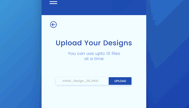
After a user starts the upload process, a progress bar dynamically fills up, indicating the percentage of completion. This microinteraction not only informs users about the file upload in progress, but also reassures them that their action has been recognized and the system is actively processing their request. Keeping the status of the file upload visible helps users feel better informed and in more control.
Error prevention and recovery
No matter how thoughtful your design, users still sometimes make mistakes. Nielsen’s fifth heuristic, Error Prevention, encourages designers to minimize errors by providing useful constraints and defaults, and to warn users when performing an action they might regret.
His ninth heuristic, Help Users Recognize, Diagnose, and Recover from Errors, reminds designers to inform users when something goes wrong by using recognizable visual cues, plain language, and clear instructions for resolving the issue.
Creating a new account can be frustrating if users are left to guess whether their password meets minimum security requirements. Inline validation is an effective pattern for reminding users what corrections they need to make their password a valid one.
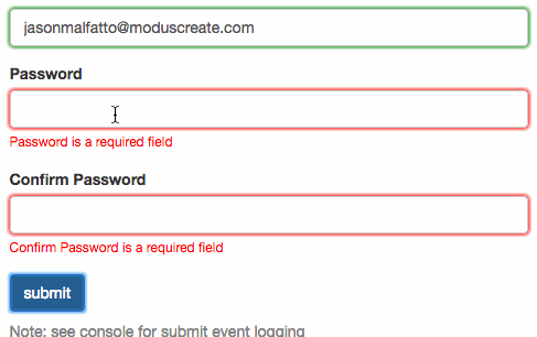
As users create and confirm their new password, the form provides immediate feedback on the validity of each input field. If a user enters a password missing required characters or creates a mismatch when confirming their password, microinteractions trigger subtle visual cues, such as changing the border color of the field to red and displaying specific error messages. This real-time feedback helps users correct errors on the spot, rather than submitting invalid entries and having to start the signup process from scratch.
Incorporating Microinteractions in User Experience Design
If you’re looking to add microinteractions to one of your existing designs, here are some steps to take.
Identify the interaction problem facing the user
Start by observing target users as they encounter a problem, and learn as much as you can about the user’s goal, the context in which the issue occurs, and the obstacle preventing the user from success.
Test and iterate
Come up with a hypothesis for what might solve the problem, create a minimum viable prototype version of your solution, and test that prototype with target users. Then, use that feedback to iterate on your solution.
Structure the microinteraction
The first two steps listed above are as true for any UX challenge as they are for microinteractions. However, once you’ve verified that a particular microinteraction helps users reach their goals, it’s time to structure the implementation.
Interaction designer and author Dan Saffer coined the term “microinteractions” in his 2013 book Microinteractions: Designing With Details. In his book, Saffer identifies four necessary components of a successful microinteraction:

- Trigger
What initiates the microinteraction? Triggers are often user-triggered, typically when the user interacts with an interface. However, some triggers are system-triggered, such as a notification appearing when a user receives an email or instant message. - Rules
What happens once the microinteraction is triggered? The rules should make sense to the user. If the user drags a scrollbar downwards, for example, the user expects page contents to scroll upwards. Any other behavior would feel jarring. - Feedback
How will the system keep the user informed of what’s happening during the microinteraction? Feedback can be any combination of visual, audio, or haptic (meaning tactile) alerts.
Providing feedback can be particularly critical to reassure users making purchases online. Imagine nothing happening after pressing a button to submit payment. Did the transaction work? Is my credit card number secure? - Loops and Modes
Loops determine the duration of the microinteraction, whether it repeats, and whether it evolves over time. Modes are settings that might impact the behavior of a microinteraction. If the user turns on Do Not Disturb mode, system-triggered email or instant messaging notifications should be silenced.
Reflect brand identity
When designing microinteractions, it’s important to know your brand’s voice and tone. How would your product react when celebrating a user’s successful achievement? What language would it use to warn a user about an action that might have negative consequences?
Many companies have created more consistent microinteractions across products by documenting their design, motion, and implementation rules within a design system. For example, Uber uses an animated component called a Snackbar to deliver important status updates such as a user successfully favoriting a location.
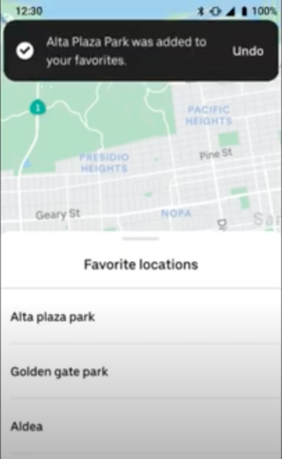
Designers can review the documentation within Uber’s Base Design System to learn Uber’s general motion principles, the specifics of designing a Snackbar component, and guidelines for crafting Snackbar messaging to provide user feedback.
Do You Have an Eye For Detail?
A lot of considerations go into creating a successful microinteraction, including researching user behavior, testing out different design ideas, communicating with developers, and understanding a company’s brand voice. If doing big work to craft small design details sounds like an exciting process, consider applying to Flatiron School’s Product Design Bootcamp.
Not sure if you’re ready to apply? Download the syllabus to learn more about the skills you can acquire in our bootcamp.
And if you are curious about what students learn during their time at Flatiron, attend our Final Project Showcase.
Disclaimer: The information in this blog is current as of April 13, 2024. Current policies, offerings, procedures, and programs may differ.

About Anwar Montasir
Anwar Montasir is a designer, developer, educator, content writer, and accessibility advocate based in Portland, Oregon.
More articles by Anwar Montasir