Microinteractions: Small Design Details That Make a Big Difference

Microinteractions are trigger-feedback pairs that occur within a digital interface. They serve as subtle cues that inform users about the outcome of their actions or the current status of the system. From a simple button click to a complex animation, microinteractions have the power to transform user interactions, provide valuable feedback, and reinforce brand identity.

When Are Microinteractions Useful?

To understand when a product might benefit from microinteractions, designers must first understand the general principles of usability and interaction design. Microinteractions are not mere aesthetic additions to a product, but an opportunity to help users learn, understand, and operate an interface.

Keeping system status visible

In 1994, usability pioneer Jakob Nielsen listed 10 Usability Heuristics for User Interface Design that are still used today to measure the usability of digital interfaces. Nielsen’s first heuristic, Visibility of System Status, states that a design “should always keep users informed about what is going on, through appropriate feedback within a reasonable amount of time.”

Users should never be left guessing about what the system is doing behind the scenes or whether their actions have been successfully processed. For example, consider an app that allows users to upload files.

After a user starts the upload process, a progress bar dynamically fills up, indicating the percentage of completion. This microinteraction not only informs users about the file upload in progress, but also reassures them that their action has been recognized and the system is actively processing their request. Keeping the status of the file upload visible helps users feel better informed and in more control.

Error prevention and recovery

No matter how thoughtful your design, users still sometimes make mistakes. Nielsen’s fifth heuristic, Error Prevention, encourages designers to minimize errors by providing useful constraints and defaults, and to warn users when performing an action they might regret.

His ninth heuristic, Help Users Recognize, Diagnose, and Recover from Errors, reminds designers to inform users when something goes wrong by using recognizable visual cues, plain language, and clear instructions for resolving the issue.

Creating a new account can be frustrating if users are left to guess whether their password meets minimum security requirements. Inline validation is an effective pattern for reminding users what corrections they need to make their password a valid one.

As users create and confirm their new password, the form provides immediate feedback on the validity of each input field. If a user enters a password missing required characters or creates a mismatch when confirming their password, microinteractions trigger subtle visual cues, such as changing the border color of the field to red and displaying specific error messages. This real-time feedback helps users correct errors on the spot, rather than submitting invalid entries and having to start the signup process from scratch.

Incorporating Microinteractions in User Experience Design

If you’re looking to add microinteractions to one of your existing designs, here are some steps to take.

Identify the interaction problem facing the user

Start by observing target users as they encounter a problem, and learn as much as you can about the user’s goal, the context in which the issue occurs, and the obstacle preventing the user from success.

Test and iterate

Come up with a hypothesis for what might solve the problem, create a minimum viable prototype version of your solution, and test that prototype with target users. Then, use that feedback to iterate on your solution.

Structure the microinteraction

The first two steps listed above are as true for any UX challenge as they are for microinteractions. However, once you’ve verified that a particular microinteraction helps users reach their goals, it’s time to structure the implementation.

Interaction designer and author Dan Saffer coined the term “microinteractions” in his 2013 book Microinteractions: Designing With Details. In his book, Saffer identifies four necessary components of a successful microinteraction:

  1. Trigger
    What initiates the microinteraction? Triggers are often user-triggered, typically when the user interacts with an interface. However, some triggers are system-triggered, such as a notification appearing when a user receives an email or instant message.
  2. Rules
    What happens once the microinteraction is triggered? The rules should make sense to the user. If the user drags a scrollbar downwards, for example, the user expects page contents to scroll upwards. Any other behavior would feel jarring.
  3. Feedback
    How will the system keep the user informed of what’s happening during the microinteraction? Feedback can be any combination of visual, audio, or haptic (meaning tactile) alerts.

    Providing feedback can be particularly critical to reassure users making purchases online. Imagine nothing happening after pressing a button to submit payment. Did the transaction work? Is my credit card number secure?
  4. Loops and Modes
    Loops determine the duration of the microinteraction, whether it repeats, and whether it evolves over time. Modes are settings that might impact the behavior of a microinteraction. If the user turns on Do Not Disturb mode, system-triggered email or instant messaging notifications should be silenced.

Reflect brand identity

When designing microinteractions, it’s important to know your brand’s voice and tone. How would your product react when celebrating a user’s successful achievement? What language would it use to warn a user about an action that might have negative consequences?

Many companies have created more consistent microinteractions across products by documenting their design, motion, and implementation rules within a design system. For example, Uber uses an animated component called a Snackbar to deliver important status updates such as a user successfully favoriting a location.

Source: Base Design System by Uber

Designers can review the documentation within Uber’s Base Design System to learn Uber’s general motion principles, the specifics of designing a Snackbar component, and guidelines for crafting Snackbar messaging to provide user feedback.

Do You Have an Eye For Detail?

A lot of considerations go into creating a successful microinteraction, including researching user behavior, testing out different design ideas, communicating with developers, and understanding a company’s brand voice. If doing big work to craft small design details sounds like an exciting process, consider applying to Flatiron School’s Product Design Bootcamp.

Not sure if you’re ready to apply? Download the syllabus to learn more about the skills you can acquire in our bootcamp.

And if you are curious about what students learn during their time at Flatiron, attend our Final Project Showcase.

The Case for Accessible Design

Most designers should already be aware of the importance of accessibility. After all, UX designers spend their careers identifying and removing obstacles between users and their goals. In the case of accessible design, that means testing whether users with disabilities can navigate and understand your content using the assistive technologies they depend upon.

Knowing the principles of digital accessibility is critical for designers. But if you’re the only person at your organization advocating for users with disabilities, your team won’t build accessible products. Accessibility requires a company-wide commitment, an inclusive hiring process that actively seeks the perspectives of people with disabilities, and a structured process of planning and testing. An organization’s accessibility maturity is a measure of the effectiveness and sustainability of its accessibility practices.

Visual representation of the five escalating levels of digital accessibility maturity.
Source: The Digital Accessibility Maturity Model

But what happens if you’re at a company with little to no accessibility maturity? How can designers make the case for a product design and development process that prioritizes accessible outcomes?

Case #1: Accessible Design is the Right Thing to Do

Users with disabilities deserve to be able to use your product, and denying them access is discrimination. This is the ideal reason organizations should embrace an accessible approach.

Any designer who truly values usability should understand that no product is truly usable until everyone can use it. This definition absolutely includes users of assistive technologies.

While there are numerous types of assistive technologies used to navigate the web, some of the best-known tools include:

  • Screen readers: software that reads web content aloud to assist users who are blind or have low vision
  • Screen magnifiers: software that increases the size of text and other web content for users with low vision
  • Alternative input: some users are unable to operate a mouse or keyboard, and depend on alternate methods of controlling the computer, such as:
    • Voice recognition: Users provide commands to the computer verbally
    • Eye tracking: Users control the mouse pointer via eye movements and blinking
    • Switch controls: Users with limited mobility can navigate computers using, for example, switches controlled by pressing a button or by the user’s breath

Disability and accessibility expert Sheri Byrne-Haber recommends showing team members numerous assistive technology demonstrations when advocating for accessible solutions, which presents users of assistive technology as highly capable once usability barriers are removed.

Accessible Design Supports All Kinds of Disabilities

As Microsoft’s Inclusive Persona Spectrum makes clear, accessible design doesn’t only support users with permanent disabilities. Some disabilities are temporary, affecting the user for a limited time. Temporary disabilities might result from illnesses, injury, or surgery.

Other disabilities are situational, meaning the user’s abilities are impacted by specific, short-term circumstances.

Captions, for example, make audio and video content accessible for all of the following:

  • Users with a permanent disability such as deafness
  • Users with a temporary disability such as an ear infection
  • Users with a situational disability such as working in a noisy room

Accessible Design Improves Usability For All Kinds of Users

The usability benefits of accessible design frequently extend to all users. This phenomenon is known as the curb-cut effect

It may seem difficult to imagine a modern city without ramps cut into sidewalks to provide access for people in wheelchairs, but disability activists fought for decades for the right to usable sidewalks. Curb cuts specifically benefit people in wheelchairs, but they also make access easier for people pushing strollers, rolling luggage, or using crutches. 

Returning to our example of captions for audio content, while statistics suggest that 15% of US adults have some degree of hearing loss, 50% of Americans watch videos with subtitles most of the time. So while captions are a must for deaf users, they also assist other viewers, including:

  • Users who aren’t native speakers of the language used in the video
  • Users watching the video at a low volume or in a noisy environment
  • Users who use captions as a concentration aid

Case #2: Accessible Design is Good For Business

In June 2020, Twitter experienced a public relations fiasco when it released an inaccessible audio tweets feature without captions. The company admitted it lacked a full-time accessibility team that would have caught the issue during the planning and testing phases, and more than a year passed before Twitter finally launched accessible voice tweets. 

While the ethical argument outlined in the previous section of this article still applies—Twitter needed higher accessibility maturity because providing audio content without captions discriminates against users who depend on them—the bad publicity surrounding the inaccessible audio tweets also undoubtedly harmed Twitter’s reputation as a company. How can designers make a business case for building accessible products?

Accessible Design Increases Market Reach

The United Nations estimates that 15% of the world’s population lives with a disability. That number rises to over 46% for people 60 years and older.

In the United States alone, there are approximately 20 million working-age adults who report at least one disability, with a market share of about $490 billion.

In addition to enhancing your organization’s reputation as disability-friendly, building accessible products means people with disabilities can spend their money at your business and not somewhere else. And customers with disabilities are frequently highly loyal; due to the difficulty of finding accessible accommodations, for example, disabled travelers tend to find one solution and stick to it.

An accessible website is also easier to find using search engines, thanks to the SEO benefits of semantic HTML markup and accessible media content. Google and other search engines value accessibility best practices such as:

  • descriptive and properly ordered headings
  • descriptive link text
  • alternative descriptions for images
  • captions and transcripts for audio and video files

Accessible Design Can Lower Operational Costs

If users with disabilities are able to conduct successful transactions using your product, that means fewer complaints, which lowers the amount your business needs to spend staffing customer service centers.

Accessible Design Leads to Innovation

A common misconception about accessible design is that accessibility compliance stands in the way of the creation of innovative products, when in fact much of the technology users currently rely upon for communication was originally invented to help users with disabilities, including the following:

Case #3: Accessibility Compliance Avoids Lawsuits

Avoiding lawsuits isn’t the ideal motivation for an accessibility program, as it tends to lead to doing the bare minimum, reactively conducting audits and applying fixes rather than proactively building a sustainable level of accessibility maturity. 

Still, if the ethical and business cases for accessible design don’t sway your organization, perhaps the very real threat of a lawsuit will.

Accessibility Lawsuits are Increasing, and Quick Fixes Aren’t Helping

From 2019 to 2022, the number of website accessibility lawsuits filed in federal courts annually increased from 12 to 14%. By 2023, the total number of lawsuits had climbed to more than 4,600
What’s striking about the 2023 numbers is that over 900 of the lawsuits were against businesses that included accessibility overlays on their websites.

Accessibility overlays are automated plugins that attempt to improve a website’s accessibility through external third-party code. While these overlays promise a quick fix, thus far they’ve proved no substitute for a robust accessible design process. In fact, a blind user named Patrick Perdue told The New York Times in 2022 that overlays make using a screen reader to navigate the web more difficult:

“I’ve not yet found a single one that makes my life better . . . I spend more time working around these overlays than I actually do navigating the website.”

Solving For Accessibility is Cheaper Than Settling a Lawsuit

According to attorney Kris Rivenburgh, businesses targeted in web accessibility litigation can expect to spend a minimum of $25,000 in legal fees and remediation expenses. And the costs can sometimes be far higher. 

In the court case Robles v. Domino’s Pizza, LLC, a blind user named Guillermo Robles sued Domino’s Pizza because its website and mobile app were not accessible using a screen reader. The pizza chain spent six years in court arguing unsuccessfully that the Americans with Disabilities Act (ADA) should not apply to websites. 

By the time the Ninth Circuit Court of Appeals confirmed in 2022 that websites qualify as “places of public accommodation” and deserve ADA protection, observers estimated that Domino’s had spent millions of dollars in legal fees. And by fighting the lawsuit, Domino’s established a reputation as a brand willing to discriminate against users with disabilities.

Most organizations would prefer to avoid serious legal fees and a similar hit to their reputation. The best strategy to avoid lawsuits is a high level of accessibility maturity—one you can advocate for as a compassionate and informed designer.

Interested in Designing for Accessibility?

If designing products that people with disabilities can use aligns with your passions, consider applying now to Flatiron School’s Product Design Bootcamp. Our curriculum contains numerous lessons on working accessibility into your design process and complying with accessibility guidelines.

Not sure if you’re ready to apply? Download the syllabus to learn more about the skills you can acquire in our bootcamp.

And if you are curious about what students learn during their time at Flatiron, attend our Final Project Showcase.

Storytelling in Design Presentations

As a product designer, I’ve seen talented product designers with wireframes that achieved cosmic perfection fail. I’ve seen lesser (albeit capable) product designers succeed time and time again. The reason? Successful designers know how to tell amazing, memorable stories in their design presentations to sell their work. 

Why Do UX Designers Create Presentations?

Design presentations serve a few purposes. They are a chance for designers to connect their decisions to the needs and problems facing either the business or the user. They also allow designers to gather feedback and alignment from the team.

So, say you work at a tech company that (like most) prides itself on making decisions based on data. Why not just prepare a series of charts and diagrams? While data does an excellent job of narrowing decisions, it doesn’t capture human problems particularly well. To evangelize a product team and give an engaging UX presentation, you need something more potent, something that transcends the boundaries of statistics and wireframes—enter storytelling.

Why is Effective Storytelling Helpful When Presenting UX Work?

Imagine you’re presenting a new feature to your team. You could list the features you’ve designed, the user flow diagram, and maybe even some specs for the work. I’d argue this style of presentation doesn’t rationalize your design or sell your audience on your work. Instead, it proves how much work you did, which isn’t the goal of a design presentation.

Successful narrative design in presentations is all about walking your audience through a set of problems facing a user, a sequence of how they look for solutions, and ultimately, how they experience relief and delight from that problem. Executives believe in the value of storytelling in business, because they know it helps sales, marketing, and engineering align around a common set of goals and advocate for excellence. (Not to mention a study that found 65-70% of information retained via storytelling versus 5-10% for simple charts and graphs.) 

“You don’t sell a house by talking about sheetrock. You sell it by getting the buyer to picture themselves in the neighborhood.”
– Mike Montiero, Mule Design Studio

Storytelling fosters empathy. When we put our audience in the shoes of a user, it opens the door for more thoughtful discussion and problem solving because it invites non-designers to weigh in on problems they understand instead of feeling removed from technical jargon.

6 Storytelling Techniques to Apply to Your Design Presentations

Now that we’ve established the importance of storytelling, let’s dive into some practical UX presentation techniques that designers can apply to their presentations:

Craft a Compelling Narrative

Good narrative design in presentations relies on a satisfying structure. Start by setting the stage—introduce the protagonist (the user) and establish the context of their journey. What are their pain points, frustrations, and motivations? It’s important to make sure you also talk about how your user attempts to solve these problems as you introduce them. Then present a hypothesis or assumption on how your solution offers them relief, and how you intend to prove it. Finally, conclude with the transformation—how your product makes their life better, and most importantly; how you know.

Use Visual Storytelling

People process and understand stories a lot faster than non-narrativized content. Are you explaining to us how airport security lacks efficiency? Show us a flow chart. Does your design presentation center on how customer support struggles with call volume? Charts and pictures can help us understand the magnitude of the problem. Visual storytelling in design can take many forms, but rest assured your narrative will resonate with your audience and hold their attention if you include strong visuals. 

Use Assumptions to Create Contrast

You will encounter dozens of story structure models, all with their own merits—but one of the easiest and most engaging UX presentation techniques is to present an assumption, and compare it to a reality you encountered in your process. Sometimes this reality is revealed through user testing, other times through research and iteration. This technique helps you gain credibility and gives you moments of surprise; a “plot twist” to grab your audience with.

Invoke Emotion

Don’t be afraid to tug at your audience’s heartstrings. Is your story about elementary schoolers? Show us some cute kids. Global hunger? Give the audience a statistic or quote that illustrates the magnitude of the problem. Emotion is the fuel that drives engagement and empathy. Share anecdotes, testimonials, or case studies that evoke joy, frustration, or excitement. Help your audience connect with the human side of your design, and they’ll be more invested in its success.

Keep it Simple and Clear

While storytelling adds depth and richness to our presentations, for impactful design storytelling, simplicity is key. Avoid jargon and technical details that may confuse or overwhelm your audience. Focus on conveying your message in clear, concise language, ensuring that everyone can follow along and understand the story you’re telling. 

Invite Participation

Lastly, make your design presentations interactive. Encourage questions, feedback, and discussions to foster a sense of ownership and collaboration among stakeholders. It’s okay to think about your presentation as negotiation and Invite them to become co-creators of the narrative, shaping the future of the product together. A great way to engage your audience is to tell them what type of feedback you’re looking for so they can keep an eye out in your presentation for opportunities to chime in. 

In Conclusion

Storytelling is a powerful tool that can help you make engaging UX presentations and earn credibility if done well. By explaining the value of design instead of its contents we can inspire, educate, and ultimately drive meaningful change. So, the next time you find yourself preparing for a design presentation, remember to channel your inner storyteller—because that’s where the magic happens.

Ready to Learn the Foundations of Product Design?

Any product design role requires a foundational knowledge of design thinking and user-centric design. If you are ready to start your journey as a product designer, apply now to Flatiron’s Product Design Bootcamp. Need more time to decide? Take a look at our syllabus and see how we teach designers to succeed in tech.   

Enhancing Your Tech Career with Remote Collaboration Skills

Landing a career in the tech industry requires more than just technical/hard skills; it requires soft skills like effective communication, adaptability, time management, problem-solving abilities, and remote collaboration skills. Remote collaboration is especially key for those who work in tech; according to U.S. News & World Report, the tech industry leads all other industries with the highest percentage of remote workers.

At Flatiron School, we understand the importance of these skills in shaping successful tech professionals. Hackonomics, our AI-focused hackathon event happening between March 8 and March 25, will see participants sharpen remote collaboration skills (and many others) through the remote team-based building of an AI-driven personal finance platform. We’ll reveal more about Hackonomics later in the article; right now, let’s dive deeper into why remote collaboration skills are so important in today’s work world.

Mastering Remote Collaboration Skills

Remote collaboration skills are invaluable in today’s digital workplace, where teams are often distributed across different locations and time zones. Whether you’re working on a project with colleagues halfway across the globe or collaborating with clients remotely, the ability to effectively communicate, problem-solve, and coordinate tasks in a remote work setting is essential for success. Here are some other key reasons why this skill is becoming so important. 

Enhanced Productivity and Efficiency

Remote collaboration tools and technologies empower teams to communicate, coordinate, and collaborate in real-time, leading to increased productivity and efficiency. With the right skills and tools in place, tasks can be completed more quickly, projects can progress smoothly, and goals can be achieved with greater ease.

Flexibility and Work-life Balance

Remote work offers unparalleled flexibility, allowing individuals to balance their professional and personal lives more effectively. However, this flexibility comes with the responsibility of being able to collaborate effectively from anywhere, ensuring that work gets done regardless of physical location.

Professional Development and Learning Opportunities

Embracing remote collaboration opens doors to a wealth of professional development and learning opportunities. From mastering new collaboration tools to honing communication and teamwork skills in virtual settings, individuals can continually grow and adapt to the evolving demands of the digital workplace.

Resilience in the Face of Challenges

Events such as the COVID-19 pandemic—and the massive shift to at-home work it caused—has highlighted the importance of remote collaboration skills. When faced with unforeseen challenges or disruptions, the ability to collaborate remotely ensures business continuity and resilience, enabling teams to adapt and thrive in any environment.

Join Us for the Hackonomics Project Showcase and Awards Ceremony

Come see the final projects born out of our Hackonomics teams’ remote collaboration experiences when our Hackonomics 2024 Showcase and Awards Ceremony happens online on March 28. The event is free to the public and offers those interested in attending a Flatiron School bootcamp a great opportunity to see the types of projects they could work on should they enroll.

The 8 Things People Want Most from an AI Personal Finance Platform

Great product design is one of those things you just know when you see it, and more importantly—use it. It’s not just about being eye-catching; it’s about serving a real purpose and solving a real problem—bonus points if you can solve that problem in a clever way. If there ever was a time to build a fintech app, that time is now. The market is ripe, the problems to solve are plenty, and the tools and resources are readily available. Flatiron School Alumni from our Cybersecurity, Data Science, Product Design, and Software Engineering bootcamps have been tasked to help me craft Money Magnet, an AI personal finance platform that solves common budget-making challenges. They’ll tackle this work during Hackonomics, our two-week-long hackathon that runs from March 8 to March 25.

There is one goal in mind: to help individuals and families improve their financial well-being through an AI financial tool.

A loading screen mockup for AI personal finance platform Money Magnet

My Personal Spreadsheet Struggle

The concept for Money Magnet sprang from personal frustration and mock research around user preferences in AI finance. As a designer, I often joke, “I went to design school to avoid math.” Yet, ironically, I’m actually quite adept with numbers. Give me a spreadsheet and 30 minutes, and I’ll show you some of the coolest formulas, conditional formats, and data visualization charts you’ve ever seen.

Despite this, in my household, the responsibility of budget management falls squarely to my partner. I prefer to stay blissfully unaware of our financial details—knowing too much about our funds admittedly tends to lead to impulsive spending on my part. However, occasionally I need to access the budget, whether it’s to update it for an unexpected expense or to analyze historical data for better spending decisions.

We’re big on goal-setting in our family—once we set a goal, we stick to it. We have several future purchases we’re planning for, like a house down payment, a new car, a vacation, and maybe even planning for children. 

But here’s the catch: None of the top AI financial tools on the market incorporate the personal finance AI features that Money Magnet proposes bringing to the market. Families need an AI personal finance platform that looks into our spending patterns from the past and projects into the future to tell users when the budget gets tighter. This product should be easy to use with access to all family members to make changes without fear of wrecking the budget.

For more context, each year, my partner forecasts a detailed budget for us. We know some expenses fluctuate—a grocery trip might cost $100 one time and $150 the next. We use averages from the past year to estimate and project those variable expenses. This way, we manage to live comfortably without having to scale back in tighter months, fitting in bigger purchases when possible, and working towards an annual savings goal.

Top financial apps chart from Sensor Tower

But here’s where the challenge lies: My partner, as incredible as he is, is not a visualist. He can navigate a sea of spreadsheet cells effortlessly, which is something I struggle with (especially when it comes to budgeting). I need a big picture, ideally represented in a neat, visual chart or graph that clearly illustrates our financial forecast.

Then there’s the issue of access and updates. Trying to maneuver a spreadsheet on your phone in the middle of a grocery store is far from convenient. And if you make an unplanned purchase, updating the sheet without disrupting the formulas can be a real hassle, especially on a phone. This frustration made me think, “There has to be a better solution!”

Imagining the Ultimate AI Personal Finance Platform

Imagine an AI personal finance platform that “automagically” forecasts the future, securely connects to your bank and credit cards to pull transaction histories, and creates a budget considering dynamic and bucketed savings goals. This dream app would translate data into a clear dashboard, visually reporting on aspects like spending categories, monthly trends in macro and micro levels, amounts paid to interest, debt consolidation plans, and more.

It’s taken eight years of experiencing my partner’s budget management to truly understand a common struggle that many other families in the U.S. face: Advanced spreadsheet functions, essential in accounting and budgeting, are alien to roughly 73% of U.S. workers.

The extent of digital skills in the U.S. workforce according to OECD PIAAC survey data. Image Source: Information Technology and Innovation Foundation

Money Magnet aims to automate 90% of the budgeting process by leveraging AI recommendations about users’ personal finances to solve eight of the key findings outlined in a mock research study based on some of the challenges I had faced when developing a budget of my own.

Features to Simplify Your Finances

This dream budgeting tool is inspired by my own financial journey and the collective wish list of what an ideal personal finance assistant should be. Here’s a snapshot of the personal finance AI features that aims to position Money Magnet as one of the top AI financial tools on the market:

  1. Effortless Onboarding: Starting a financial journey shouldn’t be daunting. Money Magnet envisions a platform where setting up accounts and syncing banking information is as quick and effortless as logging into the app, connecting your bank accounts, and establishing some savings goals (if applicable).
  2. Unified Account Dashboard: Juggling multiple banking apps and credit card sites can be a circus act, trying to merge those separate ecosystems as a consumer is nearly impossible. Money Magnet proposes a unified dashboard, a one-stop financial overview that could declutter your digital financial life.
  3. Personalized AI Insights: Imagine a platform that knows your spending habits better than you do, offering bespoke guidance to fine-tune your budget. Money Magnet aims to be that savvy financial companion, using AI to tailor its advice just for you.
  4. Vivid Data Visualization: For those of us who see a blur of numbers on statements and spreadsheets, Money Magnet could paint a clearer picture with vibrant graphs and charts—turning the abstract into an understandable, perceivable, engaging, and dynamic visual that encourages you to monitor the trends.
  5. Impenetrable Security: When dealing with informational and financial details, security is non-negotiable. Money Magnet will prioritize protecting your financial data with robust encryption and authentication protocols, so your finances are as secure as Fort Knox.
  6. Intelligent Budget Optimization and Forecasting: No more cookie-cutter budget plans that force your spending to fit conventional categorization molds! Money Magnet will learn user preferences in AI finance and forecast from your historic spending, suggesting ways to cut back on lattes or add to your savings—all personalized to improve your financial well-being based on your real-world spending and forecast into the future to avoid pinch-points.
  7. Smooth Bank Integrations: Another goal of Money Magnet is to eliminate the all-too-common bank connection hiccups where smaller banks and credit unions don’t get as much connectivity as the larger banks, ensuring a seamless link between your financial institutions and the app.
  8. Family Financial Management: Lastly, Money Magnet should be a tool where managing family finances is a breeze. Money Magnet could allow for individual family profiles, making it easier to teach kids about money and collaborate on budgeting without stepping on each other’s digital toes or overwriting a budget. It’s important for those using Money Magnet to know it can’t be messed up, and that any action can always be reverted.

See the Money Magnet Final Projects During Our Closing Ceremony on March 28

Attend the Hackonomics 2024 Showcase and Awards Ceremony on March 28 and see how our participating hackathon teams turned these eight pillars of financial management into a reality through their Money Magnet projects. The event is online, free of charge, and open to the public. Hope to see you there!

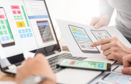
Wireframing and Prototyping: Bringing Your Ideas to Life

As product designers, we are responsible for delivering a wide variety of artifacts throughout the design process. The deliverables we create not only help us come to design decisions ourselves, but also help effectively communicate our decisions or ideas to key stakeholders. Wireframes and prototypes are probably the most common types of deliverables, because both present a highly visual way to communicate our ideas. A picture is worth a thousand words, right? But wireframing and prototyping come in all different levels of detail and are used at all different points in the product design process.

Before talking about the role wireframing and prototyping play at various stages in the product design process, let’s first try to define each of these deliverables from a high level. 

Defining Wireframing and Prototyping

Picture this: you’re crafting an app, website, or new feature for an existing product. Before we jump right into crafting the final version of that app, website, or feature—the one with all the bells and whistles—we need to have a plan of attack. We need to strategize around what content we want to show users. What pages will need to live inside our product and what actions can users take on those pages? This is the role of wireframing.

Creating wireframes is like generating the blueprint of your grand design. They’re the skeletal structure of a product that helps us outline what content is needed and how it should be organized. Wireframing outlines the basic layout—where everything goes—and how users will navigate through your product. They map out the foundation without getting into too many details.

Mockup of a mobile app user interface at a mid-fidelity stage, created in Figma.
Source: Figma

Okay, great! At this point we have an outline. We know what information we want to show on any given page and what actions need to be available to users. Now is the time to put that plan to test. This is where prototypes come in.

Prototypes bring your wireframes to life, adding function to the structure we’ve created. With prototypes, you’re not just showing where things go—you’re showing how they work. Clickable buttons, scrollable pages, interactive elements—they’re all here to demonstrate how the product should behave. Naturally, this makes prototypes the perfect artifact for designers and researchers to test our concepts with real end-users. Prototypes allow us to gather feedback and refine a design before going all-in on a product concept. 

User testing prototypes in low fidelity
Source: UXPlayground

In the simplest terms, creating wireframes helps us shape our approach to solving a design problem. Prototyping tools allow us to test that plan, as they demonstrate in more detail how the product will work.

Low-Fidelity Wireframing and Prototyping

I mentioned that wireframing and prototyping exist all throughout the product design process and at different levels of detail. In the world of design, we refer to this as levels of fidelity. Levels of fidelity in product design refer to the degree of detail and realism incorporated into design prototypes. Low-fidelity design involves creating basic, simplified representations of a product or interface using minimal resources. Typically, this involves sketching with pencil and paper to create wireframes and prototypes.

Three samples of low-fidelity wireframes sketched with pen and paper
Source: InVision

To begin wireframing and prototyping in low fidelity, designers start by outlining the basic structure and layout of the product or interface. They use simple shapes, lines, and text to represent various elements such as buttons, menus, and content sections. Pencil and paper are popular tools for this stage due to their accessibility and ease of use. The primary purpose is to communicate the concept broadly so our audience can think about the idea abstractly without getting bogged down in details that don’t matter at this point (like color and typography choices). 

Testing Prototypes and Low-Fidelity Wireframes

Because we can create low-fidelity wireframes and prototypes so quickly, the product design process is highly iterative. Designers continually refine their sketches based on feedback and insights gathered from testing sessions to help determine which ideas are valid and which ones users find value in. This helps designers make decisions on which ones to pursue further. This iterative approach allows designers to explore different ideas quickly and make adjustments as needed.

Testing prototypes and iterating in low fidelity are crucial steps in the product design process. By gathering feedback from users early on, designers can identify potential issues and make improvements before investing significant time and resources into higher-fidelity designs. Iterating in low fidelity using prototyping tools allows designers to refine the user experience, ensuring that the final product meets the needs and expectations of its intended audience.

Wireframing and Prototyping: Mid-Fidelity to High Fidelity

Once we’ve settled on a concept we’ve validated in low fidelity, we can start thinking about our solutions in more detail. This is when designers start to think more critically about what information goes on each screen and how users will navigate through the product to accomplish core tasks. This is where designers begin to operate in mid-fidelity. 

Mid-fidelity design sits between low- and high-fidelity design, offering a balance of detail and realism. This stage involves adding more visual elements and interactivity compared to low-fidelity wireframes (but still lacks the full polish and functionality of high-fidelity prototypes).

High-fidelity design, on the other hand, represents the most detailed and realistic version of a product or interface. It includes precise visuals, interactive components, and often closely resembles the final product in terms of appearance and functionality. Typically, high-fidelity prototypes are the final check before handing our decisions off for development. 

Progression of interface design from initial low-fidelity wireframes to high-fidelity wireframes, depicting the product design process.
Source: Emma Moldoveanu (FIS Graduate)

Wireframing and Prototyping Tools in Figma

Figma is a versatile prototyping tool used for visualizing our concepts and collaborating on design projects. It supports both mid-fidelity and high-fidelity prototypes one would create through the product design process, allowing designers to create detailed and interactive prototypes.

To start wireframing in mid fidelity using Figma, designers start by refining the basic structure and layout established in low-fidelity wireframes. There are tons of wireframe kits available in the community space to help get designers a head start in creating the components they need for their products. Once all the components, information, and structure is in place, designers can use Figma to add more detailed visuals, such as color schemes, typography, and images to convey the intended look and feel of the final product. Interactive elements, like clickable buttons and links, are also incorporated to simulate user interactions.

Testing Your Solutions

With both mid-fidelity and high-fidelity prototypes, testing is crucial to ensure a successful product on launch. In mid fidelity, designers are concerned about testing the information architecture. They need to answer questions like: 

  • Do users know how to navigate to another page?
  • Where would users expect to find this specific information?

Once we know we have all the right pieces in place, we can then apply our visual design choices and interactions before testing again. This time testing is focused on usability. How well are users actually able to use the tool to solve for common tasks within the product? We can observe users to determine where they run into errors and inefficiencies so we can correct those earlier rather than after release (which could be frustrating for everybody). 

Long story short, testing and iterating are essential components of the product design process, regardless of fidelity level. By testing prototypes and mid-fidelity wireframes, designers can gather valuable feedback on the overall user experience and identify areas for improvement. Iterating on these wireframes allows designers to refine their designs based on user feedback, ensuring that the final product meets user needs and expectations.

Ready to Elevate Your Design Skills?

Dive into our Product Design Bootcamp to master wireframing, prototyping tools, sketching, and Figma—all essential tools in today’s design landscape.  Unlock your potential and kickstart your journey towards becoming a proficient and sought-after product designer by applying today. Don’t miss out on this opportunity to learn from industry experts and take your design career to new heights.

How to Achieve Portfolio Optimization With AI

Here’s a fact: Employers are seeking candidates with hands-on experience and expertise in emerging technologies. Portfolio optimization using Artificial Intelligence (AI) has become a key strategy for people looking to break into the tech industry. Let’s look at some of the advantages of having an AI project in a portfolio, and how portfolio optimization with AI can be a possible game changer in regards to getting your foot in the door at a company.

The Pros of Having AI Projects in a Portfolio

For people seeking to transition into the tech industry, having AI projects in their portfolios can be a game-changer when it comes to landing coveted roles and advancing their careers. By showcasing hands-on experience with AI technologies and their applications in real-world projects, candidates can demonstrate their readiness to tackle complex challenges and drive innovation in any industry. Employers value candidates who can leverage AI to solve problems, optimize processes, and deliver tangible results, making AI projects a valuable asset for aspiring tech professionals.

Achieving portfolio optimization with AI by integrating AI into portfolios is quickly becoming a cornerstone of success for tech job seekers. However, portfolio optimization with AI involves more than just adopting the latest technology. It requires a strategic business approach and a deep understanding of Artificial Intelligence. Below are details about Hackonomics, Flatiron School’s AI-powered budgeting hackathon

The Components of Flatiron’s AI Financial Platform Hackathon

Identifying the Right Business Problem

The Hackonomics project revolves around cross-functional teams of recent Flatiron graduates building an AI-driven financial platform to increase financial literacy and provide individualized financial budgeting recommendations for customers. Identifying the right business problem entails understanding the unique needs and challenges of a target audience, ensuring that a solution addresses critical pain points and that the utilization of AI delivers tangible value to users.      

AI Models

At the core of Hackonomics are machine learning models meticulously designed to analyze vast amounts of financial data. These models will enable the uncovering of valuable insights into user spending patterns, income sources, and financial goals, laying the foundation for personalized recommendations and budgeting strategies.

Software and Product Development

As students develop their Hackonomics projects, continuous product development and fine-tuning are essential for optimizing performance and usability. This involves iterating on platform features (including UI design and SE functionality) and refining AI algorithms to ensure that the platform meets the evolving needs of users and delivers a seamless and intuitive experience.

Security and Encryption

Ensuring the security and privacy of users’ financial data is paramount. The Hackonomics project incorporates robust security measures, including encryption techniques, to safeguard sensitive information from outside banking accounts that need to be fed into the platform. Additionally, multi-factor authentication (MFA) adds an extra layer of protection, mitigating the risk of unauthorized access and enhancing the overall security posture of our platform.

Join Us at the Hackonomics Project Showcase on March 28

From March 8 to March 25, graduates of Flatiron School’s Cybersecurity, Data Science, Product Design, and Software Engineering bootcamps will collaborate to develop fully functioning AI financial platforms that analyze user data, provide personalized recommendations, and empower individuals to take control of their financial futures.

The Hackonomics outcomes are bound to be remarkable. Participants will create a valuable addition to their AI-optimized project portfolios and gain invaluable experience and skills that they can showcase in job interviews and beyond.

The judging of the projects will take place from March 26 to 27, followed by the showcase and awards ceremony on March 28. This event is free of charge and open to prospective Flatiron School students, employers, and the general public. Reserve your spot today at the Hackonomics 2024 Showcase and Awards Ceremony and don’t miss this opportunity to witness firsthand the innovative solutions that emerge from the intersection of AI and finance. 

Unveiling Hackonomics, Flatiron’s AI-Powered Budgeting Hackathon

Are you interested in learning about how software engineering, data science, product design, and cybersecurity can be combined to solve personal finance problems? Look no further, because Flatiron’s AI-powered budgeting hackathon—Hackonomics—is here to ignite your curiosity.

This post will guide you through our Hackonomics event and the problems its final projects aim to solve. Buckle up and get ready to learn how we’ll revolutionize personal finance with the power of AI.

Source: Generated by Canva and Angelica Spratley

Unveiling the Challenge

Picture this: a diverse cohort of recent Flatiron bootcamp graduates coming together on teams to tackle an issue that perplexes and frustrates a huge swath of the population—personal budgeting.

Hackonomics participants will be tasked with building a financial planning application named Money Magnet. What must Money Magnet do? Utilize AI to analyze spending patterns, income sources, and financial goals across family or individual bank accounts.

The goal? To provide personalized recommendations for optimizing budgets, identifying potential savings, and achieving financial goals through a dynamic platform that contains a user-friendly design with interactive dashboards, a personalized recommendation system to achieve budget goals, API integration of all financial accounts, data encryption to protect financial data, and more.

The Impact of AI in Personal Finance

Let’s dive a little deeper into what this entails. Integrating AI into personal finance isn’t just about creating fancy algorithms; it’s about transforming lives through the improvement of financial management. Imagine a single parent struggling to make ends meet, unsure of where their hard-earned money is going each month. With AI-powered budgeting, they can gain insights into their spending habits, receive tailored recommendations on how to save more effectively, and ultimately, regain control of their financial future. It’s about democratizing financial literacy and empowering individuals from all walks of life to make informed decisions about their money.

Crafting an Intuitive Technical Solution Through Collaboration

As the teams embark on this journey, the significance of Hackonomics becomes abundantly clear. It’s not just about building an advanced budgeting product. It’s about building a solution that has the power to vastly improve the financial health and wealth of many. By harnessing the collective talents of graduates from Flatiron School’s Cybersecurity, Data Science, Product Design, and Software Engineering bootcamps, Hackonomics has the opportunity to make a tangible impact on people’s lives.

Let’s now discuss the technical aspects of this endeavor. The platforms must be intuitive, user-friendly, and accessible to individuals with varying levels of financial literacy. They also need to be up and running with personalized suggestions in minutes, not hours, ensuring that anyone can easily navigate and understand their financial situation. 

Source: Generated by Canva and Angelica Spratley

Embracing the Challenge of Hackonomics

Let’s not lose sight of the bigger picture. Yes, the teams are participating to build a groundbreaking platform, but they’re also participating to inspire change. Change in the way we think about personal finance, change in the way we leverage technology for social good, and change in the way we empower individuals to take control of their financial destinies.

For those participating in Hackonomics, it’s not just about building a cool project. It’s about honing skills, showcasing talents, and positioning themselves for future opportunities. As participants develop their AI-powered budgeting platforms, they’ll demonstrate technical prowess, creativity, collaborative skills, and problem-solving abilities. In the end, they’ll enhance their portfolios with AI projects, bettering their chances of standing out to potential employers. By seizing this opportunity, they’ll not only revolutionize personal finance but also propel their careers forward.

Attend the Hackonomics Project Showcase and Awards Ceremony Online

Participation in Hackonomics is exclusively for Flatiron graduates. Participants will build their projects from March 8 through March 25. Winners will be announced during our project showcase and awards ceremony closing event on March 28.

If you’re interested in attending the showcase and ceremony on March 28, RSVP for free through our Eventbrite page Hackonomics 2024 Showcase and Awards Ceremony. This is a great opportunity for prospective students to see the types of projects they can work on should they decide to apply to one of Flatiron’s bootcamp programs.

Solving Common Design Problems With UI Design Patterns

Spend enough time on the web, and you’ll encounter a lot of familiar experiences.

For example, try visiting any news website. Even if it’s one you’ve never seen before, you’ll likely instantly recognize that the site contains news. You’ll also spot a number of clues indicating how to use the site.

The New York Times website resembles many other news sites. The logo in the top center serves as a link to the homepage. Underneath the logo is a series of tabs for each section of news content. The page header also contains a magnifying glass icon allowing the user to search the site. 

Below the header are today’s news articles. The most important article is accompanied by the largest headline, as well as a photo.

And it’s not just news websites that feel alike. Pull up examples from just about any category of digital content—public libraries, athletic shoe stores, social media apps for sharing videos—and you’ll undoubtedly find more similarities than differences in their interfaces.

The reason these experiences feel so familiar is that designers are taking advantage of UI design patterns. Design patterns are common solutions designers use to solve frequently occurring usability problems in user interfaces.

But why are these patterns so popular? How do designers decide where and when to implement them? And are they appropriate for every usability challenge?

Why Do Designers Use Patterns?

Creating familiar experiences reduces the cognitive load required for users to understand and use an interface. Cognitive load is defined as the mental effort required to process information and perform a task.

Web usability consultant Jakob Nielsen provides a rule reminding interface designers to minimize cognitive load: 

“Users spend most of their time on other sites. This means that users prefer your site to work the same way as all the other sites they already know.”

In other words, your interface needs to match the expectations of both mobile and desktop audiences who are used to navigating products similar to yours.

But when faced with a common usability challenge within a digital product, such as organizing a large number of news categories, beginning designers might feel tempted to create an alternative to the top navigation pattern found on competitor websites. After all, product designers are hired for their creativity, right? 

However, straying from the familiar pattern wastes the user’s time. Users aren’t visiting to puzzle their way through the designer’s fresh new interface—they’re here to read the news. And if the news that interests them is too difficult to find, they’ll leave.

And from the product team’s perspective, why spend extra design, testing, and development hours creating a novel approach to a navigation problem that’s been solved by countless other news websites?

Working with UI Design Patterns

Is implementing UI design patterns as simple as plugging one into your product’s interface? Not quite. Designers generally follow a four-step process to choose the right pattern and adapt it to the needs of their product and audience.

1. Identify the Problem

Before selecting a UI pattern as a solution, gather as much information as possible about the problem users are having. For example, web analytics might indicate potential subscribers to your news website are bailing out at a specific stage of the checkout form.

Your team should observe users attempting to complete the form in order to thoroughly understand the following:

  • User goals: What motivates users to complete this task? 
  • Pain points: What frustrations stand in their way?
  • Context: What is the user doing when the problem occurs?

2. Find a Common Solution

Now that you understand the pain points facing users, the next step is to research what patterns are available to help solve the problem.

Start by reading about the problem. If you’ve observed that users are struggling to format phone numbers to match the expectations of your checkout form, read up on alternate solutions that don’t require specific formatting.

You might additionally check out sites that compile UI design patterns. Not all of these resources are free, but they can speed up the process of finding patterns and learning more about their implementation.

3. Check Out Examples

Once you’ve identified the most useful pattern to solve your product’s usability problem, test out websites and apps that make use of the pattern. 

  • When, where, and how is the pattern used? 
  • What are the usability benefits of the pattern?
  • Are there contexts in which the pattern might not make sense?

Your review should also evaluate the accessibility and ethics of the pattern. Accessibility means ensuring your interface can be operated by users with disabilities. As for ethics, avoid using dark patterns designed to trick users into performing unwanted actions.  

4. Adapt to Your Product’s Needs

Here’s where your creativity as a designer comes in. You’ll need to adjust your chosen pattern to suit your product in a way that balances all of the following:

  • Desirability: Can users understand and use this pattern to reach their goals?
  • Viability: Will the pattern help fulfill business needs?
  • Feasibility: How easily can the development team implement this pattern?

Beyond Design Patterns

After thoroughly researching a design problem, you’ll occasionally discover that no existing pattern really satisfies your users’ needs. In that case, ideate on some new approaches to the problem. This is where great innovation comes from.

While today we might take popular UI design patterns such as tab bars across the bottom of mobile screens for granted, patterns like these began as a designer’s solution to a problem (in this case, limited mobile screen real estate combined with the need to keep frequently accessed options near the user’s thumb).

When in doubt, follow the advice of Don’t Make Me Think author Steve Krug. “Innovate when you know you have a better idea, but take advantage of conventions when you don’t.”

Ready to Build Your Own Interfaces?

If solving usability problems and designing user interfaces within digital products sounds like a fun challenge, consider applying now to Flatiron School’s Product Design Bootcamp. You’ll learn the design skills you need to build a competitive portfolio and land your first job in the product design industry.

Not sure if you’re ready to apply? Download the syllabus to learn more about the skills you can acquire in our bootcamp, or check out our free Product Design Prep Work to explore the material we teach in the course.

And if you are curious about what students learn during their time at Flatiron, attend our Final Project Showcase.

Life After Graduation From a Product Design Bootcamp

So what’s it really like to graduate from a product design bootcamp? Can a bootcamp really provide the skills necessary to land a job as a junior designer?

The answer is yes—absolutely —provided you’re aware that your hardest work begins the day you graduate.

Completing a product design bootcamp is an achievement surely worth celebrating. But know this: the grads currently succeeding weren’t simply handed a job on their last day of school. Getting their foot in the door took a lot of hustle: networking, refining portfolios, and completing new projects. 

We spoke to Flatiron School alumni about how they used their time between graduation and landing a design industry job.

Define Your Unique Value Proposition

In her Medium article “Your Portfolio is Freaking Boring,” Melody Koh cautions against generic-sounding welcome statements like I am a junior UX designer passionate about solving problems. If your bio sounds like it could describe almost any junior designer, you’ll find it difficult to distinguish yourself.

Alexandra’s Value Proposition Story

One way to define your unique value proposition is to to connect your pre-bootcamp experience to your new UX knowledge. Flatiron graduate Alexandra Grochowski came from a background in the banking industry. After graduation, she began blogging on Medium about the overlap between UX design and finance. One of her posts caught the attention of the marketing director of Amount, a banking software platform. Alexandra started writing for Amount’s blog, which eventually led to a full-time position as a product designer.

Design graduates are sometimes reluctant to highlight their non-design experience in their promotional materials, but this is a missed opportunity. By blogging her insights about the intersection of design and banking, Alexandra established herself as not just another junior design candidate, but instead, a unique voice with a specifically marketable set of skills.

Revise Your Portfolio Thoughtfully

A common mistake among recent product design bootcamp grads is to wait to apply for jobs until their portfolios are perfect. But here’s the thing:

Perfect design portfolios don’t exist.

Since there’s always room for improvement, take a Lean UX approach to developing your portfolio. Revise until it’s complete enough to receive meaningful feedback from industry contacts and mentors. Use the advice you’ve gathered to make improvements. And in the meantime, keep applying for jobs.

Crystal’s Portfolio Revision Story

Flatiron grad Crystal Ma credits her mentor, a designer at a large Chicago marketing technology company, with providing actionable feedback on her portfolio. Recalling her mentor’s advice that hiring managers may spend five minutes or less reviewing each portfolio, Crystal heavily edited her case studies, using block quotes to call out main points and reducing the amount of text in favor of eye-catching visual assets. She also worked to improve her case study storytelling, removing lengthy design process descriptions and instead highlighted moments of discovery that demonstrate the true value of a design project.

Crystal also emphasized a learning moment from early in the interviewing process: “I didn’t realize that for portfolio presentations, it’s typical to use a slide deck. I used to just open up my website and scroll through it. Do not do this. Go and make a simple slide deck in Figma.”

Find Real Stakeholders

Many product design bootcamps don’t require you to work on actual client projects prior to graduation. And in a way, this makes sense. The typical bootcamp experience involves a quick immersion in the principles of UX research, UX design, and UI design. This is followed by projects that provide an opportunity to demonstrate your knowledge. The short timelines of these projects don’t always allow students enough time to gather and apply feedback from stakeholders.

However, design projects without stakeholders are less likely to impress hiring managers. These rapidly executed assignments allow students to demonstrate their ability to satisfy target users of a product or service. But what about balancing user goals with business needs?

Working with real stakeholders also frequently involves respecting constraints, such as budget limitations or technology requirements, that are hard to replicate in the classroom. You’ll also find that working with actual stakeholders is a great way to practice your communication skills and build connections that can lead to future job opportunities.

Laurel’s Stakeholder Story: Working With a Non-Profit

For her final student project, Flatiron grad Laurel Klafehn worked with the Immigrant Freedom Fund, a non-profit organization advocating for the end of cash bail that pays immigration bonds for people detained in Aurora, Colorado. Laurel’s client provided tangible, real-world goals—including reworking the organization’s digital presence—to attract more donations from community members, as well as allowing people advocating for their detained loved ones to request help. 

Just as importantly, Laurel learned to work within the project’s constraints, including a limited budget, providing support for users who speak languages other than English, and the need to help families navigate a civil detention system that is intimidating and unclear. Laurel has continued working with the Immigrant Freedom Fund after graduation, demonstrating a high level of commitment and an alignment between her design work and her personal values.

Nonprofit organizations like the Immigrant Freedom Fund can be a useful and rewarding source of real stakeholder work after graduation. To find nonprofit opportunities, try reaching out to your LinkedIn network. Or, search Google for design volunteer opportunities in [your location]. You might also check out some of the websites aimed at connecting volunteers with organizations in need. While a few websites such as UX Rescue are aimed specifically at helping designers make an impact, most offer a more general collection of volunteering opportunities.

Tara’s Stakeholder Story: Leveraging Family and Friends

In addition to partnering with nonprofits, some graduates have used their existing network of family and friends creatively to help them find opportunities to create client work. Flatiron graduate Taras Sarvas graduated from Flatiron shortly before the start of the COVID-19 pandemic, a moment of high uncertainty where design projects were difficult to find. Taras used this time to design an e-commerce website for San-Tech, a plumbing fixture retail chain located in Ukraine and run by Taras’s father.

Source: Taras Sarvas

Taras also credits part of the success of his job search to letting his personality shine through in his portfolio. Recruiters and hiring managers view dozens of portfolios in a single sitting, so a list of technical abilities alone won’t grab their attention. Taras recalls hearing “multiple times from hiring managers that my portfolio is memorable because I have a silly waving .gif of me on my landing page.”

Network, Network, Network

It’s no secret that networking is essential to developing your career and discovering job opportunities. In fact, after graduating from a product design bootcamp, you’ll need to spend just as much time networking using LinkedIn as you do revising your portfolio, completing new projects, and filling out applications. Especially since having someone in your network refer you for a position is far more productive than filling out online applications at companies where you’ve made no connections.

One common networking mistake is concentrating only on people in a position to offer you a job. Being referred to an open position can be a bonus effect of networking, but the true goal is to build meaningful relationships within the industry, and to learn from other people’s experiences. Establishing industry contacts has tremendous value even when it doesn’t immediately result in a job lead.

Max’s Networking Story

Flatiron grad Max Shakun connected with as many people as he could after finishing the program, including recruiters and hiring managers, junior designers with less than a year’s experience, and more senior professionals. 

Max notes recruiters and hiring managers frequently stated a preference for real-world projects as opposed to school work, which emphasizes our earlier point about the importance of working with real stakeholders. In fact, reaching out to his existing network (including non-designers) led Max to his first client project, participating in a redesign of the non-profit Symphony New Hampshire website with an emphasis on WCAG accessibility compliance.

Source: Max Shakun
Source: Max Shakun

As Max looked for jobs, he learned from the missteps and eventual successes of junior designers who were six months to a year ahead of him in their career path. And as for senior designers, Max found them a valuable source of design mentorship:

“I have found the UX/UI community to be incredibly supportive, and so many senior designers are happy to answer questions you may have about the field and your portfolio. I think the support system likely comes from the built in iterative nature of product design. We all value and appreciate honest feedback!”

Is Product Design Right For You?

If the experiences and portfolios of design professionals like Alexandra, Taras, Crystal, Laurel, and Max have you feeling inspired, consider applying to Flatiron School’s Product Design Bootcamp. You’ll learn the design skills needed to build a competitive portfolio and land your first job in the product design industry.

Not sure if you’re ready to apply? Download the syllabus to learn more about the skills you can acquire in our bootcamp. Or, check out our free Product Design Prep Work to explore the material we teach in the course.

And if you are curious about what students learn during their time at Flatiron, attend our Final Project Showcase.