Quantifying Rafael Nadal’s Dominance with French Open Data

The French Open, also known as Roland-Garros, began on May 26th in Paris and culminates in championship matches held on June 8th and 9th. It is the second of four major tennis tournaments collectively known as the Grand Slam—the Australian Open, Wimbledon, and the U.S. Open being the other three. 

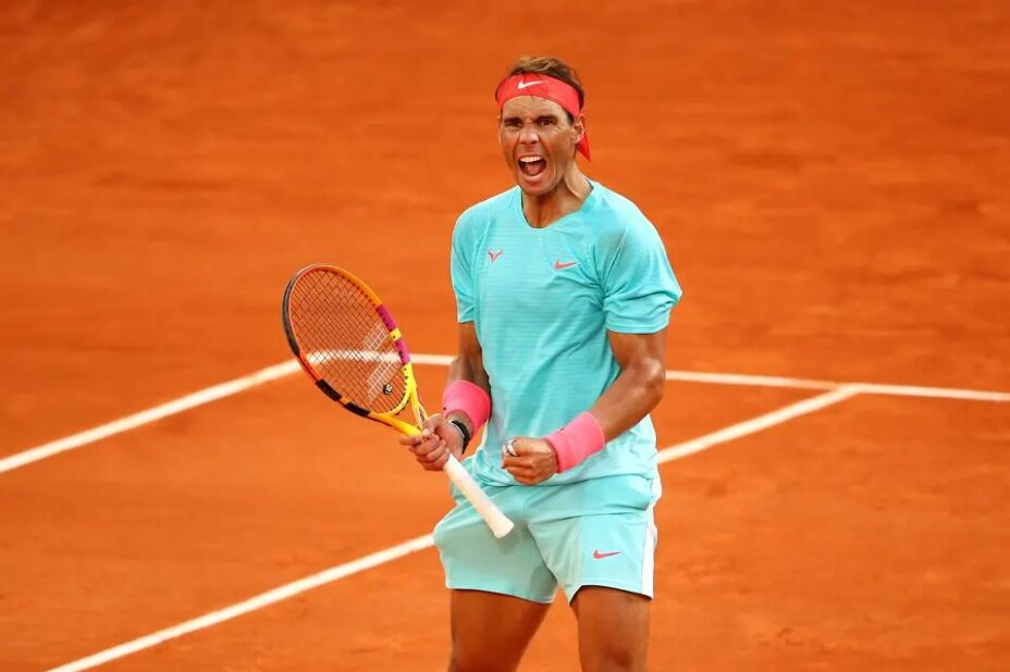
A big question heading into the tournament was whether tennis superstar Rafael Nadal would compete after being unable to last year due to injury. Nadal has won the French Open 14 times in his career—the most of any individual player, male or female. Although he was defeated in the first round of the tournament this year by Alexander Zverev, Nadal’s career record is nevertheless impressive.

In this blog post we’ll explore his French Open data and try to identify the je ne sais quoi that led to his record-breaking success and earned him the nickname “The King of Clay.”

French Open Titles

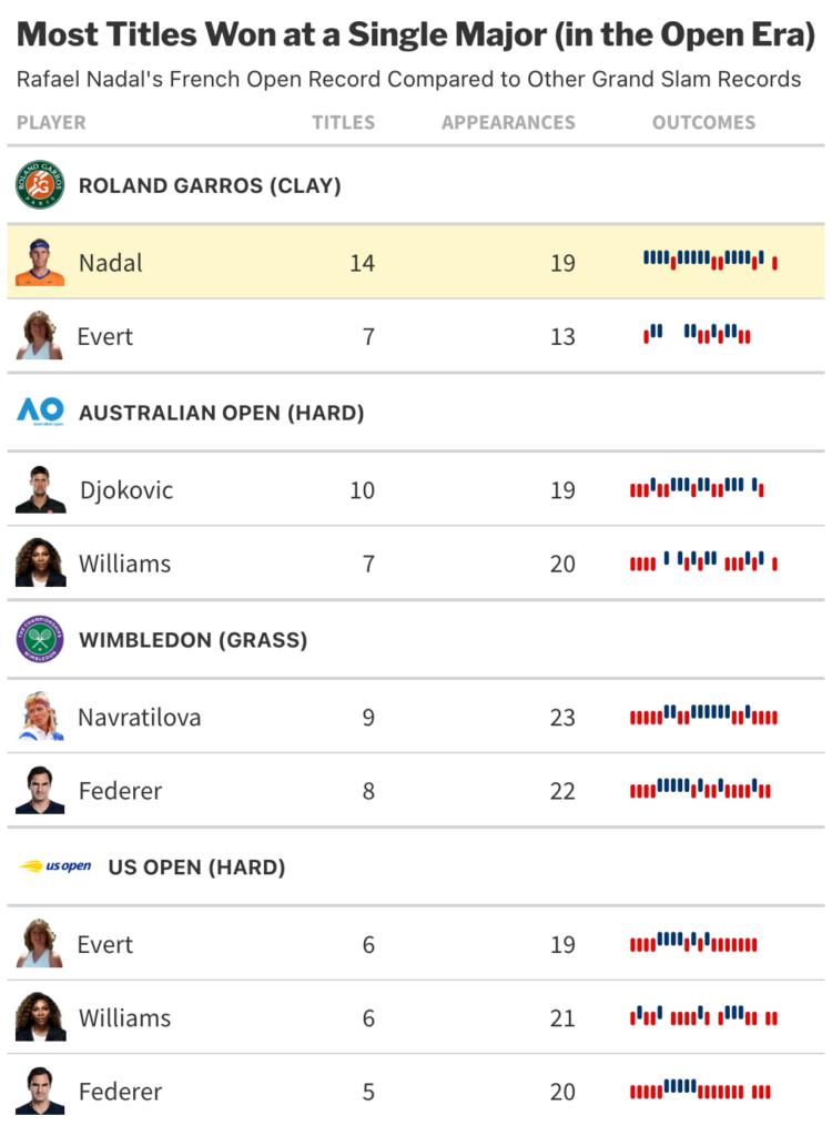
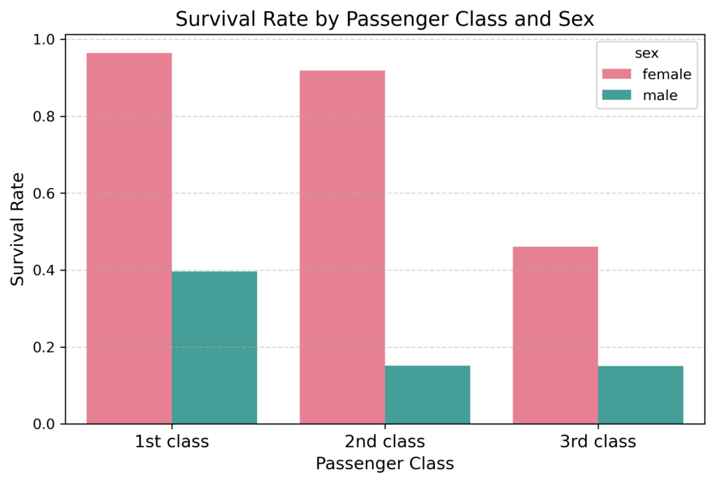
In 19 career appearances, Rafael Nadal has won the French Open 14 times. The next closest male is Björn Borg with six titles. On the female side, Chris Evert holds the record with seven.

Taking our scope beyond just French Open data, no player, male or female, has 14 titles at any one of the Grand Slam tournaments. Aside from Nadal, the only active player in the table below is Novak Djokovic, who holds the closest active record with 10 Australian Open titles. Already playing the tournament 19 times, career longevity becomes a challenge if Djokovic were to unseat Nadal as the winningest player at a single major tournament.

Among these tennis greats, Nadal’s stretch of success at the French Open is truly eye-catching.

The table above comes from Flatiron’s analysis of individual titles at a single Grand Slam tournament in the Open Era (1968 to present). Court surfaces are in parentheses. 
Data source: Wikipedia
The table above comes from Flatiron’s analysis of individual titles at a single Grand Slam tournament in the Open Era (1968 to present). Court surfaces are in parentheses. 
Data source: Wikipedia

The Court at the French Open

A unique aspect of the French Open is its surface. Rather than the traditional blue or green hard court (typically concrete) that you’re likely to find at a nearby park or sports complex, the French Open features an orange-red surface made of densely packed clay. This surface results in a distinct gameplay that rewards defensive play and makes the ball behave differently off the bounce. Another challenge posed by clay is the reduced friction between the shoe and the surface, requiring players to slide into position to strike the ball as they move around the court.

Rafael Nadal on the clay court at the French Open.
Rafael Nadal on the clay court at the French Open. 
Source: rolandgarros.com

Many experts attribute Nadal’s success at the French Open to his athleticism and emphasis on power and ball spin off the racket. These characteristics, accentuated by the clay court, allow him to hit returns other players cannot and to remain on the offensive even while his opponent is serving.

Comparing Match Stats with French Open Data

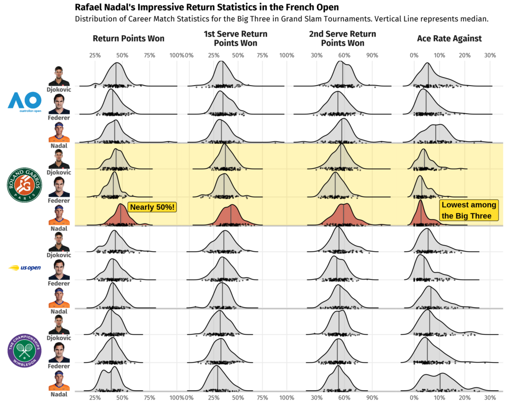
The Big Three—composed of Novak Djokovic, Roger Federer, and Rafael Nadal—is the nickname for the trio considered the greatest male tennis players of all time. Even among this group Nadal’s return statistics stand out. In French Open matches he wins an average of 49% of return points compared to Djokovic’s 44% and Federer’s 41%. Winning nearly 50% of return points is unheard of, especially when top players are expected to win 70% or more of the points in which they are serving.

Additionally, Nadal’s median Ace Rate Against—a measure of how often a player is unable to touch their opponent’s serve—is just 2.7% at the French Open, the lowest among all three athletes at any Grand Slam. To take the opponent’s serving advantage away this dramatically is clear evidence of Nadal’s impressive upper hand on the clay court.

The figure below compares match statistics for Djokovic, Federer, and Nadal at Grand Slam tournaments across their respective careers.

The chart above comes from Flatiron’s analysis of career matches at Grand Slam tournaments for Rafael Nadal, Roger Federer, and Novak Djokovic.
Data source: Tennis Abstract

The Greatest Sports Records of All Time

The French Open data so far shows that no tennis player has dominated one of the majors the way Nadal has. But how does his record compare to non-tennis records? What methodology could we use to compare apples and oranges, or perhaps, tennis balls, basketballs, and hockey pucks?

There are a number of ways to approach any given problem in the field of data science. In fact, for a field known for its quantitative rigor, there are many aspects that allow for creativity. Designing data visualizations, weaving insights into a cohesive story, or, in our case, developing a methodology for comparing athletic achievements are all ways in which creative thinking is an asset.

For our problem, we could visualize the difference relative to the next best record-holder or compare the length of time previous records were held. These are interesting ideas, but really only compare two data points head-to-head. With sample size in mind, let’s try to contextualize how far out of the ordinary Nadal’s 14 championship wins are and do the same for a few other sports achievements.

The Z-Score

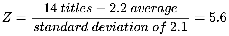
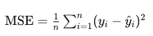
The number of wins at a tennis tournament are of a different magnitude than, say, the number of career points in basketball. To make things fair, we need to standardize. The “standard score,” sometimes called a “Z-score,” is a way for us to compare data measured on different scales. It can be calculated by taking each data point, x, subtracting the average, a, of data points from the same sample, and dividing by the standard deviation, S, a measure of how much variability there is in our data. Written in equation form, we have:

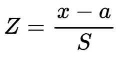
As an example, on the top 50 list of most Grand Slam titles at a single tournament, the average is 2.2 with a standard deviation of 2.1. Therefore, the Z-score for Rafael Nadal’s French Open record is:

Z-scores are unitless, meaning we can calculate and compare these for records from different categories, even different sports. It is important, however, to know that z-scores can be susceptible to skewed data. To confidently say if one is more extreme than another, we may need to account for distributional characteristics. For now, we can say with certainty that a positive z-score means a data point is atypically high relative to the population from which it comes. Conversely, a negative one means it is unusually low compared to its population. Simply put, the further a z-score is from zero, the more unusual, or further from average, it is.

Nadal vs. Gretzky, Clark, and Ledecky 

In the chart below, we compare Nadal’s record with three notable records:

  1. The National Hockey League career points record held by Wayne Gretzky since 1999.
  2. The recently-set women’s college basketball scoring record by Caitlin Clark.
  3. Katie Ledecky’s ever-growing count of gold medals for swimming at the Olympics and World Aquatics Championships.
The chart above comes from Flatiron’s analysis comparing Nadal’s 14 French Open titles to three other highly regarded athletic records.
The chart above comes from Flatiron’s analysis comparing Nadal’s 14 French Open titles to three other highly regarded athletic records. 
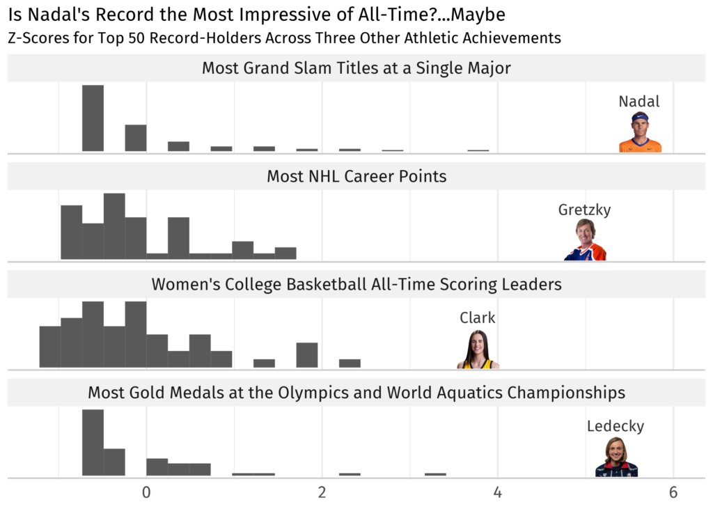
Data sources: Ultimate Tennis Statistics, NHL, Sports Reference, Wikipedia

It’s clear that all four athletes’ achievements stand far beyond the competition. Nadal’s 14 titles put him farthest from average of these four records, but the right-skewed distributions make this an imperfect comparison. To definitively say whether his record is the greatest of all time, further analysis should include exploring measures that are more robust to skew and outliers. With Gretzky retired and Clark moving on to the WNBA, only Nadal and Ledecky can extend their records. Coincidentally, Ledecky also has an opportunity in Paris with the Olympics taking place this summer.

What’s Next?

Is Nadal’s record of 14 titles at the French Open the most impressive athletic feat of all time? One could certainly argue it is. Can it be broken? Only time will tell. As we’ve seen, even among tennis legends like Serena Williams, Roger Federer, and Novak Djokovic, Rafael Nadal stands alone more than 5.6 standard deviations above the average. Perhaps if a young up-and-coming player can perfect power, spin, and mobility on clay, they, too, could become clay court royalty. That is, if they can also remain at the top of their game over a multi-decade career the way Nadal has. As his fans say, “¡Vamos Rafa!”

Learn Data Science at Flatiron

Unlocking the power of data goes beyond basic visualizations. Our Data Science Bootcamp teaches data visualization techniques, alongside machine learning, data analysis, and much more. Equip yourself with the skills to transform data into insightful stories that drive results. Visit our website to learn more about our courses and how you can become a data scientist.

The Art of Data Exploration

Exploratory Data Analysis (EDA) is an essential initial stage in the workflow of data analysts and data scientists. It provides a comprehensive understanding of the dataset prior to delving into advanced analyses. Through data exploration, we summarize the main characteristics of a dataset. In particular, we reveal patterns, anomalies, and relationships among variables with the help of a variety of data exploration techniques and statistical tools. This process establishes a robust basis for further modeling and enables us to ask relevant research questions that would finally inform impactful business strategies.

Methods for Exploring Data

Data cleaning/preprocessing

Raw data is never perfect upon collection, and data cleaning/preprocessing involves transforming raw data into a clean and usable format. This process may include handling missing values, correcting inconsistencies, normalizing or scaling numerical features, and encoding categorical variables. This ensures the accuracy and reliability of the data for subsequent analysis and ultimately for informed decision making.

Descriptive statistics

Statistical analysis usually begins with descriptive analysis, also known as descriptive statistics. Descriptive analysis provides data analysts and data scientists with an understanding of  distributions, central tendencies, and variability of the features. This lays the groundwork for future statistical inquiries. Many companies leverage the insights directly derived from descriptive statistics.

Basic visualization

Visualizations offer businesses a clear and concise way to understand their data. By representing data through graphs, charts, and plots, data analysts can quickly identify outliers,  trends, relationships, and patterns within datasets. Visualizations facilitate the communication of insights to stakeholders and support hypothesis testing. They provide an easy-to-follow visual context for understanding complex datasets. In essence, visualizations and descriptive statistics go hand in hand—they often offer complementary perspectives that improve the understanding and interpretation of data for effective decision making.

Formulating Research Questions

Data exploration plays an important role in formulating insightful research questions. By employing descriptive analysis and data visualization, data analysts can identify patterns, trends, and anomalies within the dataset. Then, this deeper understanding of variables and their relationships serves as the foundation for crafting more robust and insightful research inquiries. 

Moreover, data exploration aids in evaluating how suitable the statistical techniques are for a specific dataset. Through detailed examination, analysts ensure that the chosen methodologies align with the dataset’s characteristics. Thus, data exploration not only informs the formulation of research questions but also validates the analytical approach, thereby enhancing the credibility and validity of subsequent analyses.

Flatiron Offers Access, Merit, and Women Take Tech Scholarships
Make your career change into data science a reality.
Learn More

Exploratory Data Analysis Tools

EDA relies on powerful tools commonly used in data science.These tools offer robust functionalities for data manipulation, visualization, and analysis, making them essential for effective data exploration. Below, let’s explore some of the most common tools and their capabilities.

Python

Python’s Pandas, NumPy, Seaborn, and Matplotlib libraries greatly facilitate the process of data loading, cleaning, visualization, and analysis. Moreover, their user-friendly design attracts users of all skill levels. Python also seamlessly integrates with statistical modeling frameworks such as statsmodels and machine learning frameworks such as Scikit-learn.

This integration enables smooth transitions from data exploration to model development and evaluation in data science workflows. These Python libraries below are commonly used within the data exploration landscape:

  • Pandas: Facilitates data manipulation and analysis through dataframe and series structures, effortlessly enabling tasks such as data cleaning, transformation, and aggregation.
  • NumPy: Supports scientific computing for working with multi-dimensional arrays, which is essential for numerical operations and data manipulation.
  • Matplotlib: Matplotlib is a versatile library for creating professional visualizations, providing fine-grained control over plotting details and styles. 
  • Seaborn: Seaborn builds on Matplotlib to offer a higher-level interface, specifically designed for statistical graphics, which simplifies the creation of complex plots.
  • Plotly: Specializes in generating interactive visualizations, supports various chart types, and offers features like hover effects and zooming capabilities. 

R

R is tailored for statistical computing and graphics, and features versatile packages for data manipulation and sophisticated visualization tasks. Its extensive statistical functions and interactive environment excel in data exploration and analysis. Some of R’s key packages used for data exploration and visualization are as follows:

  • dplyr: Facilitates efficient and intuitive data manipulation tasks such as filtering, summarizing, arranging, and mutating dataframes during data exploration.
  • tidyr: Serves as a companion package to dplyr, focusing on data tidying such as reshaping data, separating and combining columns/rows, and handling missing values.
  • ggplot2: Known as a popular plotting system for creating complex, layered visualizations based on the grammar of graphics.
  • plotly: Provides an interface for creating interactive visualizations and embedding them in web applications or dashboards.
  • ggvis: Offers an interactive plotting package built on ggplot2, and provides plots that respond to user input or changes to data.

Gain an Education in Data Exploration in a Matter of Months
See what Flatiron’s Data Science Bootcamp can do for you and your career.
Learn More

Step-by-step Data Analysis

Let’s start on our practical data exploration journey with a real-life dataset that can easily be found online.

For the demo in this post, we are going to perform EDA on the infamous Titanic dataset. The dataset contains passenger information for the Titanic, with information such as the age, sex, passenger class, fare paid, and whether the passenger survived the sinking of the Titanic. We will be using the Python environment and we will rely on the power of highly robust Python libraries that facilitate data manipulation, visualization, and analysis.

We will now proceed with a step-by-step approach of discovering the hidden depths of this dataset.

Step1: Import libraries

Let’s start by importing the necessary libraries for data analysis and visualization. We’ll use Pandas for data manipulation, Numpy for numerical computing, and Seaborn and Matplotlib for visualization.

Step 2: Load the dataset

Let’s load the Titanic dataset, which is part of the Seaborn library’s built-in datasets. Next, let’s take a look at the first few rows of the dataset to understand its structure and contents. 

Step 3: Data exploration

Dataframe structure

Now let’s print a concise summary of the dataframe, displaying total number of entries, feature names (columns), counts of non-null values, and data types assigned to each column.

The Titanic dataset contains a total number of  891 rows. This comprehensive summary is helpful for verifying the absence of null values and ensuring that the data types were assigned correctly—which is necessary for precise analysis.

During the data exploration process, it is a very common practice to transform data types into a more usable format; however for this dataset, we will keep them as is. On the other hand, we see that some of its columns like age, deck, and embark_town have significant missing values. We will need to handle the null values for age later in our workflow since we will be using this variable in our exploration. 

Dataframe summary statistic

Let’s perform summary statistics on the numerical variables, which involves counts, means and standard deviations, quartiles, and minimums and maximums. This enables us to get an idea of the distribution or spread of numerical variables in a dataset, as well as pick out any possible outlying data points. For example, in the Titanic dataset, “fare” is a numerical variable referring to the money paid for tickets. It, however, covers a range of 0-512 with a median value of only 14.

In this case, it is reasonable to suspect that the presence of a value “0” might indicate errors. Also, there appear to be significant outliers on the higher end of the distribution. It would be good practice to investigate how the “fare” variable was coded further. However, we will not make any modifications to it in this exploration, as we will not use it in our analysis. 

Histogram insights

Now, let’s move onto generating histograms to portray the distributions of the numerical columns. Each vertical bar in a histogram shows the number of observations within an individual bin, while its height represents how frequently it occurs within that interval. Histograms significantly simplify the process of identifying patterns and trends present in our data as well as highlighting any anomalies. Therefore, these visualizations assist us in making decisions about how to clean up our data before proceeding to modeling, enhancing the accuracy and reliability of our analyses.

Step 4: Data cleaning/preprocessing

Identify outliers

Outliers can significantly influence the results of data analysis, and boxplots provide a helpful visual for their identification. The outliers that are present in this plot of “age” in the Titanic dataset are those points outside of the boxplot whiskers, indicating some large individual values of age. For this data exploration, we will leave these points as is; however, it is possible that their removal is required for valid and reliable results based on context and the type of analysis performed.

Handle missing values

Missing values are a common issue in datasets and can significantly impact the results of analyses by introducing bias or inaccuracies. Thereby, they need to be handled with care.

For example, for the “age” column in the Titanic dataset, we can apply several methods for the missing values. Simple approaches would involve removing rows with missing data or filling them with central tendency measures like mean, median, or mode.

Alternatively, more advanced methods such as predictive modeling can be used for imputation to fill in null values. These steps are vital for preserving data integrity and ensuring meaningful insights from subsequent analysis. In this scenario, we’ll just drop the rows with missing age values. 

Feature engineering

Let’s also explore feature engineering to further enhance our analysis. Feature engineering involves creating new features or modifying existing ones so that we can gain deeper insights from the data.

For instance, we can engineer a new feature such as “age groups” based on the “age” variable. This new variable will basically categorize age into five age groups: infant/toddler, child, teenager, adult, and senior. This will allow us to see survival rates across different age groups more clearly, and will provide deeper insight into the impact of age on survival. 

Step 5: Visualization

Now, let’s move onto visualizing relationships between some of the features within our dataset.

Survival rates by passenger class and sex: We’ll begin by creating a bar plot to examine survival rates based on passenger class and sex. Here, the x-axis represents the passenger class, while the y-axis illustrates the survival rate. We’ll employ the hue parameter to distinguish between male and female passengers.

This bar plot reveals compelling insights into the survival patterns as a function of passenger class and sex. Overall, first-class passengers survived at much higher rates compared to those in second and third class. However, female passengers consistently had higher survival rates than males across all passenger classes. The most notable difference between the male and female survival rates were among second class passengers. 

Remarkably, almost all first-class females survived with a rate of 96%, reminiscent of characters like Rose DeWitt Bukater from the movie Titanic. In contrast, the survival rate for third-class males, like the character Jack Dawson from the same movie, was sadly only at 15%.

In addition to the visual representation above, let’s create a table to display the mean survival rates for each sex and passenger class. This table could be further improved by including additional statistical features such as counts, ranges, and variability.

Survival rates by age groups and sex: Next, let’s create a bar plot to visualize survival rates across different age and sex, this time utilizing the newly engineered “age group” variable. This visualization will shed light on how survival rates differ among various age groups and between males and females.

The plot above reveals survival patterns based on age and sex. As with the previous plot, overall, female passengers survived at much higher rates than male passengers. However, the data also suggests that similar survival rates were observed for male and female passengers who were infants and toddlers. Nevertheless, as age increased, males tended to survive at increasingly lower rates while females tended to survive at increasingly higher rates.

This observation reflects the implementation of the “women and children first” principle. Notably, male children received a comparable level of priority to female children. However, despite this prioritization, males consistently faced lower survival rates compared to females, particularly more so as age advanced.

Step 6: Summary 

Through the systematic use of data exploration, descriptive statistics, and basic visualization, we’ve revealed valuable insights into the survival dynamics of the tragic voyage of Titanic.

Based on our analysis, we uncovered that passengers were more likely to survive if:

  • They held a higher class ticket.
  • They were female.
  • They were infants/toddlers regardless of sex.

Step 7: Next steps

There are many more analyses and insights to uncover in the Titanic dataset depending on your specific questions and interests. After completing data exploration, the next steps could involve hypothesis testing and advanced modeling. For instance, we might test hypotheses regarding the relative impact of other kinds of passenger characteristics on survival rates. 

Additionally, statistical or machine learning models can provide deeper insights into the most significant determinants of survival rates. For example, we could use logistic regression to predict survival based on features such as passenger age, sex, and class, and any possible interaction between them. Or we could apply a machine learning approach such as a random forest model to predict survival based on all available passenger characteristics.

Data Exploration: Conclusion

In summary, data exploration is an essential initial stage in any data analysis workflow. By systematically examining data using mathematical computations, statistical approaches, and visualizations, EDA reveals patterns, relationships, and insights in an iterative and interactive manner. It plays an important role in understanding and interpreting data, and shapes the trajectory of further analysis, ultimately leading to reliable data-driven insights. 
Flatiron School’s Data Science Bootcamp offers a fast path to an education in data exploration and exploratory data analysis. Book a call with our Admissions team today to learn more about our program and what it can do for your career. 

Tim Lee: From Finance to Data Science

With data rapidly growing in importance, the demand for skilled professionals to unlock its potential is soaring. Tim Lee exemplifies this perfectly. While Tim gained years of valuable experience as a Project Manager implementing banking software, he craved a more hands-on, creative role. This desire, combined with the rise of Data Science, led him to Flatiron School. In this blog, Tim shares his inspiring journey, detailing the challenges and triumphs that shaped his successful career shift into data science.

Before Flatiron: What were you doing and why did you decide to switch gears?

“I was working at one of the Big Four banks as a project manager, helping guide the creation of banking software,” Tim explains. “But I wasn’t getting as hands-on as I would like. A large portion of my job was filled with meetings and paperwork. It just didn’t scratch the itch to create.”

At the same time, the world of data science was just beginning to take off. Tim was fascinated by its potential to unlock insights from the ever-growing mountain of data. “The world was generating more and more data, too much for anyone to reasonably process using traditional techniques,” he says. “And along came novel ways of wrangling these huge datasets and transforming them into insights, ideas, and knowledge.” Recognizing this shift, Tim knew he needed to learn more skills to thrive in this new data-driven landscape.

During Flatiron: What surprised you most about yourself and the learning process during your time at Flatiron School?

Enrolling in Flatiron’s February 2020 Data Science bootcamp, Tim was eager to immerse himself in the learning environment. “I lived a few blocks from the downtown Manhattan campus,” he recalls. However, the global pandemic intervened, forcing the program to transition to remote learning just weeks after it began.

While many might find such a sudden shift disruptive, Tim turned it into an opportunity for deep focus. “The entire world was trapped indoors,” he says. “With nothing else to do, I studied the material. I reviewed the lessons. I practiced coding. I took notes (which I still consult sometimes today).”  This dedication turned out to be a defining factor in Tim’s success.

Tim’s final project at Flatiron exemplifies his passion and drive. “I coded an idea that I had even before enrolling in Flatiron,” he reveals. This project, called Moviegoer, aimed to teach computers how to “watch” movies and understand the emotional content within them. “I wrote the algorithm that partitions movies into individual scenes – this algorithm is still being used in Moviegoer today,” Tim says with pride.

After Flatiron: What are you most proud of in your new tech career?

Tim has successfully transitioned back into the finance sector working in Credit Analytics for Pretium Partners, but this time on his own terms. “I returned to the finance sector at a much smaller firm, a hedge fund, where I build quantitative software,” he explains. “I am significantly more hands-on: I know the software I want to make, and I build it.”

While his day job fulfills his creative needs, Tim hasn’t forgotten about Moviegoer. “Aside from that, I’m still working on Moviegoer,” he says. The project continues to evolve, and Tim highlights the progress he’s made: “Imagine the progress when working on something for three years straight!”

Moviegoer: A Passion Project with Real-World Implications

Moviegoer’s purpose is to equip computers with the ability to understand human emotion by feeding them a vast dataset of movies. “Cinema contains an enormous amount of emotional data, waiting to be unlocked,” Tim argues. “They’re a document of how we have conversations, how we live, and how we interact with one another.”  By analyzing movies, Moviegoer can create a comprehensive library of human behavior, providing invaluable data for training AI systems.

Tim’s dedication to Moviegoer underscores his commitment to innovation and his belief in the power of data science to make a positive impact. “Today, the world is alight with buzz about artificial intelligence,” he says. “I’m glad I learned the skills I needed to make this project and got a head-start on its creation – it’s more relevant than ever.”

To get a deeper understanding of Moviegoer’s capabilities, check out these resources:

Summary

Tim’s story is a testament to the transformative power of Flatiron School. By providing a rigorous curriculum and a supportive learning environment, Flatiron empowers individuals like Tim Lee to develop the skills and confidence to pursue their passions in the tech industry. Tim’s journey from project manager to data scientist building emotional AI is an inspiring example of what’s possible when ambition meets opportunity.

Inspired By Tim’s Story? Ready to take charge of your future? Apply Now to join other career changers like Tim Lee in a program that sets you apart from the competition.

What Do Data Analysts Do?

In today’s data-driven world, organizations rely heavily on insights derived from data to make informed decisions and stay competitive in their industries. Data analysts are at the forefront of this data revolution. They are equipped with the ability to interpret complex datasets and extract valuable insights to help guide businesses toward smart decisions. 

In this blog post, we’ll answer the question “What do data analysts do?” by outlining the key data analyst duties and responsibilities and highlighting the essential skills and qualifications for the role. We’ll also explore the diverse impact of data analysts across various sectors and examine potential career paths for those interested in pursuing a career in the field. Whether you’re considering a career in data analytics or simply interested in understanding the role better, read on to find out more.

Data Analyst Job Description

A data analyst collects, cleans, analyzes, and interprets datasets to address questions or solve problems. They work across various industries, including business, finance, criminal justice, fashion, food, technology, science, medicine, healthcare, environment, and government.

Data Analyst Duties and Responsibilities

The process of analyzing data typically moves through these iterative phases:

Data gathering

This involves identifying data sources, and collecting, compiling, and organizing data for further analysis. Data analysts must prioritize accuracy, reliability, and high quality in the data they gather. They employ diverse tools and techniques, such as database inquiry and web scraping, to accomplish this task. 

Data cleaning

Data cleaning is the meticulous process of removing errors, inconsistencies, or inaccuracies from data to maintain its integrity. This involves handling missing values, outliers, and transforming data while ensuring consistency in formats. Data analysts also focus on resolving inconsistencies in values or labels, ensuring the accuracy and reliability of the dataset. They utilize a range of tools and techniques, including Python, R, SQL, or Excel for data cleaning. Data analysts often spend more time on data cleaning than on modeling or other analysis tasks.

Exploratory Data Analysis

Exploratory Data Analysis (EDA) involves examining and visualizing datasets to understand their structure, uncover patterns, detect anomalies, and identify relationships between variables. It involves descriptive statistical analysis and data visualization, utilizing tools such as R, Python, Tableau, and Excel. Insights gained from EDA can inform decisions to optimize business operations, enhance customer experience, and increase revenue. 

Data modeling

Data modeling enables the generalization of findings from a sample to a larger population or the formulation of predictions for future outcomes. For a data analyst, data modeling involves selecting or engineering relevant features, determining appropriate modeling techniques, constructing inferential or predictive models, and assessing model performance. Utilizing tools like R, Python, SAS, or Stata data analysts execute modeling tasks. These models can range from straightforward linear regression models to advanced machine learning models, depending on the nature of the data and the research question.

Data visualization

This involves creating visualizations such as charts, graphs, and dashboards to effectively communicate findings and presenting reports to stakeholders. Data analysts use tools such as Python and R visualization libraries, Tableau, Microsoft Power BI, and Microsoft Excel to create charts, graphs, and dashboards that convey complex information in a simple and easy-to-understand format. Data visualizations help stakeholders to easily discern patterns and trends in the data, facilitating informed, data-driven decision-making.

Decision support and business insight

Decision support and business insight are the ultimate goals of data analysis. Data analysts can offer actionable recommendations for business decision-makers that impact the bottom line. How? By analyzing data to identify patterns, trends, and correlations, which provide insights to support strategic decision-making for businesses. Data analysts optimize business operations, enhance customer experience, and increase revenue.

Flatiron Has Awarded Over $8.6 Million in Scholarships
Begin an education in data analytics at Flatiron
Learn More

Data Analyst Skills and Qualifications

Excelling in the data analysis field demands a blend of technical and soft skills, including:

  • Critical thinking: The ability to objectively evaluate information, analyze it from multiple perspectives, and make informed judgments.
  • Problem solving: Strong analytical and problem-solving skills to interpret complex data sets and extract meaningful insights.
  • Curiosity about data: A natural inclination to investigate, experiment, and learn from data, which can lead to new discoveries.
  • Attention to detail: Meticulous attention to detail and a methodical approach to data cleaning and analysis to ensure accuracy and reliability.
  • Communication skills: Strong written and verbal communication to convey complex findings clearly and concisely to both technical and non-technical stakeholders.
  • Basic mathematical abilities: A solid foundation in mathematics and statistics to identify the most suitable tools and analysis methods.
  • Technical proficiency: Proficiency with data analysis tools and programming languages like R, Python, SAS, and STATA, and database management tools such as Microsoft Excel and SQL for efficient data querying and data manipulation.
  • Data visualization: The ability to create clear and compelling visualizations such as charts, graphs, and dashboards to effectively communicate insights. Proficiency with visualization tools such as Python and R visualization libraries, Tableau, Power BI, and Excel.
  • Domain knowledge: Industry knowledge—healthcare, business, finance, or otherwise—to understand the context of data analysis within organizational goals and objectives.
  • Time management: Efficiently managing time and prioritizing tasks to meet deadlines and deliver high-quality analysis within timelines.
  • Adaptability: The ability to quickly adapt to new tools, technologies, and methodologies in the rapidly evolving field of data analytics.
  • Collaboration: The ability to work effectively in a team environment, share insights, and collaborate with colleagues from diverse backgrounds to solve complex problems

With these essential skills, you will have the necessary tools to excel in the field of data analytics.

Career Paths for Data Analysts

As technology continues to advance, the range and volume of available data has grown exponentially. As a result, the ability to collect, arrange, and evaluate data has become essential in almost every industry. 

Data analysts are essential figures in fields such as business, finance, criminal justice, fashion, food, technology, science, medicine, healthcare, environment, and government, among others. Below are brief profiles of some of the most common job titles found in the field of data analysis. 

Business intelligence analysts analyze data to provide insights for strategic decision-making, utilizing data visualization tools to effectively communicate findings. They focus on improving efficiency and effectiveness in organizational processes, structures, and staff development using data.

Financial analysts use data to identify and evaluate investment opportunities, analyze revenue streams, and assess financial risks. They use this information to provide recommendations and insights to guide decision-making and maximize financial performance.

Operations analysts are responsible for improving a company’s overall performance by identifying and resolving technical, structural, and procedural issues. They focus on streamlining operations and increasing efficiency to improve the bottom line.

Marketing analysts study market trends and analyze data to help shape product offerings, price points, and target audience strategies. Their insights and findings play a crucial role in the development and implementation of effective marketing campaigns and strategies.

Healthcare analysts utilize data from various sources—including health records, cost reports, and patient surveys—to improve the quality of care provided by healthcare institutions. Their role involves using data analysis to enhance patient care, increase operational efficiency, and influence healthcare policy decisions.

Research data analysts gather, examine, and interpret data to aid research initiatives across various fields such as healthcare and social sciences. They work closely with researchers and utilize statistical tools for dataset analysis. Research data analysts generate reports and peer-reviewed publications to support evidence-based decision-making.

Data Analyst Career Advancement

A career as a data analyst can also pave the way to numerous other career opportunities. Based on their experience and the needs of the business, data analysts can progress into roles such as senior data analyst, data scientist, data engineer, data manager, or consultant.

Senior Data Analyst: With experience, data analysts can progress to senior roles where they handle more intricate projects and lead teams of analysts. They are also often responsible for mentoring junior analysts, shaping data strategy, and influencing business decisions with their insights.

Data Scientist: Transitioning into a data science role, data analysts can apply advanced statistical and machine learning techniques to solve more complex business problems. They develop innovative algorithms and predictive models, enhancing company performance and driving strategic decisions through future forecasting.

Data Engineer: Moving into a data engineering role, data analysts can work on designing and building data pipelines and infrastructure. They will ensure the scalability and reliability of these systems, enabling efficient data collection, storage, and analysis.

Data Manager: Transitioning into a data management role, data managers oversee the entire data lifecycle, from acquisition and storage to analysis and utilization. They handle data governance, database administration, strategic planning, team leadership, and stakeholder collaboration. 

Consultant: With several years of experience, data analysts can transition into a consulting role. They may work as a freelance contractor or for a consulting firm, serving a diverse range of clients. This role offers more variety in the type of analysis performed and increased flexibility.

Data Analyst Job Outlook

Data analysts are in high demand. The need for data analysts is rapidly growing across various industries, as organizations increasingly depend on data-driven insights for a competitive advantage. As of May 2024, the estimated annual salary for a data analyst in the United States is $91K, according to Glassdoor (although this figure can vary based on factors such as seniority, industry, and location).

The Future of Jobs Report from the World Economic Forum listed data analysts among the top high-demand jobs in 2023, predicting a growth rate of 30-35% from 2023 to 2027, potentially creating around 1.4 million jobs.

What Do Data Analysts Do? A Conclusion

Data analysts play a critical role in transforming raw data into actionable insights that drive business decisions and strategies. With a diverse skill set and a passion for problem-solving, individuals can thrive in this dynamic field and contribute to organizational success. Whether you’re just starting your career or looking to advance to higher-level roles, the field of data analysis offers ample opportunities for growth and development.

Start Your Data Analysis Career at Flatiron

Our Data Science Bootcamp provides students with the essential skills and knowledge to stand out in the data analysis field. Through practical projects and immersive learning, students gain experience applying state-of-the-art tools and techniques to real-world data problems. Learn how to clean, organize, analyze, visualize, and present data from data professionals and jumpstart your data analysis career now. Book a call with our Admissions team to learn more or begin the application process today. 

Revealing the Magic of Data Visualization: A Beginner’s Guide

Step into the world of data visualization, where numbers come alive and stories unfold. Data visualization transforms raw data into visually appealing representations that reveal hidden patterns and insights. Whether you’re an experienced data analyst or a beginner in data science, mastering data visualization is essential for effectively communicating your insights. 

Join us as we delve into why this skill is essential and how it can help you create compelling visualizations that engage and inform your audience.

Data Visualization: Bringing Numbers to Life

At its core, data visualization is about transforming raw data into visual representations that are easy to interpret and understand. It’s like painting a picture with numbers, allowing us to uncover patterns, trends, and relationships that might otherwise remain hidden in rows and columns of data. 

Types of Charts and Graphs

Different visualization methods serve distinct purposes and are suited to specific data and communication needs. Each type of visualization has its unique strengths and weaknesses, playing a unique role in visual storytelling. Therefore, choosing the right one makes a big difference in how effectively you communicate your insights. 

Let’s explore some of the most common types of charts and graphs, their strengths, and how they can be used effectively.

Bar charts

Bar charts are perfect for comparing categorical data and making comparisons between groups while highlighting patterns or trends over time. They use bars of different heights or lengths to represent data, making it easy to compare groups and identify patterns or trends.

Specifically, stacked bar charts are helpful for visualizing multiple categories, revealing both the total and the breakdown of each category’s share. Additionally, horizontal bar charts become relevant when handling lengthy category names or when emphasizing the numerical comparisons between groups.

Box plots

Box plots are good for visualizing the distribution of numerical data and identifying key statistics such as median, quartiles, outliers, and the variability of the data. Compared to bar charts, box plots provide a better understanding of the spread of the data, while allowing for easier identification of outliers and extreme values.

Histograms

Histograms are great for showing how numerical data is distributed. They use bars to represent frequency or count of values within predefined intervals, or bins. Histograms offer an intuitive way to grasp the distribution’s shape, central tendency, and variability. They make it easy to see patterns like peaks, clusters, or gaps.

Line graphs

Line graphs are ideal for illustrating patterns, trends, and correlations over time and comparing continuous data points. Unlike bar and box plots, line graphs provide a continuous view of the data, allowing for a more nuanced understanding of how different variables are related.

Scatter plots

Scatter plots are great for visualizing relationships and correlations between two continuous variables. They allow for the identification of potential outliers and clusters in the data and can provide insights into the strength and direction of correlations. 

Heatmaps

Heat maps are particularly effective for displaying relationships between two variables within a grid, using color gradients to represent different values or levels of intensity. Heatmaps make it easy to identify patterns and trends in large datasets that may not be immediately apparent.

Jumpstart a career in data analysis with a Flatiron School Scholarship
Check out information about our Access, Merit, and Women Take Tech scholarships today to get your career in data on track.

Data Visualization Tools

To begin crafting engaging visualizations, you can start with Python libraries that are beginner-friendly, such as Matplotlib, Seaborn, and Plotly. These libraries are robust and offer an array of features designed to help you bring your data to life. For a more business-oriented approach, particularly when building dashboards, tools like Tableau and Power BI can be utilized. They offer a more professional edge and are particularly suited to business data visualization.

  • Matplotlib (Python): A versatile library for creating a wide variety of plots and charts. Integrates well with other libraries like NumPy and Pandas. However, it may require more code for complex visualizations compared to other libraries and may need additional styling for visually appealing plots.
  • Seaborn (Python): Built on top of Matplotlib, Seaborn specializes in statistical data visualization with elegant and attractive graphics. Creates complex plots such as violin plots, pair plots, and heatmaps easily. However, it may not offer as much flexibility for customization compared to Matplotlib.
  • Plotly (Python): Plotly is known for its interactive and web-based visualizations. It is perfect for creating dynamic dashboards and presentations with zooming, panning, and hovering capabilities. However, the learning curve can be steep for beginners.
  • Ggplot2 (R): An elegant R package for data visualization that implements the grammar of graphics. It offers high-quality and versatile charting options for creating customized and publication-quality plots.
  • Tableau: A powerful data visualization tool that offers intuitive drag-and-drop functionality for creating interactive dashboards and reports. Tableau is widely used in the industry for its ease of use and robust features.
  • Power BI: Power BI is Microsoft’s business analytics tool for visualizing and sharing data insights. It seamlessly integrates with Microsoft products and services, providing extensive capabilities for data analysis and visualization.

Top Charting Don’ts for Better Data Visualization

“The simple graph has brought more information to the data analyst’s mind than any other device.” — John Tukey

With that said, it is important to remember that not all data visuals are created equal. To help ensure that your visualizations are effective and easy to understand, here are some top charting don’ts to keep in mind.

  • Don’t add 3D or blow-apart effects to your visuals. They just make things harder to understand. Stick to simple, flat designs for clarity.
  • Don’t overwhelm your visualizations with excessive colors. Stick to universal color categories and use them only to distinguish different categories or to convey essential information within the dataset. Especially, avoid using rainbow palettes, which can make visuals messy and difficult to follow.
  • Don’t overwhelm your visuals with excessive information. Packing it with too much information defeats the purpose of visual data processing. Consider changing chart types, simplifying colors, or adjusting axis positions to simplify the information presented to ensure a clearer picture. Keep it simple, keep it clear.
  • Don’t switch up your style halfway through. Ensure that your colors, axes, and labels are uniform across all charts. This will allow for easy visual digestion and understanding.
  • Don’t use pie charts. Our visual system struggles when estimating quantities from angles. Spare readers from “visual math” by doing extra calculations yourself. Go for visuals that clearly illustrate the relationships between variables.

Data Visualization Examples

Now, let’s explore how to create a variety of charts using Seaborn. With just a few lines of code, we can create a visually appealing chart that effectively conveys our data. We can customize the chart by changing the color palette, adjusting the plot size, font size, and style, and adding annotations or labels to the chart. Let’s delve into where each chart type would be most suitable, ensuring our presentations are clear, concise, and impactful.

Bar chart

A stacked bar plot example

This stacked bar plot shows the total number of Olympic medals won by the top five countries. It uses the `barplot()` function of the Seaborn library. Each country (x-axis) is represented by stacked bars for the total count of gold, silver, and bronze medals (y-axis). We opted for a stacked bar plot because this format helps us see each country’s medal count and the contribution of each medal type in a clear way. 

This visual tells the story that the United States leads with the most gold medals, followed by silver and bronze. Russia also stands out, especially in gold medals. Russia, Germany, the UK, and France have similar numbers of bronze and silver medals, but Russia excels in gold. We use color smartly to represent the medals accurately, keeping the focus on medal counts and country comparisons without distractions. 

A horizontal bar plot example

This bar graph illustrates the top 20 movie genres (y-axis) ranked by their total gross earnings (x-axis) using the `barplot()` function of the Seaborn library. We opted for a horizontal graph to facilitate comparisons across genres, especially with numerous categories like the top 20 movie genres. Additionally, the horizontal layout provides ample space for longer genre names, enhancing readability and comprehension. 

This visual unveils the story that the Adventure genre leads the field with $8 billion in gross earnings, closely followed by Action with $7 billion. Drama and Comedy claim the next spots with $5 billion and $3.5 billion in gross earnings, respectively. Sport and Fantasy anchor the list at the bottom. By using only one color to represent the genre category, we ensure clarity without distracting color palettes. This allows the audience to focus on the data effortlessly.

Box plot

A box plot example

This graph presents a box plot illustrating the age distribution (y-axis) among male and female passengers (x-axis) across different passenger classes (hue). It uses the `boxplot()` function of the Seaborn library. This visual conveys the information that first-class passengers tend to be older with a wider range of age, ranging from 0 to 80 years. In contrast, third-class passengers tend to be younger, typically falling between 0 and 50 years. 

Notably, outliers are present in second- and third-class passengers. Especially among third-class females, older individuals are more prevalent. We maintain consistency between males and females by using three color categories to represent the three passenger classes. 

Histogram

A histogram example

This histogram displays the distribution of passenger counts (y-axis) across age groups (x-axis) for both survivors and non-survivors (hue) aboard the Titanic. It uses the `histplot()` function of the Seaborn library. This visual depicts a predominantly normal age distribution, slightly skewed to the right, suggesting that most passengers were younger rather than older. 

Notably, there is a second cluster in the survival group for younger ages, particularly among children aged 0-10. This suggests that children had a higher likelihood of survival compared to other age groups.

Line graph

A line plot example

This line graph offers a compelling insight into the temperature dynamics (y-axis) across the seasons (x-axis) in three bustling metropolises (hue): New York, London, and Sydney. Using the `lineplot()` function of the Seaborn library, we employed color to differentiate between cities in their temperature trends. This visual tells the story that New York and London exhibit similar temperature trends throughout the year, indicating a shared climate pattern. 

However, New York experiences a wider temperature range compared to London, with notably colder winters and hotter summers. In contrast, Sydney, positioned in the southern hemisphere, showcases an opposite climate behavior with hot winter months and cooler summers.

Scatter plot

A scatter plot example

This scatter plot depicts sepal length (x-axis) against petal length (y-axis) for three types of Iris flowers (hue) using the `scatterplot()` function of the Seaborn library. Looking at the graph we see that Setosa flowers are easily distinguishable by their shorter petal and sepal lengths. 

However, using sepal and petal length alone, it’s harder to differentiate between Versicolor and Virginica flowers. Nonetheless, there’s a consistent trend across both Versicolor and Virginica: as petal length increases, sepal length tends to increase as well. We utilize color to differentiate between the flower types, aiding in their visual distinction.

Heatmap

A heatmap example

This correlation heatmap of the Iris dataset, generated using the `heatmap()` function, illustrates the relationships between each flower feature (x-axis) and all other flower features (y-axis). A correlation value close to 1 shows a strong positive correlation, indicating as one feature increases the other also increases. A correlation value close to -1 means a strong negative correlation, meaning as one feature increases the other decreases. 

The picture painted by this visual entails a strong positive correlation between similar measurements, like sepal length and petal length, and petal length and petal width. In contrast, weaker correlations are noted between unrelated features, such as sepal width and petal length.

Conclusion

In today’s data-driven world, mastering the art of data visualization is essential for effectively communicating your message and making informed decisions. However, creating impactful visualizations involves more than just crafting visually appealing charts or presenting large amounts of data. It requires thoughtful analysis of the data and the ability to deliver compelling narratives in a simple and elegant manner.

Achieving this balance between technical skills and aesthetic judgment is both a science and an art. Remember that the true strength of data visualization lies in its ability to simplify complex information and present it clearly and concisely. Start exploring today to reveal the full potential of data visualization.

Gain Data Visualization Skills at Flatiron

Unlocking the power of data goes beyond basic visualizations. Our Data Science Bootcamp dives deep into data visualization techniques, alongside machine learning, data analysis, and much more.  Equip yourself with the skills to transform data into insightful stories that drive results. Visit our website to learn more about our courses and how you can become a data science expert.

Demystifying Machine Learning: What AI Can Do for You

In the realm of modern technology, machine learning stands as a cornerstone, revolutionizing industries, transforming businesses, and shaping our everyday lives. At its core, machine learning represents a subset of artificial intelligence (AI) that empowers systems to learn from data iteratively, uncover patterns, and make predictions or decisions with minimal human intervention. It is important to demystify machine learning since it’s an invitation to explore the transformative potential of AI in your life.

In a world where technology increasingly shapes our experiences and decisions, understanding machine learning opens doors to unprecedented opportunities. From personalized recommendations that enhance your shopping experience to predictive models that optimize supply chains and improve healthcare outcomes, AI is revolutionizing industries and revolutionizing how we interact with the world around us. 

This article explores the essence of machine learning, its fundamental concepts, and real-world applications across diverse industries, as well as its limitations and ethical considerations. By demystifying, we empower individuals and businesses to harness the power of data-driven insights, unlocking new possibilities and driving innovation forward. Whether you’re a seasoned data scientist or a curious novice, exploring what AI can do for you is a journey of discovery, empowerment, and endless possibilities. 

Understanding Machine Learning

Machine learning empowers computers to learn from experience, enabling them to perform tasks without being explicitly programmed for each step. It operates on the premise of algorithms that iteratively learn from data, identifying patterns and making informed decisions. 

Unlike traditional programming, where explicit instructions are provided, machine learning systems adapt and evolve as they encounter new data. This adaptability lies at the heart of machine learning’s capabilities, enabling it to tackle complex problems and deliver insights that were previously unattainable. 

Before turning to the two types of machine learning, viz. supervised and unsupervised learning, mention should be made of the primary programming language that is used in data science.

The program language Python, which is taught and used extensively in the Flatiron School Data Science Bootcamp program, has emerged as the de facto language for machine learning since it has simple syntax, an extensive ecosystem of libraries, and excellent community support and documentation. It is also robust and has scalability, and integrates with other data science tools and workflow such as Jupyter notebooks, Anaconda, R, SQL, SQL, and Apache Spark.

Supervised learning

Supervised learning involves training a model on labeled data, where inputs and corresponding outputs are provided. The model learns to map input data to the correct output during the training process. Common algorithms in supervised learning include linear regression, decision trees, support vector machines, and neural networks. Applications of supervised learning range from predicting stock prices and customer churn in businesses to medical diagnosis and image recognition in healthcare.

Unsupervised learning

In unsupervised learning, the model is presented with unlabeled data and tasked with finding hidden patterns or structures within it. Unlike supervised learning, there are no predefined outputs, and the algorithm explores the data to identify inherent relationships. Clustering, dimensionality reduction, and association rule learning are common techniques in unsupervised learning. Real-world applications include customer segmentation, anomaly detection, and recommendation systems.

Machine learning algorithms

Machine learning algorithms serve as the backbone of data-driven decision-making. These algorithms encompass a diverse range of techniques tailored to specific tasks and data types. Some prominent algorithms include:

  • Linear Regression: A simple yet powerful algorithm used for modeling the relationship between a dependent variable and one or more independent variables.
  • Decision Trees: Hierarchical structures that recursively partition data based on features to make decisions. Decision trees are widely employed for classification and regression tasks.
  • Support Vector Machines (SVM): A versatile algorithm used for both classification and regression tasks. SVM aims to find the optimal hyperplane that best separates data points into distinct classes.
  • Neural Networks: Inspired by the human brain, neural networks consist of interconnected nodes organized in layers. Deep neural networks, in particular, have gained prominence for their ability to handle complex data and tasks such as image recognition, natural language processing, and reinforcement learning.

It should be noted that all of these can be implemented within Python using very similar syntax.

Real-world Applications Across Industries

Machine learning’s transformative potential transcends boundaries, permeating various industries and sectors. Some notable applications include healthcare, financial services, retail and e-commerce, manufacturing, and transportation and logistics.

Healthcare

In healthcare, machine learning aids in medical diagnosis, drug discovery, personalized treatment plans, and predictive analytics for patient outcomes. Image analysis techniques enable early detection of diseases from medical scans, while natural language processing facilitates the extraction of insights from clinical notes and research papers. 

Finance 

In the finance sector, machine learning powers algorithmic trading, fraud detection, credit scoring, and risk management. Predictive models analyze market trends, identify anomalies in transactions, and assess the creditworthiness of borrowers, enabling informed decision-making and mitigating financial risks. 

Retail and e-commerce

For retail and e-commerce, machine learning enhances customer experience through personalized recommendations, demand forecasting, and inventory management. Sentiment analysis extracts insights from customer reviews and social media interactions, guiding marketing strategies and product development efforts.

Manufacturing

In manufacturing, machine learning optimizes production processes, predicts equipment failures, and ensures quality control. Predictive maintenance algorithms analyze sensor data to anticipate machinery breakdowns, minimizing downtime and maximizing productivity. 

Transportation and logistics

Lastly, for transportation and logistics, machine learning optimizes route planning, vehicle routing, and supply chain management. Predictive analytics anticipate demand fluctuations, enabling timely adjustments in inventory levels and distribution strategies.

Limitations and Responsible AI Use

While machine learning offers immense potential, it also presents ethical and societal challenges that demand careful consideration. 

Bias and fairness

Machine learning models may perpetuate or amplify biases present in the training data, leading to unfair or discriminatory outcomes. It is imperative to mitigate bias by ensuring diverse and representative datasets and implementing fairness-aware algorithms. 

Privacy concerns 

Machine learning systems often rely on vast amounts of personal data, raising concerns about privacy infringement and data misuse. Robust privacy-preserving techniques such as differential privacy and federated learning are essential to safeguard sensitive information

Interpretability and transparency

Complex machine learning models, particularly deep neural networks, are often regarded as black boxes, making it challenging to interpret their decisions. Enhancing model interpretability and transparency fosters trust and accountability, enabling stakeholders to understand and scrutinize algorithmic outputs. 

Security risks

Machine learning models are vulnerable to adversarial attacks, where malicious actors manipulate input data to deceive the model’s predictions. Robust defenses against adversarial attacks, such as adversarial training and input sanitization, are critical to ensuring the security of machine learning systems.

Conclusion

Now that machine learning has been demystified, we can see what AI can do for us. Machine learning epitomizes the convergence of data, algorithms, and computation, ushering in a new era of innovation and transformation across industries. From healthcare and finance to retail and manufacturing, its applications are ubiquitous, reshaping the way we perceive and interact with the world. 

However, this technological prowess must be tempered with a commitment to responsible and ethical use, addressing concerns related to bias, privacy, transparency, and security. By embracing ethical principles and leveraging machine learning for societal good, we can harness its full potential to advance human well-being and prosperity in the digital age. Thus, by demystifying, we unveil a world of possibilities where AI becomes not just a buzzword, but a tangible tool for enhancing productivity, efficiency, and innovation.

Flatiron School Teaches Machine Learning

Our Data Science Bootcamp offers education in fundamental and advanced machine learning topics. Students gaining hands-on AI skills to prep them for high-paying careers in fast-growing fields like AI engineering and data analysis. Download the bootcamp syllabus to learn more about what you’ll learn. If you would like to learn more about financing, including flexible payment options and scholarships, schedule a 10-minute call with our Admissions team.

Understanding Data: A Beginner’s Guide to Data Types and Structures

Coding a function, an app, or a website is an act of creation no different from writing a short story or painting a picture. From very simple tools we create something where there never was something. Painters have pigments. Writers have words. Coders have data types.

Data types govern just about every aspect of coding. Each type represents a specific kind of thing stored in a computer’s memory, and has different ways of being used in writing code. They also range in complexity from the humble integer to the sophisticated dictionary. This article will lay out the basic data types, using Python as the base language, and will also discuss some more advanced data types that are relevant to data analysts and data scientists.

Computers, even with the wondrous innovations of generative AI in the last few years, are still— just as their name suggests—calculators. The earliest computers were people who performed simple and complex calculations faster than the average person. (All the women who aided Alan Turing in cracking codes at Bletchley Park officially held the title of computers.)

A hierarchical map of all the data types in Python
A hierarchical map of all the data types in Python. This article only discusses the most common ones: integers, floats, strings, lists, and dictionaries.
Source: Wikipedia

Simple Numbers

It’s appropriate, then, that the first data type we discuss is the humble integer. These are the whole numbers 0 to 9, in their millions of combinations from 0 to 999,999,999,999 and beyond, including negative numbers. Different programming languages handle integers differently.

Python supports integers, usually denoted as int, as “arbitrary precision.” This means it can hold as many places as the computer has memory for. Java, on the other hand, recognizes int as the set of 32-bit integers ranging from -2,147,483,648 to 2,147,483,647. (A bit is the smallest unit of computer information, representing the logical state of on or off, 1 or 0. A 32-bit system can store 2^32 different values.)

The next step up the complexity ladder brings us to floating point numbers, or more commonly, floats. Floating point numbers approximate real numbers that include decimalized fractions from 0.0 to 99.999 and so on, again including negative numbers and repeating to the limits of a computer’s memory. The level of precision (number of decimal places) is constrained by a computer’s memory, but Python implements floats as 64-bit numbers.

With these two numeric data types, we can perform calculations. All the arithmetic operations are available with Python, along with exponentiation, rounding, and modulo operation. (Denoted %, modulo returns the remainder of division. For example, 3 % 2 returns 1.) It is also possible to convert a float to an int, and vice versa.

From Numbers to Letters and Words

Although “data” and “numbers” are practically synonymous in popular understanding, data types also exist for letters and words. These are called strings or string literals

“Abcdefg” is a string.

So is:

“When in the course of human events it becomes necessary for one people to dissolve the political bands which have connected them with another.”

For that matter so is:

“Lorem ipsum dolor sit amet, consectetur adipiscing elit. Curabitur vitae lobortis enim.”

Computer languages don’t care whether the string in question is a letter, a word, a sentence, or complete gobbledygook. They only care, really, whether the thing being stored is a number or not a number, and specifically whether it is a number the computer can perform arithmetic on. 

An aside: to humans, “1234” and 1234 are roughly the same. We humans can infer from context whether something is a calculable number, like on a receipt, or a non-calculable number, like a ZIP code. “1234” is a string. 1234 is an integer. We call those quotation marks “delimiters” and they serve the same role for the computer that context serves for us humans.  

Strings come with their own methods that allow us to do any number of manipulations. We can capitalize words, reverse them, and slice them up in a multitude of ways. Just as with floats and ints, it’s also possible to tell the computer to treat a number as if it were a string and do those same manipulations on it. This is handy when, for example, you encounter a street address in data analysis, or if you need to clean up financial numbers that someone left a currency mark on.

Encoding numbers and letters is a valuable tool, but we also need ways to check that things are what they claim to be. This is the role of the boolean data type, usually shortened to bool. This data type takes on one of two values: True or False, although it is also often represented as 1 or 0, respectively. The bool also gives rise to the boolean operators (<,>, !=, ==) which evaluate the truth value of some expression, like 2 < 3 (True) or “Thomas” == “Tom” (False).

Ints, floats, and strings are the most basic data types that you will find across computing languages. And they are very useful for storing singular things: a number, a word. (Strictly speaking, an entire library could be encoded as a single string.)

These individual data types are great if we only want to encode simple, individual things, or make one set of calculations. But the real value of (digital) computers is their ability to do lots of calculations very very quickly. So we need some additional data types to collect the simpler ones into groups.

From Individuals to Collections

The first of these collection data types is the list. This is simply an unordered collection of objects of any data type. In Python, lists are set off by brackets ([]). (“Ordered” means that the elements are arranged any old way, and not sorted high-to-low or low-to-high.)

For example, the below is a list:

[1, 3.7, 2, 3.4, 4, 6.74, 5.0]

 This is also a list:

[“John”, “Mary”, “Sue”, “Alphonse”]

Even this a list:

[1, “John”, 2.2, “Mary”, 3] 

It’s important to note that within a list, each element (or item) of the list still operates according to the rules of its data type. But know that the list as a whole also has its own methods. So it’s possible to remove elements from a list, add things to a list, sort the list, as well as do any of the manipulations the individual data types support on the appropriate elements (e.g., calculations on a float or an integer, capitalize a string).

The last and probably most complicated of the basic data types is the dictionary, usually abbreviated dict. Some languages refer to this as a map. Dictionaries are unordered collections of key-value pairs, set off by braces ({}). Individual key-value pairs inside a dictionary are set off with a comma. They enable a program to use one value to get another value. So, for example, a dictionary for a financial application might contain a stock ticker and that ticker’s last closing price,like so:

{“AAPL”: 167.83,

“GOOG”: 152.62,

“META”: 485.58}

In this example, “AAPL” is the key, 167.83 is the value. A program that needed the price of Apple’s stock could then get that value by calling the dictionary key “AAPL.” And as with lists, the individual items of the dictionary, both keys and values, retain the attributes of their own data types.

These pieces form the basics of data types in just about every major scripting language in use today. With these (relatively) simple tools you can code up anything from the simplest function to a full spreadsheet program or a Generative Pre-trained Transformer (GPT). 

Extending Data Types into Data Analysis

If we want to extend the data types that we have into even more complicated forms, we can get out of basic Python and into libraries like Numpy and Pandas. These bring additional data types that expand Python’s basic capabilities into more robust data analysis and linear algebra, two essential functions for machine learning and AI.

First we can look at the Numpy array. This handy data type allows us to set up matrices, though they really just look like lists, or lists of lists. However, they are less memory intensive than lists, and allow more advanced calculation. They are therefore much better when working with large datasets.

If we combine a bunch of arrays, we wind up with a Pandas DataFrame. For a data analyst or machine learning engineer working in Python this is probably your most common tool. It can hold and handle all the other data types we have discussed. The Pandas DataFrame is, in effect, a more powerful and efficient version of the Excel spreadsheet. It can handle all the calculations that you need for exploratory data analysis and data visualization.

Data types in Python, or any programming language, form the basic manipulable unit. Everything a language uses to store information for future use is a data type of some kind, and each type has specific things it can store, and rules governing what it can do.

Learn Data Types and Structures in Flatiron’s Data Science Bootcamp

Ready to gain a deeper understanding of data types and structures to develop real-world data science skills? Our Data Science Bootcamp can help take you from basic concepts to in-demand applications. Learn how to transform data into actionable insights—all in a focused and immersive program. Apply today and launch your data science career!

Kendall McNeil: From Project Management to Data Science

Inspired by the power of data and a yearning to explore a field that aligned perfectly with her strengths, Kendall McNeil, a Memphis, TN resident, embarked on a strenuous career journey with Flatiron School. In this blog, we’ll delve into Kendall’s story – from her pre-Flatiron experience to the challenges and triumphs she encountered during the program, and ultimately, her success in landing a coveted Data Scientist role.

Before Flatiron: What were you doing and why did you decide to switch gears?

For eight years, Kendall thrived in the world of project management and research within the fields of under-resourced education and pediatric healthcare. Data played a crucial role in her work, informing her decisions and sparking a curiosity for Python’s potential to streamline processes. However, a passion for coding piqued her curiosity outside of work, compelling her to explore this field further.

“When I found Flatiron School, I was excited about the opportunity to level up my coding skills and gain a deeper understanding of machine learning and AI,” shared Kendall.

The scholarship opportunity she received proved to be a pivotal moment, encouraging her to strategically pause her career and fully immerse herself in Flatiron School’s Data Science program for four intensive months. This decision reflected not just a career shift, but a commitment to aligning her work with her true calling.

During Flatiron: What surprised you most about yourself and the learning process during your time at Flatiron School? 

Flatiron School’s rigorous curriculum challenged Kendall in ways she didn’t anticipate. Yet, the supportive environment and exceptional instructors like David Elliott made a significant difference.

“Big shout out to my instructor, David Elliott,” expressed Kendall in appreciation. “Throughout my time in his course, he skillfully balanced having incredibly high standards for us, while remaining approachable and accessible.”

Beyond the initial surprise of just how much she loved learning about data science, Kendall was particularly impressed by the program’s structure. The curriculum’s fast pace, coupled with the ability to apply complex concepts to hands-on projects, allowed her to build a strong portfolio that would become instrumental in her job search. The downloadable course materials also proved to be a valuable resource, something she continues to reference in her current role.

After Flatiron: What are you most proud of in your new tech career? 

Looking back at her Flatiron experience, Kendall highlights her capstone project as a source of immense pride. The project involved creating an AI model designed to detect up to 14 lung abnormalities in chest X-rays. This innovation has the potential to address a critical challenge in healthcare – the high rate (20-30%) of false negatives in chest X-ray diagnoses.

“The model, still a work in progress, boasts an 85% accuracy rate and aims to become a crucial ally for healthcare providers, offering a second opinion on these intricate images by identifying subtle patterns that may be harder to detect with the human eye,” explained Kendall.

However, her pride extends beyond the technical aspects of the project. By leveraging Streamlit, Kendall successfully deployed the model onto a user-friendly website, making it accessible to the everyday user. This focus on accessibility aligns with her core belief in the importance of making complex data and research readily available.

Within just six weeks of completing the program, she received multiple job offers – a testament to the skills and foundation she acquired at Flatiron School. With support from her Career Coach, Sandra Manley, Kendall navigated the interview process with ease. Currently, Kendall thrives in her new role as a Data Scientist at City Leadership. She’s recently embarked on a “data listening tour” to understand the organization’s data needs and explore possibilities for future innovation.

“It has been a joy and, again, I really feel that I have discovered the work I was made for!” concluded Kendall.

Kendall invites you to follow her journey on social media: GitHub Portfolio | Blog | LinkedIn

Summary: Unleashing Your Potential at Flatiron School

Kendall’s story is a shining example of how Flatiron School empowers individuals to pursue their passions and embark on fulfilling tech careers. The program’s immersive curriculum, coupled with exceptional instructors and a focus on practical application, equips students with the skills and knowledge they need to thrive in the data science field.

Inspired by Kendall’s story? Ready to take charge of your future and embark on your own transformative journey?

Apply Now to join Flatiron School’s Data Science program and connect with a community of like-minded individuals. You could be the next success story we celebrate! And for even more inspiring stories about career changers like Kendall, visit the Flatiron School blog.

Intro to Predictive Modeling: A Guide to Building Your First Machine Learning Model

Predictive modeling is a process in data science that forecasts future outcomes based on historical data and statistical algorithms. It involves building mathematical models that learn patterns from past data to make predictions about unknown or future events. These models analyze various variables or features to identify relationships and correlations, which are then used to generate predictions. Well over half of the Flatiron School’s Data Science Bootcamp program involves learning about various predictive models.

Applications of Predictive Modeling

One common application of predictive modeling is in finance, where it helps forecast stock prices, predict market trends, and assess credit risk. In marketing, predictive modeling helps companies target potential customers more effectively by predicting consumer behavior and preferences. For example, companies can use customer data to predict which products a customer is likely to purchase next or which marketing campaigns will yield the highest return on investment.
Healthcare is another field that uses predictive modeling. Predictive modeling plays a vital role in identifying patients at risk of developing certain diseases. It also helps improve treatment outcomes and optimize resource allocation. By analyzing patient data, such as demographics, medical history, and lifestyle factors, healthcare providers can predict potential health issues and intervene early to prevent or manage them effectively. 

Manufacturing and logistics widely use predictive modeling to optimize production processes, predict equipment failures, and minimize downtime. By analyzing data from sensors and machinery, manufacturers can anticipate maintenance needs and schedule repairs before breakdowns occur, reducing costs and improving efficiency.

Overall, predictive modeling has diverse applications across various industries, helping businesses and organizations make more informed decisions, anticipate future events, and gain a competitive advantage in the marketplace. Its ability to harness the power of data to forecast outcomes makes it a valuable tool for driving innovation and driving success in today’s data-driven world.

The Steps for Building a Predictive Model

Below is a step-by-step guide to building a simple predictive machine learning model using Python pseudocode. Python is a versatile, high-level programming language known for its simplicity and readability, making it an excellent choice for beginners and experts alike. Its extensive range of libraries and frameworks, particularly in fields such as data science, machine learning, artificial intelligence, and scientific computing, has solidified its place as a cornerstone in the data science community. While Flatiron School Data Science students learn other technical skills and languages, such as dashboards and SQL, the primary language that students learn and use is Python.

Step 1

In Step 1 below (in the gray box), Python libraries are imported. A Python library is a collection of functions and methods that allows you to perform many actions without writing your code. It is a reusable chunk of code that you can use by importing it into your program, saving time and effort in coding from scratch. Libraries in Python cover a vast range of programming needs, including data manipulation, visualization, machine learning, network automation, web development, and much more. 

The two most widely used Python libraries are NumPy and pandas. The former adds support for large, multi-dimensional arrays and matrices, along with a large collection of high-level functions to operate on these arrays. The latter is a high-level data manipulation tool built on top of the Python programming language. It is most well-suited for structured data operations and manipulations, akin to SQL but in Python. 

The third imported Python library is scikit-learn, which is an open-source machine learning library that proves a wide range of supervised and unsupervised learning algorithms. It is built on NumPy, SciPy, and Matplotlib, offering tools for statistical modeling, including classification, regression, clustering, and dimensionality reduction. In data science, scikit-learn is extensively used for developing predictive models and conducting data analysis.  Its simplicity, efficiency, and easy for integration with other Python libraries makes it an essential tool for machine learning practitioners and researchers.

Code chunk for importing libraries

Step 2

Now that the libraries have been imported in Step 1, the data needs to be brought in—as can be seen in Step 2. Since we’re considering predictive modeling, we’ll use the feature variables to predict the target variable. 

In a dataset for a predictive model, feature variables (also known as predictors or independent variables) are the input variables that are used to predict the outcome. They represent the attributes or characteristics that help the model learn patterns to make predictions. For example: In a dataset for predicting house prices, feature variables might include:

  • Square_Feet: The size of the house in square feet
  • Number_of_Bedrooms: The number of bedrooms in the house
  • Age_of_House: The age of the house in years
  • Location_Rating: A rating representing the desirability of the house’s location

The target variable (also known as the dependent variable) is the output variable that the model is trying to predict. Continuing with our housing example, the target variable would be:

  • House_Price: The price of the house

Thus, In this scenario, the model learns from the feature variables (Square_Feet, Number_of_Bedrooms, Age_of_House, Location_Rating) to accurately predict the target variable (House_Price).

Code chunk for loading and preprocessing data

Step 3

Note, We split the dataset into training and test sets in Step 2. We did this to evaluate the predictive model’s performance on unseen data, ensuring it can generalize well beyond the data it was trained on. This split helps identify and mitigate overfitting, where a model performs well on its training data but poorly on new, unseen data, by providing a realistic assessment of how the model is likely to perform in real-world scenarios.

Now comes the key moment in Step 3, where we use our statistical learning model. In this case, we’re using multiple linear regression, which is an extension of simple linear regression. It is designed to predict an outcome based on multiple independent variables, and fits a linear equation to the observed data where the target variable is modeled as a linear combination of two or more feature variables, incorporating a separate coefficient (slope) for each independent variable plus an intercept. This approach allows for the examination of how various feature variables simultaneously affect the outcome. It provides a more comprehensive analysis of the factors influencing the dependent variable.

Code chunk for choosing and training the model

Step 4

In Step 4, we evaluate the model to find out how well it fits the data. There are a myriad of metrics that one can use to evaluate predictive learning models. In the pseudocode below, we use the MSE, or the mean squared error.

Code chunk for evaluating the model

The MSE is a commonly used metric to evaluate the performance of a regression model. It measures the average squared difference between the actual values (observed values) and the predicted values generated by the model. Mathematically, it is calculated by taking the average of the squared differences between each predicted value and its corresponding actual value. The formula for MSE is:

Formula for MSE

In this formula, 

  • n is the number of observations
  • yi represents the actual value of the dependent variable for the ith observation
  • ŷi represents the predicted value of the dependent variable for the ith observation

A lower MSE value indicates that the model’s predictions are closer to the actual values, suggesting a better fit of the model to the data. Conversely, a higher MSE value indicates that the model’s predictions are further away from the actual values, indicating poorer performance.

Step 5

At this point, one usually would want to tune (i.e., improve on the model). But for this introductory explanation, Step 5 will be to use our model to make predictions.

Code chunk for predictions

Summary of Predictive Modeling

The pseudocode in Steps 1 through 5 shows the basic steps involved in building a simple predictive machine learning model using Python. You can replace placeholders like `’your_dataset.csv’`, `’feature1’`, `’feature2’`, etc., with actual data and feature names in your dataset. Similarly, you can replace `’target_variable’` with the name of the target variable you are trying to predict. Additionally, you can experiment with different models, preprocessing techniques, and evaluation metrics to improve the model’s performance.

 Predictive modeling in data science involves using statistical algorithms and machine learning techniques to build models that predict future outcomes or behaviors based on historical data. It encompasses various steps, including data preprocessing, feature selection, model training, evaluation, and deployment. Predictive modeling is widely applied across industries for tasks such as forecasting, classification, regression, anomaly detection, and recommendation systems. Its goal is to extract valuable insights from data to make informed decisions, optimize processes, and drive business outcomes. 

Effective predictive modeling requires a combination of domain knowledge, data understanding, feature engineering, model selection, and continuous iteration to refine and improve model performance over time that lead to actionable insights.

Learn About Predictive Modeling (and More) in Flatiron’s Data Science Bootcamp

Forge a career path in data science in as little as 15 weeks by attending Flatiron’s Data Science Bootcamp. Full-time and part-time opportunities await, and potential career paths the field holds include ones in data analysis, AI engineering, and business intelligence analysis. Apply today or schedule a call with our Admissions team to learn more!

Mapping Camping Locations for the 2024 Total Solar Eclipse

The data visualizations in this blog post—which are tied to best camping locales for viewing the 2024 total solar eclipse—are not optimized for a mobile screen. For the best viewing experience, please read on a desktop or tablet.

I once read about a married couple who annually plan vacations to travel the world in pursuit of solar eclipses. They spoke about how, regardless of their location, food preferences, or language abilities, they always managed to share a moment of awe with whoever stood near them as they gazed up at the hidden sun.

While I can’t speak to the experience of viewing an eclipse abroad, I did travel to the path of totality for a solar eclipse in 2017, and I can confirm the feeling of awe and the sense of shared experience with strangers. Chasing eclipses around the world isn’t something I can easily squeeze into my life, but when an eclipse is nearby, I make an effort to go see it. 

On April 8, 2024, a solar eclipse will pass over the United States. It will cast the moon’s shadow over the states of Texas, Oklahoma, Arkansas, a sliver of Tennessee, Missouri, Kentucky, Illinois, Indiana, Ohio, Michigan, Pennsylvania, New York, Vermont, New Hampshire, and Maine.

As I’ve been making plans for this eclipse, I’ve been using NASA’s data tool for exploring where in the path of totality I might view the eclipse from. This tool is exceptional and includes the time the eclipse will begin by location, a simulation of the eclipse’s journey, and a weather forecast. I have several friends who have traveled to see an eclipse only to be met with a gray cloudy sky, so keeping an eye on the weather is very important

But, as I was using this tool, I found myself wanting to know what camping options fall within the path of totality for the 2024 total solar eclipse. I, like many, prefer to make a small camping vacation out of the experience, and the location of parks is information not provided by NASA’s data tool. So I found a dataset detailing the location of 57,000 parks in the United States, isolated the parks that fall within the path of totality, and plotted them.

Below is the final visualization, with an added tooltip for viewing the details of the park.
For those interested in the code for this project, check out the links to the data and my data manipulation and visualization code.

Happy eclipsing, everyone!

Gain Data Science Skills at Flatiron School

Learn the data science skills that employers are after in as little as 15 weeks at Flatiron School. Our Data Science Bootcamp offers part-time and full-time enrollment opportunities for both onsite and online learning. Apply today or download the syllabus for more information on what you can learn. Interested in seeing the types of projects our students complete upon graduation? Attend our Final Project Showcase.