The Art of Data Exploration

Data exploration uncovers patterns, anomalies, and relationships in datasets through descriptive statistics and visualizations. It sets the stage for advanced analysis and informs business decisions. Continue reading for a step-by-step exploratory data analysis using a sample dataset.
Exploratory Data Analysis (EDA) is an essential initial stage in the workflow of data analysts and data scientists. It provides a comprehensive understanding of the dataset prior to delving into advanced analyses. Through data exploration, we summarize the main characteristics of a dataset. In particular, we reveal patterns, anomalies, and relationships among variables with the help of a variety of data exploration techniques and statistical tools. This process establishes a robust basis for further modeling and enables us to ask relevant research questions that would finally inform impactful business strategies.
Methods for Exploring Data
Data cleaning/preprocessing
Raw data is never perfect upon collection, and data cleaning/preprocessing involves transforming raw data into a clean and usable format. This process may include handling missing values, correcting inconsistencies, normalizing or scaling numerical features, and encoding categorical variables. This ensures the accuracy and reliability of the data for subsequent analysis and ultimately for informed decision making.
Descriptive statistics
Statistical analysis usually begins with descriptive analysis, also known as descriptive statistics. Descriptive analysis provides data analysts and data scientists with an understanding of distributions, central tendencies, and variability of the features. This lays the groundwork for future statistical inquiries. Many companies leverage the insights directly derived from descriptive statistics.
Basic visualization
Visualizations offer businesses a clear and concise way to understand their data. By representing data through graphs, charts, and plots, data analysts can quickly identify outliers, trends, relationships, and patterns within datasets. Visualizations facilitate the communication of insights to stakeholders and support hypothesis testing. They provide an easy-to-follow visual context for understanding complex datasets. In essence, visualizations and descriptive statistics go hand in hand—they often offer complementary perspectives that improve the understanding and interpretation of data for effective decision making.
Formulating Research Questions
Data exploration plays an important role in formulating insightful research questions. By employing descriptive analysis and data visualization, data analysts can identify patterns, trends, and anomalies within the dataset. Then, this deeper understanding of variables and their relationships serves as the foundation for crafting more robust and insightful research inquiries.
Moreover, data exploration aids in evaluating how suitable the statistical techniques are for a specific dataset. Through detailed examination, analysts ensure that the chosen methodologies align with the dataset’s characteristics. Thus, data exploration not only informs the formulation of research questions but also validates the analytical approach, thereby enhancing the credibility and validity of subsequent analyses.
Exploratory Data Analysis Tools
EDA relies on powerful tools commonly used in data science.These tools offer robust functionalities for data manipulation, visualization, and analysis, making them essential for effective data exploration. Below, let’s explore some of the most common tools and their capabilities.
Python
Python’s Pandas, NumPy, Seaborn, and Matplotlib libraries greatly facilitate the process of data loading, cleaning, visualization, and analysis. Moreover, their user-friendly design attracts users of all skill levels. Python also seamlessly integrates with statistical modeling frameworks such as statsmodels and machine learning frameworks such as Scikit-learn.
This integration enables smooth transitions from data exploration to model development and evaluation in data science workflows. These Python libraries below are commonly used within the data exploration landscape:
- Pandas: Facilitates data manipulation and analysis through dataframe and series structures, effortlessly enabling tasks such as data cleaning, transformation, and aggregation.
- NumPy: Supports scientific computing for working with multi-dimensional arrays, which is essential for numerical operations and data manipulation.
- Matplotlib: Matplotlib is a versatile library for creating professional visualizations, providing fine-grained control over plotting details and styles.
- Seaborn: Seaborn builds on Matplotlib to offer a higher-level interface, specifically designed for statistical graphics, which simplifies the creation of complex plots.
- Plotly: Specializes in generating interactive visualizations, supports various chart types, and offers features like hover effects and zooming capabilities.
R
R is tailored for statistical computing and graphics, and features versatile packages for data manipulation and sophisticated visualization tasks. Its extensive statistical functions and interactive environment excel in data exploration and analysis. Some of R’s key packages used for data exploration and visualization are as follows:
- dplyr: Facilitates efficient and intuitive data manipulation tasks such as filtering, summarizing, arranging, and mutating dataframes during data exploration.
- tidyr: Serves as a companion package to dplyr, focusing on data tidying such as reshaping data, separating and combining columns/rows, and handling missing values.
- ggplot2: Known as a popular plotting system for creating complex, layered visualizations based on the grammar of graphics.
- plotly: Provides an interface for creating interactive visualizations and embedding them in web applications or dashboards.
- ggvis: Offers an interactive plotting package built on ggplot2, and provides plots that respond to user input or changes to data.
Step-by-step Data Analysis
Let’s start on our practical data exploration journey with a real-life dataset that can easily be found online.
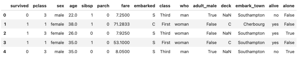
For the demo in this post, we are going to perform EDA on the infamous Titanic dataset. The dataset contains passenger information for the Titanic, with information such as the age, sex, passenger class, fare paid, and whether the passenger survived the sinking of the Titanic. We will be using the Python environment and we will rely on the power of highly robust Python libraries that facilitate data manipulation, visualization, and analysis.
We will now proceed with a step-by-step approach of discovering the hidden depths of this dataset.
Step1: Import libraries
Let’s start by importing the necessary libraries for data analysis and visualization. We’ll use Pandas for data manipulation, Numpy for numerical computing, and Seaborn and Matplotlib for visualization.
Step 2: Load the dataset
Let’s load the Titanic dataset, which is part of the Seaborn library’s built-in datasets. Next, let’s take a look at the first few rows of the dataset to understand its structure and contents.
Step 3: Data exploration
Dataframe structure
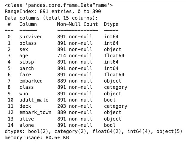
Now let’s print a concise summary of the dataframe, displaying total number of entries, feature names (columns), counts of non-null values, and data types assigned to each column.
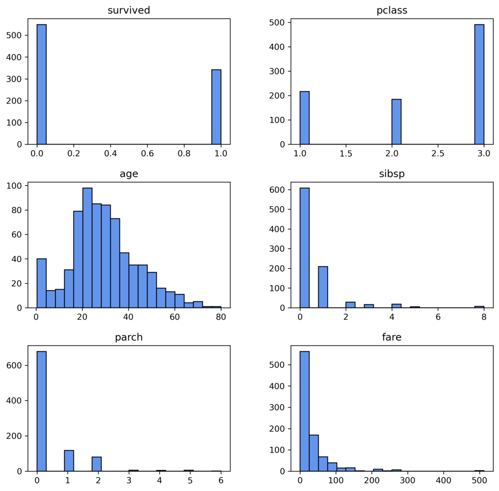
The Titanic dataset contains a total number of 891 rows. This comprehensive summary is helpful for verifying the absence of null values and ensuring that the data types were assigned correctly—which is necessary for precise analysis.
During the data exploration process, it is a very common practice to transform data types into a more usable format; however for this dataset, we will keep them as is. On the other hand, we see that some of its columns like age, deck, and embark_town have significant missing values. We will need to handle the null values for age later in our workflow since we will be using this variable in our exploration.
Dataframe summary statistic
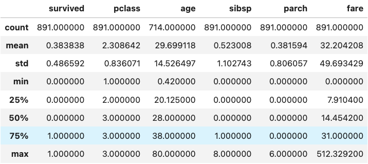
Let’s perform summary statistics on the numerical variables, which involves counts, means and standard deviations, quartiles, and minimums and maximums. This enables us to get an idea of the distribution or spread of numerical variables in a dataset, as well as pick out any possible outlying data points. For example, in the Titanic dataset, “fare” is a numerical variable referring to the money paid for tickets. It, however, covers a range of 0-512 with a median value of only 14.
In this case, it is reasonable to suspect that the presence of a value “0” might indicate errors. Also, there appear to be significant outliers on the higher end of the distribution. It would be good practice to investigate how the “fare” variable was coded further. However, we will not make any modifications to it in this exploration, as we will not use it in our analysis.
Histogram insights
Now, let’s move onto generating histograms to portray the distributions of the numerical columns. Each vertical bar in a histogram shows the number of observations within an individual bin, while its height represents how frequently it occurs within that interval. Histograms significantly simplify the process of identifying patterns and trends present in our data as well as highlighting any anomalies. Therefore, these visualizations assist us in making decisions about how to clean up our data before proceeding to modeling, enhancing the accuracy and reliability of our analyses.
Step 4: Data cleaning/preprocessing
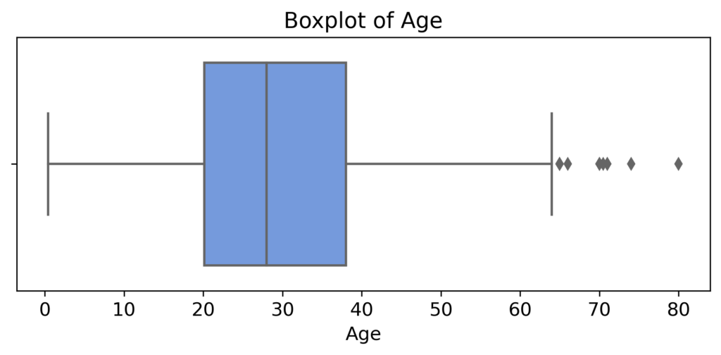
Identify outliers
Outliers can significantly influence the results of data analysis, and boxplots provide a helpful visual for their identification. The outliers that are present in this plot of “age” in the Titanic dataset are those points outside of the boxplot whiskers, indicating some large individual values of age. For this data exploration, we will leave these points as is; however, it is possible that their removal is required for valid and reliable results based on context and the type of analysis performed.
Handle missing values
Missing values are a common issue in datasets and can significantly impact the results of analyses by introducing bias or inaccuracies. Thereby, they need to be handled with care.
For example, for the “age” column in the Titanic dataset, we can apply several methods for the missing values. Simple approaches would involve removing rows with missing data or filling them with central tendency measures like mean, median, or mode.
Alternatively, more advanced methods such as predictive modeling can be used for imputation to fill in null values. These steps are vital for preserving data integrity and ensuring meaningful insights from subsequent analysis. In this scenario, we’ll just drop the rows with missing age values.
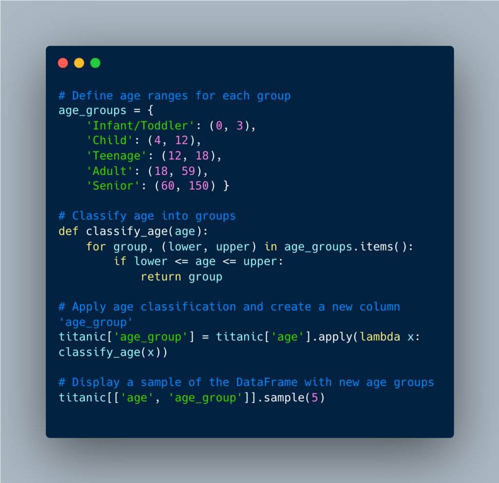
Feature engineering
Let’s also explore feature engineering to further enhance our analysis. Feature engineering involves creating new features or modifying existing ones so that we can gain deeper insights from the data.
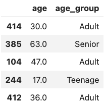
For instance, we can engineer a new feature such as “age groups” based on the “age” variable. This new variable will basically categorize age into five age groups: infant/toddler, child, teenager, adult, and senior. This will allow us to see survival rates across different age groups more clearly, and will provide deeper insight into the impact of age on survival.
Step 5: Visualization
Now, let’s move onto visualizing relationships between some of the features within our dataset.
Survival rates by passenger class and sex: We’ll begin by creating a bar plot to examine survival rates based on passenger class and sex. Here, the x-axis represents the passenger class, while the y-axis illustrates the survival rate. We’ll employ the hue parameter to distinguish between male and female passengers.
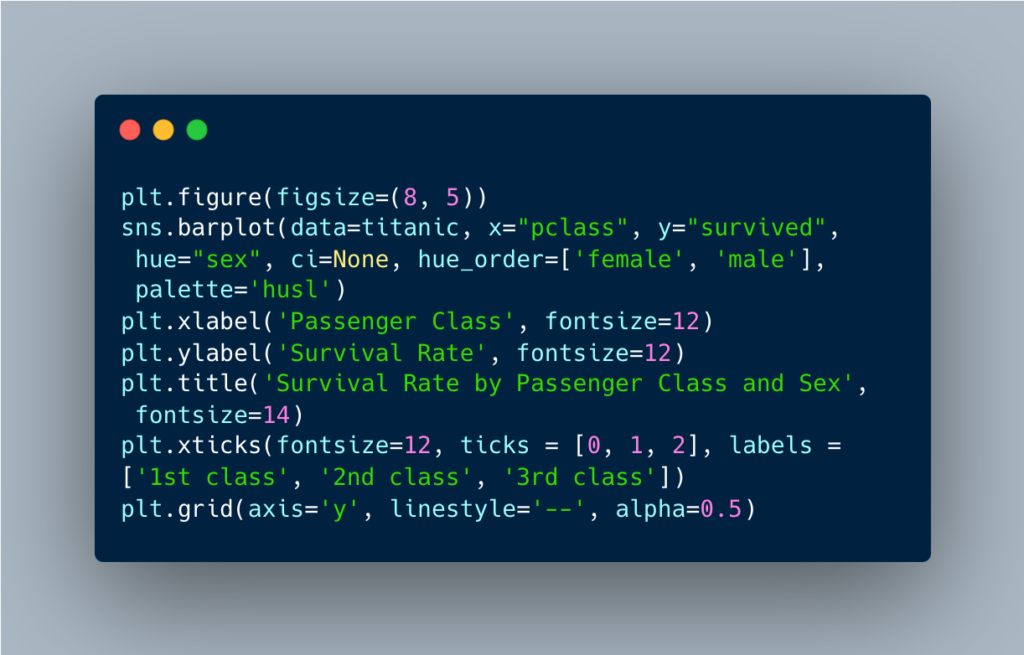
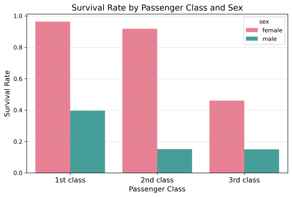
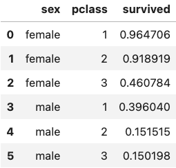
This bar plot reveals compelling insights into the survival patterns as a function of passenger class and sex. Overall, first-class passengers survived at much higher rates compared to those in second and third class. However, female passengers consistently had higher survival rates than males across all passenger classes. The most notable difference between the male and female survival rates were among second class passengers.
Remarkably, almost all first-class females survived with a rate of 96%, reminiscent of characters like Rose DeWitt Bukater from the movie Titanic. In contrast, the survival rate for third-class males, like the character Jack Dawson from the same movie, was sadly only at 15%.
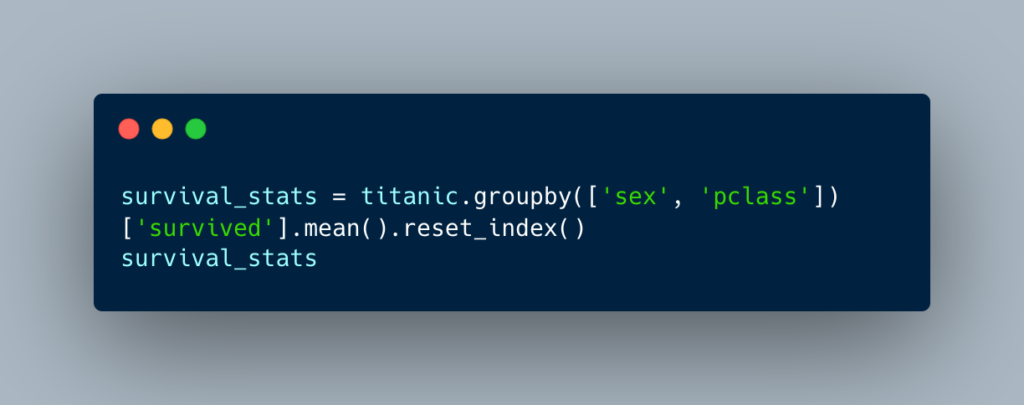
In addition to the visual representation above, let’s create a table to display the mean survival rates for each sex and passenger class. This table could be further improved by including additional statistical features such as counts, ranges, and variability.
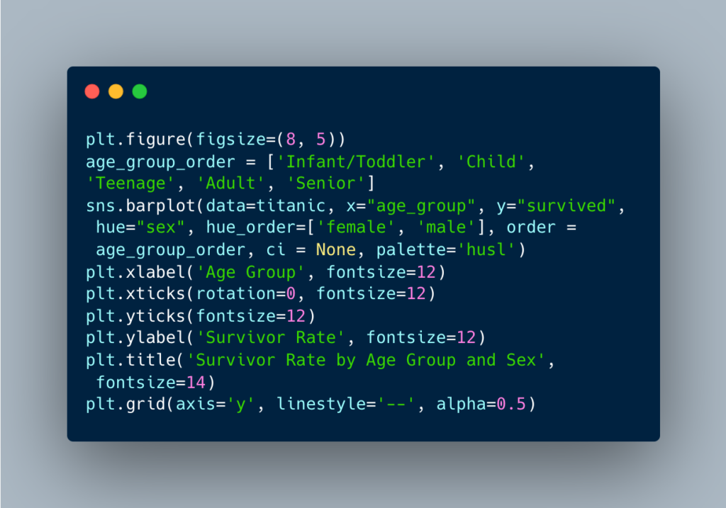
Survival rates by age groups and sex: Next, let’s create a bar plot to visualize survival rates across different age and sex, this time utilizing the newly engineered “age group” variable. This visualization will shed light on how survival rates differ among various age groups and between males and females.
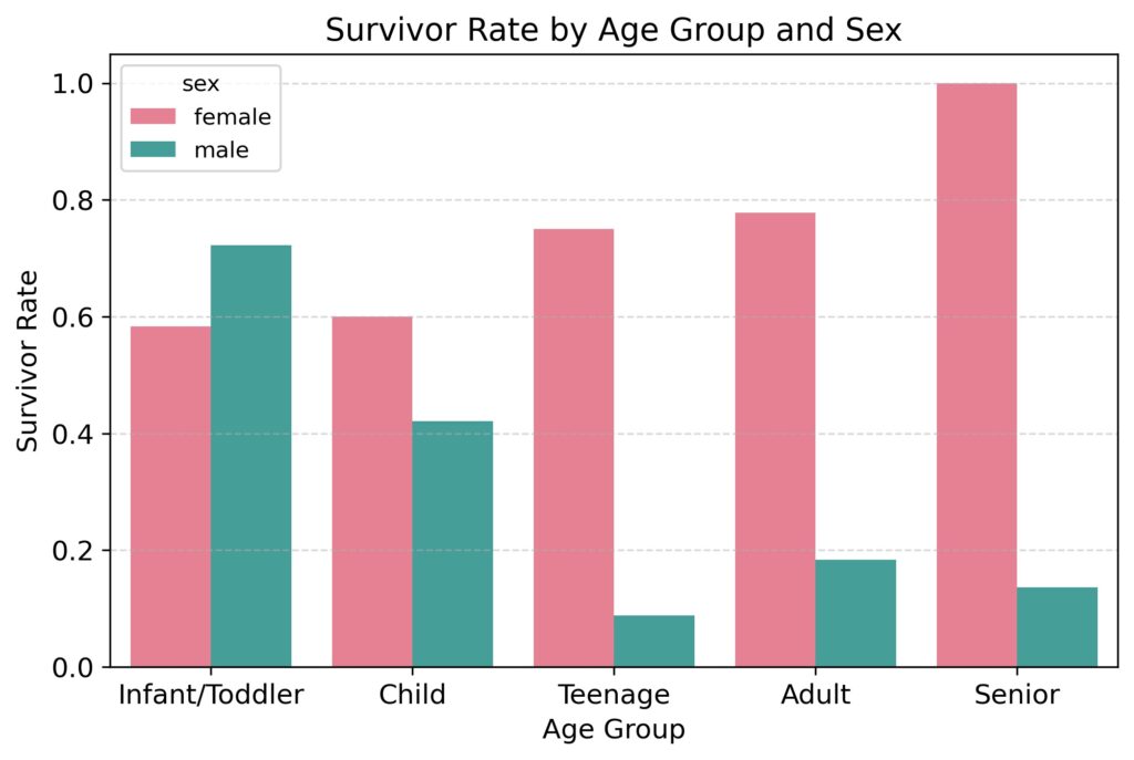
The plot above reveals survival patterns based on age and sex. As with the previous plot, overall, female passengers survived at much higher rates than male passengers. However, the data also suggests that similar survival rates were observed for male and female passengers who were infants and toddlers. Nevertheless, as age increased, males tended to survive at increasingly lower rates while females tended to survive at increasingly higher rates.
This observation reflects the implementation of the “women and children first” principle. Notably, male children received a comparable level of priority to female children. However, despite this prioritization, males consistently faced lower survival rates compared to females, particularly more so as age advanced.
Step 6: Summary
Through the systematic use of data exploration, descriptive statistics, and basic visualization, we’ve revealed valuable insights into the survival dynamics of the tragic voyage of Titanic.
Based on our analysis, we uncovered that passengers were more likely to survive if:
- They held a higher class ticket.
- They were female.
- They were infants/toddlers regardless of sex.
Step 7: Next steps
There are many more analyses and insights to uncover in the Titanic dataset depending on your specific questions and interests. After completing data exploration, the next steps could involve hypothesis testing and advanced modeling. For instance, we might test hypotheses regarding the relative impact of other kinds of passenger characteristics on survival rates.
Additionally, statistical or machine learning models can provide deeper insights into the most significant determinants of survival rates. For example, we could use logistic regression to predict survival based on features such as passenger age, sex, and class, and any possible interaction between them. Or we could apply a machine learning approach such as a random forest model to predict survival based on all available passenger characteristics.
Data Exploration: Conclusion
In summary, data exploration is an essential initial stage in any data analysis workflow. By systematically examining data using mathematical computations, statistical approaches, and visualizations, EDA reveals patterns, relationships, and insights in an iterative and interactive manner. It plays an important role in understanding and interpreting data, and shapes the trajectory of further analysis, ultimately leading to reliable data-driven insights.
Flatiron School’s Data Science Bootcamp offers a fast path to an education in data exploration and exploratory data analysis. Book a call with our Admissions team today to learn more about our program and what it can do for your career.
Disclaimer: The information in this blog is current as of May 29, 2024. Current policies, offerings, procedures, and programs may differ.

About Aysu Erdemir
Aysu Erdemir is a research data scientist with an expertise in clinical research and advanced analytical skills. Holding a Ph.D. in Cognitive Psychology, she has spent over a decade untangling the intricacies…
More articles by Aysu Erdemir