Data Science

Tech Trends
Revealing the Magic of Data Visualization: A Beginner’s Guide
Join us on a journey to explore the art and science of data visualization. Discover the importance of mastering this skill, the various types of charts and graphs available, and the powerful tools that can bring your data to life.
Artificial Intelligence
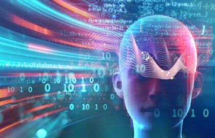
Demystifying Machine Learning: What AI Can Do for You
By demystifying machine learning, we unveil a world of possibilities where AI becomes not just a buzzword, but a tangible tool for enhancing productivity, efficiency, and innovation.

Tech Trends
Understanding Data: A Beginner’s Guide to Data Types and Structures
Explore the essentials of data types and structures in this beginner's guide. Learn about integers, strings, floats, lists, dictionaries and more.

Alumni Stories
Kendall McNeil: From Project Management to Data Science
"When I found Flatiron School, I was excited about the opportunity to level up my coding skills and gain a deeper understanding of machine learning and AI."

Tech Trends
Intro to Predictive Modeling: A Guide to Building Your First Machine Learning Model
Predictive modeling in data science involves using statistical algorithms and machine learning techniques to build models that predict future outcomes or behaviors based on historical data. It encompasses various steps, including data preprocessing, feature selection, model training, evaluation, and deployment.

Tech Trends
Introduction to Natural Language Processing (NLP) in Data Science
Natural Language Processing (NLP) encompasses a variety of techniques designed to enable computers to understand and process human languages. In this post you’ll learn about NLP applications like text classification and sentiment analysis, plus NLP techniques like tokenization and stemming.

Tech Trends
Rejecting the Null Hypothesis Using Confidence Intervals
After a discussion on the two primary methods of statistical inference, viz. hypothesis tests and confidence intervals, it is shown that these two methods are actually equivalent.