Revealing the Magic of Data Visualization: A Beginner’s Guide

Join us on a journey to explore the art and science of data visualization. Discover the importance of mastering this skill, the various types of charts and graphs available, and the powerful tools that can bring your data to life.
Step into the world of data visualization, where numbers come alive and stories unfold. Data visualization transforms raw data into visually appealing representations that reveal hidden patterns and insights. Whether you’re an experienced data analyst or a beginner in data science, mastering data visualization is essential for effectively communicating your insights.
Join us as we delve into why this skill is essential and how it can help you create compelling visualizations that engage and inform your audience.
Data Visualization: Bringing Numbers to Life
At its core, data visualization is about transforming raw data into visual representations that are easy to interpret and understand. It’s like painting a picture with numbers, allowing us to uncover patterns, trends, and relationships that might otherwise remain hidden in rows and columns of data.
Types of Charts and Graphs
Different visualization methods serve distinct purposes and are suited to specific data and communication needs. Each type of visualization has its unique strengths and weaknesses, playing a unique role in visual storytelling. Therefore, choosing the right one makes a big difference in how effectively you communicate your insights.
Let’s explore some of the most common types of charts and graphs, their strengths, and how they can be used effectively.
Bar charts
Bar charts are perfect for comparing categorical data and making comparisons between groups while highlighting patterns or trends over time. They use bars of different heights or lengths to represent data, making it easy to compare groups and identify patterns or trends.
Specifically, stacked bar charts are helpful for visualizing multiple categories, revealing both the total and the breakdown of each category’s share. Additionally, horizontal bar charts become relevant when handling lengthy category names or when emphasizing the numerical comparisons between groups.
Box plots
Box plots are good for visualizing the distribution of numerical data and identifying key statistics such as median, quartiles, outliers, and the variability of the data. Compared to bar charts, box plots provide a better understanding of the spread of the data, while allowing for easier identification of outliers and extreme values.
Histograms
Histograms are great for showing how numerical data is distributed. They use bars to represent frequency or count of values within predefined intervals, or bins. Histograms offer an intuitive way to grasp the distribution’s shape, central tendency, and variability. They make it easy to see patterns like peaks, clusters, or gaps.
Line graphs
Line graphs are ideal for illustrating patterns, trends, and correlations over time and comparing continuous data points. Unlike bar and box plots, line graphs provide a continuous view of the data, allowing for a more nuanced understanding of how different variables are related.
Scatter plots
Scatter plots are great for visualizing relationships and correlations between two continuous variables. They allow for the identification of potential outliers and clusters in the data and can provide insights into the strength and direction of correlations.
Heatmaps
Heat maps are particularly effective for displaying relationships between two variables within a grid, using color gradients to represent different values or levels of intensity. Heatmaps make it easy to identify patterns and trends in large datasets that may not be immediately apparent.
Data Visualization Tools
To begin crafting engaging visualizations, you can start with Python libraries that are beginner-friendly, such as Matplotlib, Seaborn, and Plotly. These libraries are robust and offer an array of features designed to help you bring your data to life. For a more business-oriented approach, particularly when building dashboards, tools like Tableau and Power BI can be utilized. They offer a more professional edge and are particularly suited to business data visualization.
- Matplotlib (Python): A versatile library for creating a wide variety of plots and charts. Integrates well with other libraries like NumPy and Pandas. However, it may require more code for complex visualizations compared to other libraries and may need additional styling for visually appealing plots.
- Seaborn (Python): Built on top of Matplotlib, Seaborn specializes in statistical data visualization with elegant and attractive graphics. Creates complex plots such as violin plots, pair plots, and heatmaps easily. However, it may not offer as much flexibility for customization compared to Matplotlib.
- Plotly (Python): Plotly is known for its interactive and web-based visualizations. It is perfect for creating dynamic dashboards and presentations with zooming, panning, and hovering capabilities. However, the learning curve can be steep for beginners.
- Ggplot2 (R): An elegant R package for data visualization that implements the grammar of graphics. It offers high-quality and versatile charting options for creating customized and publication-quality plots.
- Tableau: A powerful data visualization tool that offers intuitive drag-and-drop functionality for creating interactive dashboards and reports. Tableau is widely used in the industry for its ease of use and robust features.
- Power BI: Power BI is Microsoft’s business analytics tool for visualizing and sharing data insights. It seamlessly integrates with Microsoft products and services, providing extensive capabilities for data analysis and visualization.
Top Charting Don’ts for Better Data Visualization
“The simple graph has brought more information to the data analyst’s mind than any other device.” — John Tukey
With that said, it is important to remember that not all data visuals are created equal. To help ensure that your visualizations are effective and easy to understand, here are some top charting don’ts to keep in mind.
- Don’t add 3D or blow-apart effects to your visuals. They just make things harder to understand. Stick to simple, flat designs for clarity.
- Don’t overwhelm your visualizations with excessive colors. Stick to universal color categories and use them only to distinguish different categories or to convey essential information within the dataset. Especially, avoid using rainbow palettes, which can make visuals messy and difficult to follow.
- Don’t overwhelm your visuals with excessive information. Packing it with too much information defeats the purpose of visual data processing. Consider changing chart types, simplifying colors, or adjusting axis positions to simplify the information presented to ensure a clearer picture. Keep it simple, keep it clear.
- Don’t switch up your style halfway through. Ensure that your colors, axes, and labels are uniform across all charts. This will allow for easy visual digestion and understanding.
- Don’t use pie charts. Our visual system struggles when estimating quantities from angles. Spare readers from “visual math” by doing extra calculations yourself. Go for visuals that clearly illustrate the relationships between variables.
Data Visualization Examples
Now, let’s explore how to create a variety of charts using Seaborn. With just a few lines of code, we can create a visually appealing chart that effectively conveys our data. We can customize the chart by changing the color palette, adjusting the plot size, font size, and style, and adding annotations or labels to the chart. Let’s delve into where each chart type would be most suitable, ensuring our presentations are clear, concise, and impactful.
Bar chart
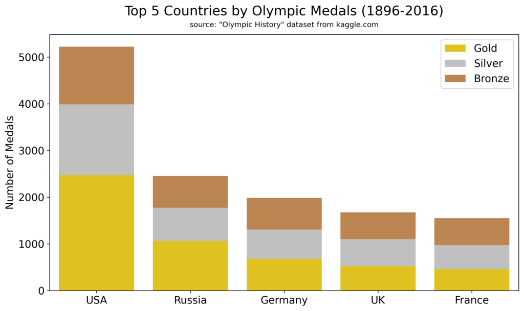
This stacked bar plot shows the total number of Olympic medals won by the top five countries. It uses the `barplot()` function of the Seaborn library. Each country (x-axis) is represented by stacked bars for the total count of gold, silver, and bronze medals (y-axis). We opted for a stacked bar plot because this format helps us see each country’s medal count and the contribution of each medal type in a clear way.
This visual tells the story that the United States leads with the most gold medals, followed by silver and bronze. Russia also stands out, especially in gold medals. Russia, Germany, the UK, and France have similar numbers of bronze and silver medals, but Russia excels in gold. We use color smartly to represent the medals accurately, keeping the focus on medal counts and country comparisons without distractions.
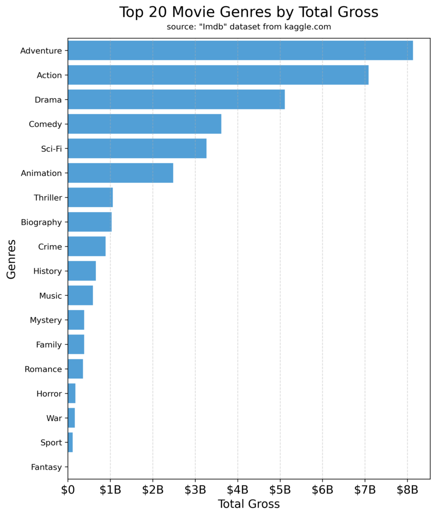
This bar graph illustrates the top 20 movie genres (y-axis) ranked by their total gross earnings (x-axis) using the `barplot()` function of the Seaborn library. We opted for a horizontal graph to facilitate comparisons across genres, especially with numerous categories like the top 20 movie genres. Additionally, the horizontal layout provides ample space for longer genre names, enhancing readability and comprehension.
This visual unveils the story that the Adventure genre leads the field with $8 billion in gross earnings, closely followed by Action with $7 billion. Drama and Comedy claim the next spots with $5 billion and $3.5 billion in gross earnings, respectively. Sport and Fantasy anchor the list at the bottom. By using only one color to represent the genre category, we ensure clarity without distracting color palettes. This allows the audience to focus on the data effortlessly.
Box plot
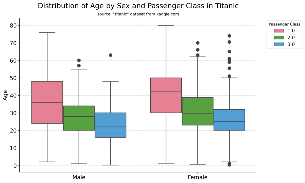
This graph presents a box plot illustrating the age distribution (y-axis) among male and female passengers (x-axis) across different passenger classes (hue). It uses the `boxplot()` function of the Seaborn library. This visual conveys the information that first-class passengers tend to be older with a wider range of age, ranging from 0 to 80 years. In contrast, third-class passengers tend to be younger, typically falling between 0 and 50 years.
Notably, outliers are present in second- and third-class passengers. Especially among third-class females, older individuals are more prevalent. We maintain consistency between males and females by using three color categories to represent the three passenger classes.
Histogram
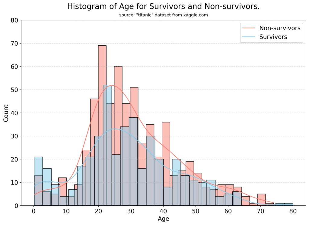
This histogram displays the distribution of passenger counts (y-axis) across age groups (x-axis) for both survivors and non-survivors (hue) aboard the Titanic. It uses the `histplot()` function of the Seaborn library. This visual depicts a predominantly normal age distribution, slightly skewed to the right, suggesting that most passengers were younger rather than older.
Notably, there is a second cluster in the survival group for younger ages, particularly among children aged 0-10. This suggests that children had a higher likelihood of survival compared to other age groups.
Line graph
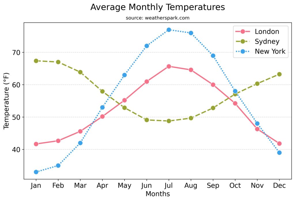
This line graph offers a compelling insight into the temperature dynamics (y-axis) across the seasons (x-axis) in three bustling metropolises (hue): New York, London, and Sydney. Using the `lineplot()` function of the Seaborn library, we employed color to differentiate between cities in their temperature trends. This visual tells the story that New York and London exhibit similar temperature trends throughout the year, indicating a shared climate pattern.
However, New York experiences a wider temperature range compared to London, with notably colder winters and hotter summers. In contrast, Sydney, positioned in the southern hemisphere, showcases an opposite climate behavior with hot winter months and cooler summers.
Scatter plot
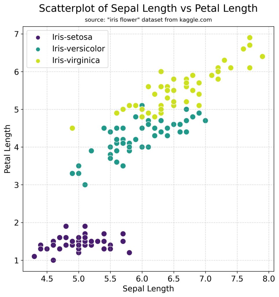
This scatter plot depicts sepal length (x-axis) against petal length (y-axis) for three types of Iris flowers (hue) using the `scatterplot()` function of the Seaborn library. Looking at the graph we see that Setosa flowers are easily distinguishable by their shorter petal and sepal lengths.
However, using sepal and petal length alone, it’s harder to differentiate between Versicolor and Virginica flowers. Nonetheless, there’s a consistent trend across both Versicolor and Virginica: as petal length increases, sepal length tends to increase as well. We utilize color to differentiate between the flower types, aiding in their visual distinction.
Heatmap
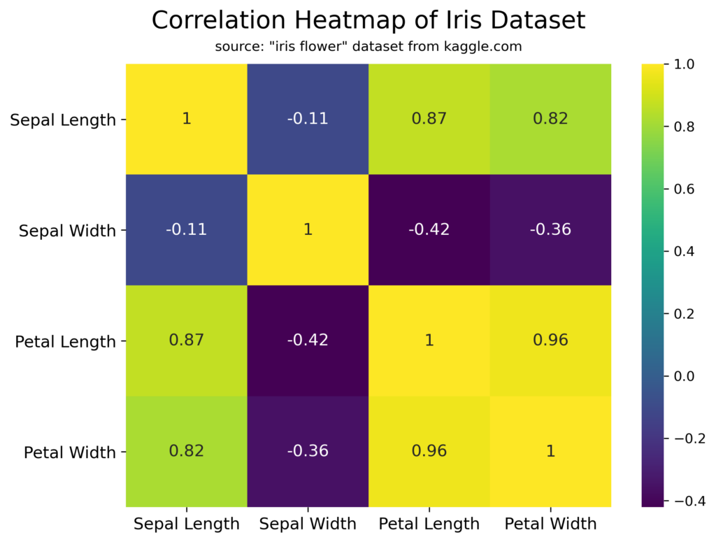
This correlation heatmap of the Iris dataset, generated using the `heatmap()` function, illustrates the relationships between each flower feature (x-axis) and all other flower features (y-axis). A correlation value close to 1 shows a strong positive correlation, indicating as one feature increases the other also increases. A correlation value close to -1 means a strong negative correlation, meaning as one feature increases the other decreases.
The picture painted by this visual entails a strong positive correlation between similar measurements, like sepal length and petal length, and petal length and petal width. In contrast, weaker correlations are noted between unrelated features, such as sepal width and petal length.
Conclusion
In today’s data-driven world, mastering the art of data visualization is essential for effectively communicating your message and making informed decisions. However, creating impactful visualizations involves more than just crafting visually appealing charts or presenting large amounts of data. It requires thoughtful analysis of the data and the ability to deliver compelling narratives in a simple and elegant manner.
Achieving this balance between technical skills and aesthetic judgment is both a science and an art. Remember that the true strength of data visualization lies in its ability to simplify complex information and present it clearly and concisely. Start exploring today to reveal the full potential of data visualization.
Gain Data Visualization Skills at Flatiron
Unlocking the power of data goes beyond basic visualizations. Our Data Science Bootcamp dives deep into data visualization techniques, alongside machine learning, data analysis, and much more. Equip yourself with the skills to transform data into insightful stories that drive results. Visit our website to learn more about our courses and how you can become a data science expert.
Disclaimer: The information in this blog is current as of May 3, 2024. Current policies, offerings, procedures, and programs may differ.

About Aysu Erdemir
Aysu Erdemir is a research data scientist with an expertise in clinical research and advanced analytical skills. Holding a Ph.D. in Cognitive Psychology, she has spent over a decade untangling the intricacies…
More articles by Aysu Erdemir