
Spend enough time on the web, and you’ll encounter a lot of familiar experiences.
For example, try visiting any news website. Even if it’s one you’ve never seen before, you’ll likely instantly recognize that the site contains news. You’ll also spot a number of clues indicating how to use the site.
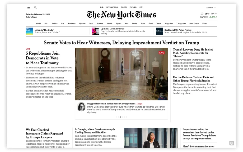
The New York Times website resembles many other news sites. The logo in the top center serves as a link to the homepage. Underneath the logo is a series of tabs for each section of news content. The page header also contains a magnifying glass icon allowing the user to search the site.
Below the header are today’s news articles. The most important article is accompanied by the largest headline, as well as a photo.
And it’s not just news websites that feel alike. Pull up examples from just about any category of digital content—public libraries, athletic shoe stores, social media apps for sharing videos—and you’ll undoubtedly find more similarities than differences in their interfaces.
The reason these experiences feel so familiar is that designers are taking advantage of UI design patterns. Design patterns are common solutions designers use to solve frequently occurring usability problems in user interfaces.
But why are these patterns so popular? How do designers decide where and when to implement them? And are they appropriate for every usability challenge?
Why Do Designers Use Patterns?
Creating familiar experiences reduces the cognitive load required for users to understand and use an interface. Cognitive load is defined as the mental effort required to process information and perform a task.
Web usability consultant Jakob Nielsen provides a rule reminding interface designers to minimize cognitive load:
“Users spend most of their time on other sites. This means that users prefer your site to work the same way as all the other sites they already know.”
In other words, your interface needs to match the expectations of both mobile and desktop audiences who are used to navigating products similar to yours.
But when faced with a common usability challenge within a digital product, such as organizing a large number of news categories, beginning designers might feel tempted to create an alternative to the top navigation pattern found on competitor websites. After all, product designers are hired for their creativity, right?
However, straying from the familiar pattern wastes the user’s time. Users aren’t visiting to puzzle their way through the designer’s fresh new interface—they’re here to read the news. And if the news that interests them is too difficult to find, they’ll leave.
And from the product team’s perspective, why spend extra design, testing, and development hours creating a novel approach to a navigation problem that’s been solved by countless other news websites?
Working with UI Design Patterns
Is implementing UI design patterns as simple as plugging one into your product’s interface? Not quite. Designers generally follow a four-step process to choose the right pattern and adapt it to the needs of their product and audience.
1. Identify the Problem
Before selecting a UI pattern as a solution, gather as much information as possible about the problem users are having. For example, web analytics might indicate potential subscribers to your news website are bailing out at a specific stage of the checkout form.
Your team should observe users attempting to complete the form in order to thoroughly understand the following:
- User goals: What motivates users to complete this task?
- Pain points: What frustrations stand in their way?
- Context: What is the user doing when the problem occurs?
2. Find a Common Solution
Now that you understand the pain points facing users, the next step is to research what patterns are available to help solve the problem.
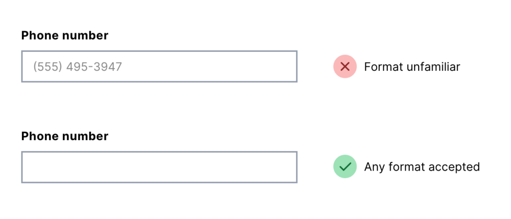
Start by reading about the problem. If you’ve observed that users are struggling to format phone numbers to match the expectations of your checkout form, read up on alternate solutions that don’t require specific formatting.
You might additionally check out sites that compile UI design patterns. Not all of these resources are free, but they can speed up the process of finding patterns and learning more about their implementation.
3. Check Out Examples
Once you’ve identified the most useful pattern to solve your product’s usability problem, test out websites and apps that make use of the pattern.
- When, where, and how is the pattern used?
- What are the usability benefits of the pattern?
- Are there contexts in which the pattern might not make sense?
Your review should also evaluate the accessibility and ethics of the pattern. Accessibility means ensuring your interface can be operated by users with disabilities. As for ethics, avoid using dark patterns designed to trick users into performing unwanted actions.
4. Adapt to Your Product’s Needs
Here’s where your creativity as a designer comes in. You’ll need to adjust your chosen pattern to suit your product in a way that balances all of the following:
- Desirability: Can users understand and use this pattern to reach their goals?
- Viability: Will the pattern help fulfill business needs?
- Feasibility: How easily can the development team implement this pattern?
Beyond Design Patterns
After thoroughly researching a design problem, you’ll occasionally discover that no existing pattern really satisfies your users’ needs. In that case, ideate on some new approaches to the problem. This is where great innovation comes from.
While today we might take popular UI design patterns such as tab bars across the bottom of mobile screens for granted, patterns like these began as a designer’s solution to a problem (in this case, limited mobile screen real estate combined with the need to keep frequently accessed options near the user’s thumb).
Source: Navigation patterns in mobile applications. How to make the right choice?
When in doubt, follow the advice of Don’t Make Me Think author Steve Krug. “Innovate when you know you have a better idea, but take advantage of conventions when you don’t.”
Ready to Build Your Own Interfaces?
If solving usability problems and designing user interfaces within digital products sounds like a fun challenge, consider applying now to Flatiron School’s Product Design Bootcamp. You’ll learn the design skills you need to build a competitive portfolio and land your first job in the product design industry.
Not sure if you’re ready to apply? Download the syllabus to learn more about the skills you can acquire in our bootcamp, or check out our free Product Design Prep Work to explore the material we teach in the course.
And if you are curious about what students learn during their time at Flatiron, attend our Final Project Showcase.