This Isn’t Carl Sagan’s “Flatland”: Achieving Flat Design on iOS
This post originally appeared on Cong Sun's blog. Read more at Cong's iOS Study Note. WHAT IS FLAT DESIGN? Think of flat design as the opposite of 3D. Emphasizing “flatness” and two-dimensionality, flat design focuses on “simplifying an interface by removing extra elements such as shadows, bevels, textures, and gradients that create a 3D look” […]
This post originally appeared on Cong Sun's blog. Read more at Cong's iOS Study Note.
WHAT IS FLAT DESIGN?
Think of flat design as the opposite of 3D. Emphasizing “flatness” and two-dimensionality, flat design focuses on “simplifying an interface by removing extra elements such as shadows, bevels, textures, and gradients that create a 3D look” (Awwwards http://www.awwwards.com/flat-design-an-in-depth-look.html).
Emphasizing minimalism, flat design is geared towards improving usability through the use of open space and bright colors that highlight important elements with little to no clutter.
*Caveat– flat design might be “in” right now, but it might not necessarily be the best approach for every project. Ultimately, the design approach should focus on function and usability as opposed to trendy!
THE RISE
Prior to the advent of flat design, skeuomorphism reigned supreme. Skeuomorphism, unlike the abstraction of flat design, incorporated design cues taken from the physical world. Think – folder and computer icons, at first glance you are able to deduce the purpose of those icons. Even with buttons, a simple toggle slider accurately conveys its interactive nature.
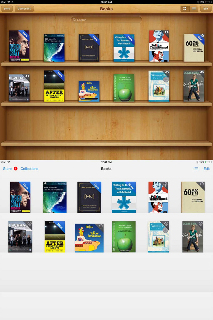
Notice the wood textures and shelves imitating a real bookshelf
However, critics of skeuomorphism denounced the principle, stating that, “its lack of ingenuity and its failure to pioneer designs that truly harness a computer’s superior capabilities, rather than forcing it to merely mimic the behavior of a physical object” (Techopedia http://www.techopedia.com/definition/28955/skeuomorphism).
Even Apple was a huge proponent of skeuomorphism until iOS 7 when, under Jony Ives, there was a sharp shift towards flat design.
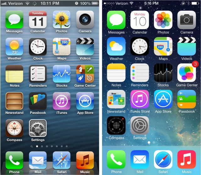
iOS 6 on the left compared to the new flat design of iOS 7 on the right

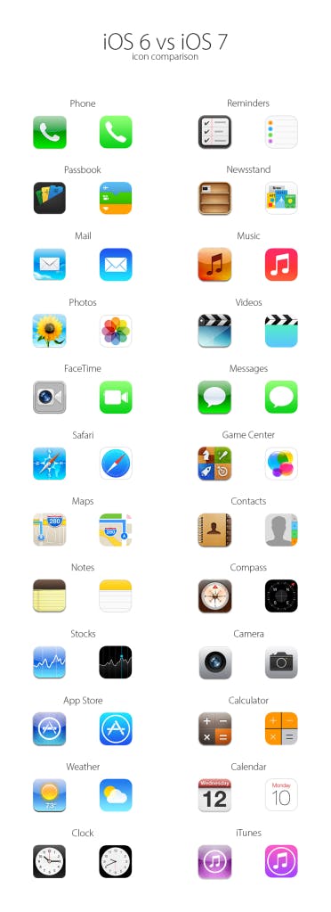
Overview of icon design changes in iOS 7
HOW TO ACHIEVE FLAT DESIGN
-
All design elements should be centered around the idea of simplicity.
-
Bold, bright colors are used to create emphasis around design elements. This website is a great resource for picking the perfect flat UI color.
-
Focus on typography. Flat designtypically uses sans-serif typography.
-
UI elements should be clear and noticeable
ADDITIONAL RESOURCES
-
Examples of Mobile App Flat Designs – http://www.awwwards.com/mobile-gallery/flat-design/
-
Flat Design Resources – http://www.hongkiat.com/blog/flat-design-resources/
-
Skeumorphism.it – Photoshop extension that’ll convert graphic assets to “flat design”

Example from skeumorphism.it
Disclaimer: The information in this blog is current as of July 27, 2015. Current policies, offerings, procedures, and programs may differ.