In a time when a new virus has completely changed the way that people live their lives, people are turning to data more than ever before (or so it feels). Everyone is searching for high-quality data about the Coronavirus to analyze what exactly is happening in the world today, and a good understanding of data and some data science training is exactly what you need to navigate the non-stop flow of Coronavirus numbers across our news feeds as we explore this new way of life.
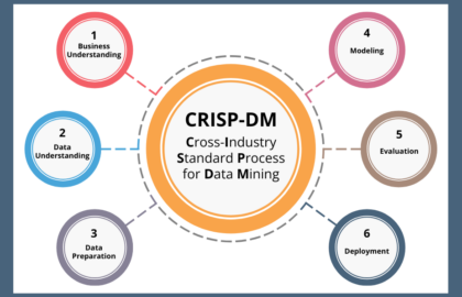
With that in mind, here is an exploration of that Coronavirus data — where it comes from, what we can learn from it, and its limitations.. This post is structured to mirror the data science process. For those wondering what exactly a data scientist does, the process can be loosely explained as: frame the problem, find the data, prepare and explore the data, model the data, and evaluate the results.
Data Framing
Before diving into any data science project, it’s important to think through the value and impact the project may have. The World Economic Forum explored how data can be used during the Coronavirus pandemic, especially focusing on how world leaders can use data to make informed decisions, and on how a lack of access to quality COVID-19 data can detrimentally affect the world for the foreseeable future.
Data Sources

Cover image for the Postman COVID-19 API Resource Center.
Now that we’ve thought through how we could frame data related to the virus, we can ask ourselves — where are all of these numbers about the Coronavirus even coming from? Postman, an Application Programming Interface (API) development platform, created a thorough roundup of COVID-19 related APIs that would allow you to quickly collect data from reliable sources like the World Health Organization and the Centers for Disease Control and Prevention, as well as COVID-19-specific APIs that have been built since the virus began spreading.
Other projects are also garnering some attention. The Corona Data Scraper is built to not only grab reliable data, but to also connect that data with geolocation data to make visualization more accessible.
Data Preparation
With data in hand, it is time to begin processing our data to make sure we make the most of it. This is the time to start understanding any assumptions made when the data was gathered, any limitations inherent in the data, and any ideas or knowledge that isn’t captured in the data you’re working with. When dealing with health data, that awareness of the underlying assumptions and what’s missing from the data is even more vital. This Spectator article does a great job decomposing the data about the Coronavirus and all the complications that come with conveying the impact of it.
Data Exploration
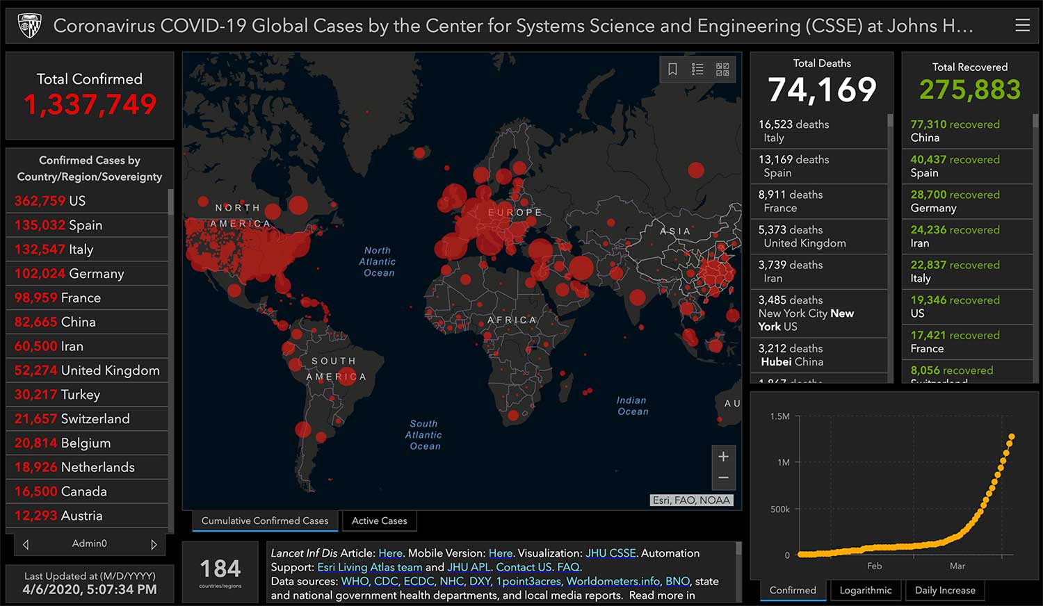
Screenshot of the Johns Hopkins University dashboard, taken on April 6, 2020.
Once we have the data and a basic understanding of what’s contained in it, we can begin to explore it, and the easiest way to look for meaning in data is to begin to visualize it. Chances are high that, at some point since COVID-19 started spreading, you’ve looked at a data dashboard like this one from John Hopkins University. While the color scheme they use is a bit dire, and there is a lot of information on the page to digest at once, it is updated often from reliable sources which are linked directly on the page. Remember to put the statistics you see there in context, using the subject matter understanding we built in the previous steps!
If you want a different perspective on the data, the Information is Beautiful dashboard, with a more pleasant color scheme, covers information ranging from infection trajectories to media mentions. Their bold images make for great screen grabs, and their visualizations put the information we do know into context.
Beyond the obvious tracking of Coronavirus cases and infection rates, you can bring in data that, on the surface, isn't directly connected to the virus. While it has its limitations, this tracker by Unacast conveys how well people are social-distancing by tracking cell phone movements — and gives grades to states and counties based on how much ‘distance traveled’ has changed in recent times.
Of course, the impact of Coronavirus is being widely felt throughout the economy, nowhere more starkly than in the sharp rise of unemployment claims, which the New York Times visualized simply and effectively using Department of Labor statistics. Further economic impact will likely be the focus of data exploration in the coming weeks, as more data which conveys that impact begins to capture the ways in which our lives have changed.
Another impact being explored is how Coronavirus is affecting the environment. NASA’s Earth Observatory explored that question at length, producing some striking images of before and after the virus started spreading. They also explain exactly how the virus is not impacting the virus, doing a good job of also adding in that subject matter expertise to better understand what exactly the data is telling us.
Data Modeling
Beyond the descriptive work we’ve done so far, the predictive work of modeling the future is the heart of what data science is. Epidemiological models trying to understand and predict the spread of COVID-19 are complex, but Linear Digressions, a data science podcast, does an excellent job walking through a recent model published in Science in a relatively short 25-minute episode. The biggest takeaway is that social distancing really will have an impact on the outcomes, according to all the data that scientists have crunched so far.
For burgeoning data scientists looking to contribute, Kaggle, a data science competition website owned by Google, is running weekly forecasting challenges using an accessible data set curated from reliable sources which could be an excellent way to test your data science skills.
Evaluation
As you go through the data science process, it’s important to evaluate your results and reflect on the impact of your work. Data can inform, educate and incite people to action — but it can also, when misused or misrepresented, distort the truth. There are special considerations in times of crisis and when dealing with health data. The author of this Medium post spells those out well, citing concerns regarding variations in definitions inherent in the data being used. She urges data enthusiasts to not build COVID-19 visualizations or models without carefully considering the audience and the purpose of those projects, as we are in a situation of ‘information overload’ which could, at worst, incite alarm.
With that being said, there are plenty of good reasons to contribute towards Coronavirus-related projects at the moment, and plenty of responsible ways to do so (like the above Kaggle competition).
Additionally, there is a lot of related data that can be explored or modeled that captures aspects of this crisis without directly trying to grapple with complicated health data. Beyond the more serious analyses of the impacts the Coronavirus is having on the world, there is a lighter side that could let us focus on things like how communication and free time is changing as we adapt. Explore Twitch data to see how the video game streaming platform’s viewership has changed over time. If you’re missing sports, check out FiveThirtyEight’s take on what might have happened in the NCAA tournament (a different take than the one explored at the end of the Linear Digressions podcast linked above). Or blend video games and sports by examining the impact this has had on eSports.