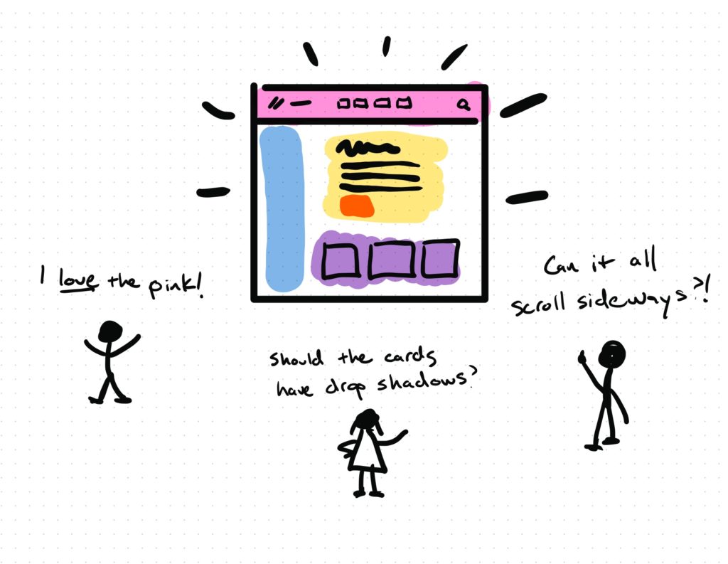
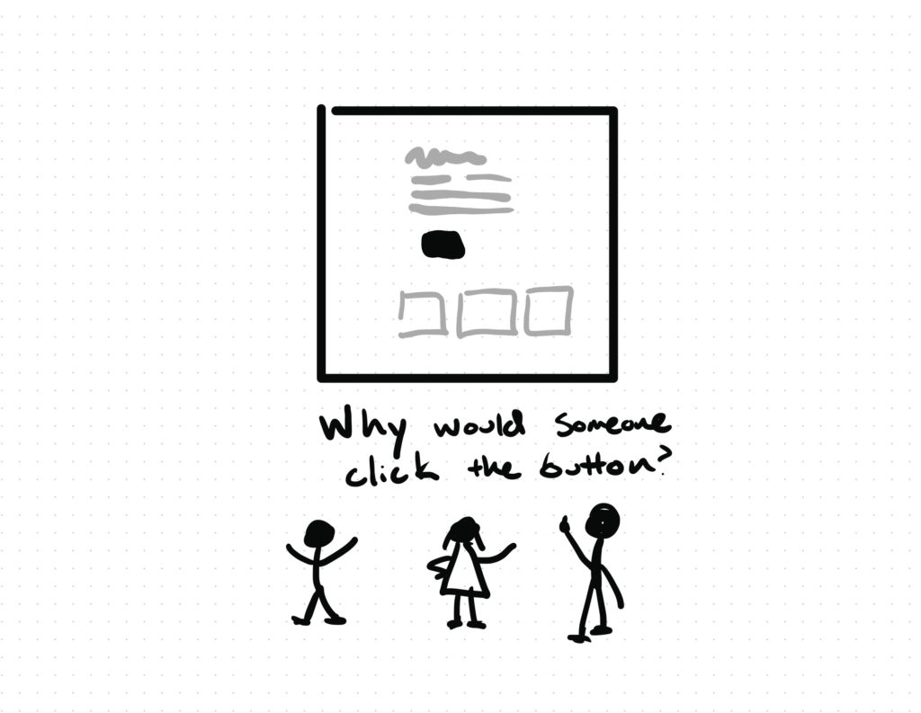
A big part of User Experience (UX) and User Interface (UI) design involves something called wireframing. Simply put, a wireframe is a visual mockup of a web page without all the final details. The goal of a wireframe is to demonstrate how the content should function on the screen.
Doing this work in Figma makes it easy to wireframe lots of ideas quickly and get direct feedback.
Start with wireframes
A few weeks ago, the Product Design team at Flatiron School designed an update for a page on our website. We were moving quickly and instead of starting with wireframes, I instructed one of our designers to start with high-fidelity mockups. Big mistake you guys – starting with pretty mockups created 2 challenges:
- The polish made the design too precious. We needed our content and engineering partners to critique the content, but they were not sure how much we were open to changing.
- We ran out of time to iterate. The design spurred some other good ideas, but we spent too much time on the finishes and had no more time to explore.

In this case, we were able to push the deadline out another week. The design team regrouped, produced a handful of wireframes without branded styles (colors, fonts, icons, images, etc.), and something magical happened:
- The content and engineering teams suddenly had helpful questions.
- It was easier to share the wireframes early and often, so iteration happened naturally.

Wireframe from the inside out
When most people start a wireframe, they skip an important step. Most people start with a big box shape to frame all the content. Then they make smaller boxes inside those boxes to represent things like navigation, page footers, sidebars, and so on.
Instead, start with the most important content on the screen and move out from there. This approach is called Epicenter Design and it will change your life.
Wireframe faster with Figma
If you are making wireframes in Figma, it’s really easy to explore multiple concepts quickly using components templates.

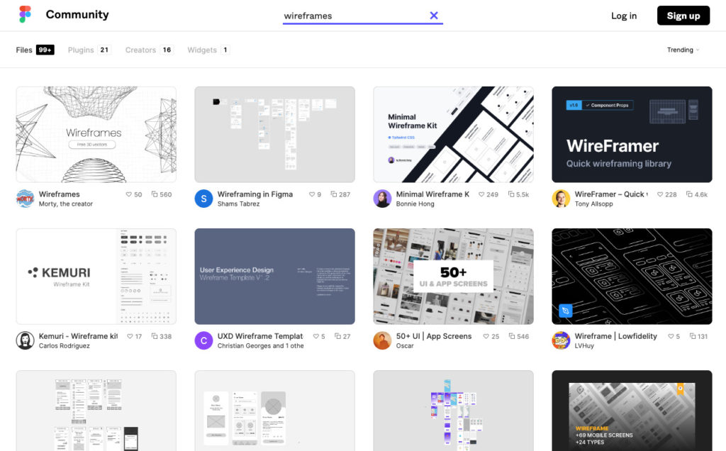
One of the wonderful things about Figma is the Figma Community. Other designers just like you and I have added hundreds of templates to the community library. Many of them are free and new designers benefit a lot from seeing existing solutions to problems they may be working on for the first time.
Want To Try It Out?
Hiring companies consistently rate Figma knowledge as one of the top “must-have” skills for UX / UI Product Designers.
In the Product Design course at Flatiron School, students are taught hands-on, practical skills, including how to use Figma.
A great way to try out the course is by taking a Free Product Design Prep Work, with no commitment or strings attached! You can also see all the skills we teach in our Product Design Course Syllabus.
You can also learn more about what it’s like to be one of our students in this day-in-the-life of a Product Design student post.


