The following is a guest post by Adam Waxman and originally appeared on his blog. Adam is currently a student at The Flatiron School. You can follow him on Twitter here.
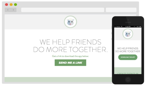
Over the last year I’ve been working on a mobile app called Flock. To get ready for our launch, I created a new landing page to allow people to easily download the app. On a desktop browser, it allows people to input their phone number and receive a text on their phone with a link to download the app. On a mobile device, it allows people to download the app directly.
The Ingredients
-
Twilio: An API to make and receive phone calls and send and receive text messages. I used this service to send a text message to desktop users containing a link to download the app.
-
fancyBox: Tool for displaying images, html content and multi-media in a Mac-style “lightbox” that floats overtop of web page
-
Creative Buttons: Button inspirations from Codrops
-
SASS/Bourbon/Neat:
Sending a Text
My first step was to get the text message part of the landing page working. High level I wanted to be able to send users a text message with a link to download Flock on their iPhone. To do this, I created a form to collect a user’s phone number, and then utilized a Twilio gem to send a message to the collected number.
Using the ‘twilio-ruby’ gem I was able to get a text message up and running relatively quickly by creating a form and adding the Twilio logic in the route associated with that form.

Making it Look Pretty Part 1: Adding a fancyBox
I wanted to use javascript on the “SEND ME A LINK” button so that the website didn’t have to load a new page to display the number form. Not wanting to re-invent the wheel, I looked around for js plugins and ended up choosing fancyBox, a library to easily implement “lightbox” popups.
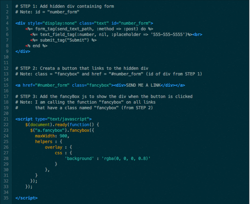
To implement this plugin, there were a couple main steps:
-
Create a hidden div containing the number form
-
Link a button to the hidden div
-
Add the necessary js from fancyBox
Making it Look Pretty Part 2: A Fancy Button
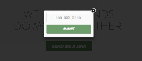
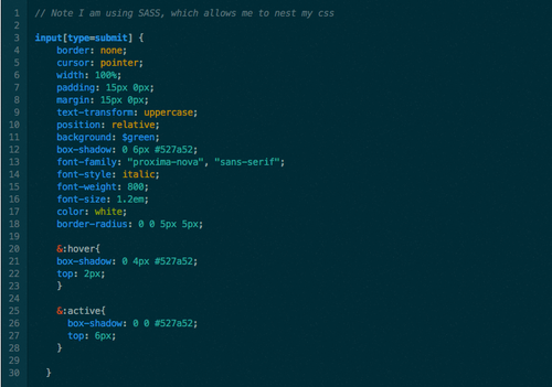
Once I got the fancyBox working, I wanted to customize the styling of the form. Earlier in the week I stumbled across an awesome link from Codrops that had examples of many different buttons using CSS. I chose my favorite and added the appropriate CSS.
The button I chose gives a 3D effect by creating a shadow and making the shadow smaller / shifting down the button while hovering over the button, and removing the shadow all together when clicked.
Making it Look Pretty Part 3: Responsive Design
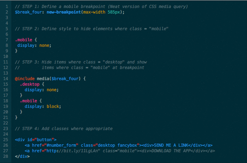
Once I got the button looking sharp on a desktop browser, I then wanted to make the page responsive for mobile users. Not only did I want to change the styling so it looked good on a phone, but I also wanted to change the main button so that when a user opens the site on their iPhone the “SEND ME A LINK” button turns into a “DOWNLOAD THE APP” button that takes him or her directly to the App Store.
I made the button (and rest of the website) responsive using Bourbon and Neat. Bourbon is a mixin library for SASS, and Neat is a grid framework for SASS with Bourbon.
And that’s how to create a simple landing page for a mobile app!


