This blog is part of a continuous series that highlights experiences, insights, and tutorials from learning developers at Flatiron School in Web and iOS.
iOS Application Design 101
At the end of my second week at Flatiron School, I have learned more than I ever have in such a short period of time. Time seems to move so incredibly fast — I cannot believe that we’re already a sixth of the way done!
We’re finally learning about views, a topic I have been looking forward to since the program started. I have experience mocking up some mobile app prototypes in the past for my design engineering classes, but it’s such a thrill to finally be able to see all the functionalities work, rather than pretending that a box takes you to a different screen.
Inclined towards User Interaction, I have always been interested in people and the way people interact with their products. One of the many reasons why I wanted to learn iOS Development over Web Development was people’s relationships with their phones. Due to our increasingly smartphone-focused culture, apps now hold a larger responsibility to be better designed because of their everyday usage and their use to interact with other smartphone users.
Designing for the smartphone is very different than designing for the computer: small screen vs big screen, intermittent vs reliable connectivity, and so on. However, this does not undermine the power of smartphones as they are highly personal, always on, always with us, usually connected, and directly addressable. They are constantly tracking our location, movement, acceleration, orientation and more.

Generations of iPhones
Nearly every year, Apple makes changes to their interface, sometimes completely redesigning the style and adding new features for the ease of the user. Their frequent changes bring them to the forefront of modern tech and graphic design. Relevant apps keep up with Apple to accommodate their new design and every year, along with more and more apps coming to the App store. With this huge influx of new apps, Apple has outlined their basic design principles for iOS.
Apple’s Basic Design Principles
Deference: The UI helps people understand and interact with the content, but never competes with it.
Clarity: Text is legible at every size, icons are precise and lucid, adornments are subtle and appropriate, and a sharpened focus on functionality motivates the design.
Depth: Visual layers and realistic motion impart vitality and heighten people’s delight and understanding.
Apple’s focuses on simple and straight-to-the-point design, meaning no clutter and no room for user confusion.
Be prepared to defy precedent, question assumptions, and let a focus on content and functionality motivate every design decision.

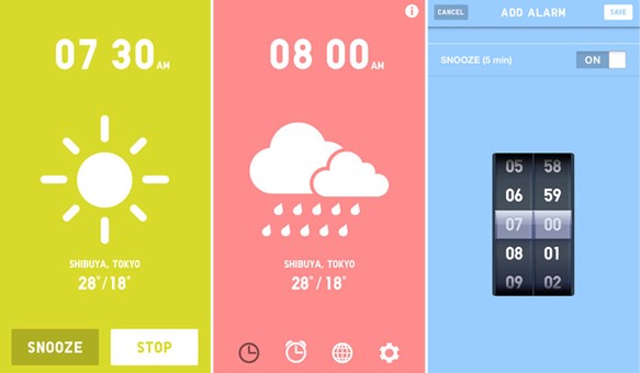
UNIQLO Wake Up app
Apple further expands on these three important principles, mostly highlighting the importance of taking advantage of the whole screen, using negative space to make important content and functionality more noticeable and easier to understand, and maximizing the use of layering of objects to help users understand the relationships among on-screen objects.

Take advantage of the whole screen
It is important to think about how the user interacts with your iOS app. Small changes make big meaningful changes in the way that an app may work. However, don’t be fooled that one design will stay the same forever. Apple is constantly changing and the landscape of technology changes so quickly it can be daunting at times, but at least it’s never boring!
ReferencesDesigning for iOSThe 10 principles of mobile interface design This post originally appeared on Olivia Lim's blog. Read more at Olivia Lim on Medium.


