When done right, case studies are seriously complex and represent hundreds of hours of design work. At their start, they can feel like a disorganized, overwhelming mess.
Step by step, they transform into a piece of work a designer can truly be proud of because it tells the story of their growth over the project. Being able to effectively communicate and illustrate that unique story is key to a designer’s success in the interview process, and a way for them to stand out from competitors.
I’ve lost track of how many case studies I’ve reviewed in my time at Designation — it’s probably somewhere close to 1,000 by now — and in all that time, I’ve seen many important parts of case study writing come into focus.
Below are five of the most important areas that go beyond the basics of case study writing and get into the more challenging parts that can provide a far greater reward. Together, they can turn good designers into great design storytellers—and set them up for greater success later on as professionals.
Show your process assets purposefully.
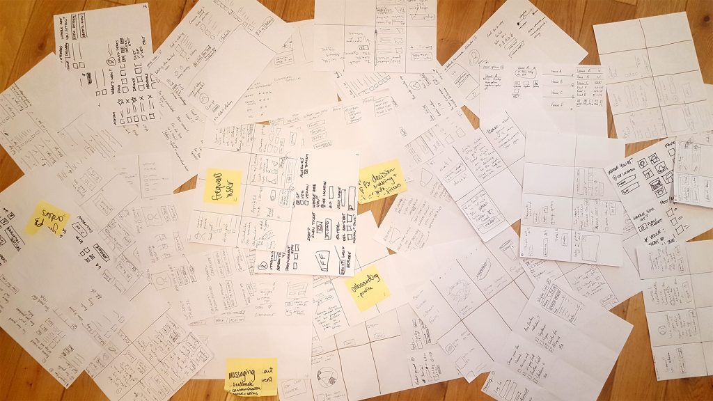
Assets are your opportunity to show rather than tell—explain a big chunk of the process in a visual form. Assets can take many forms, and the more diversity in them, the more engaging for readers.
They include photographs, which can backup descriptions of on-site research, interviews, and teamwork; screenshots of in-progress work and art boards; sketches showing rough ideas that were fleshed out later; Post-it notes and affinity diagrams; wireframes, sometimes with color added for extra clarity for the reader; animated gifs showing microinteractions and user flows through the product; charts and tables; and so many others.

When focusing on a design or visual case study image like this shows a surprising amount of information and process—how creatively messy it can be to sketch, sorting to find ideas worthy of development, fleshing the strong ones out, and applying design elements and patterns to them.
A case study without showing assets is incomplete, but one that shows assets without explaining them is almost worse, because a designer always needs to explain their importance to the process.
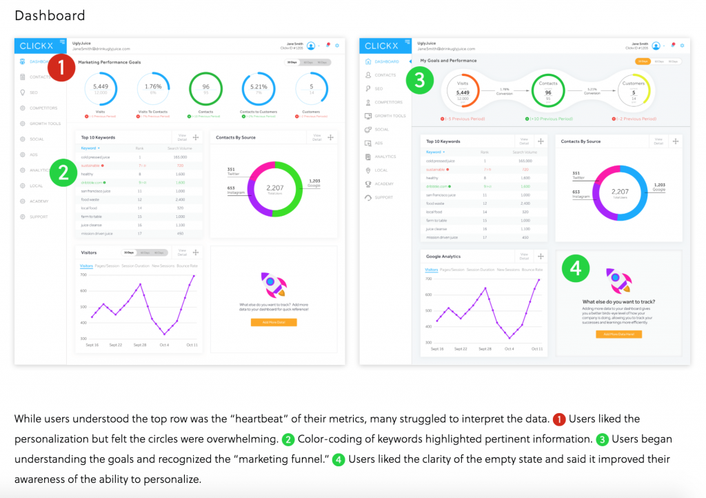
The best way to do that is to use captions for each asset. But captions must always be a part of the overall story; they shouldn’t only repeat information that the asset already shows. They must provide a unique insight, and further the story for the reader. By doing this, it activates the caption and justifies its existence and the work it takes to write them by the designer.

This designer used two forms of captions to illustrate their screens: Annotations that point out specific areas of concern from testers who looked at them, and a caption below that collected and synthesized them for easier comprehension.
Provide a competitive benchmark for the study.
Designers often like to downplay the research and analysis of competitors that happens near the beginning of a project because it doesn’t directly focus on the work they created. This is an unfortunate mistake because it’s a huge part of the story and it often leads directly to designers making research or design decisions later in the process.
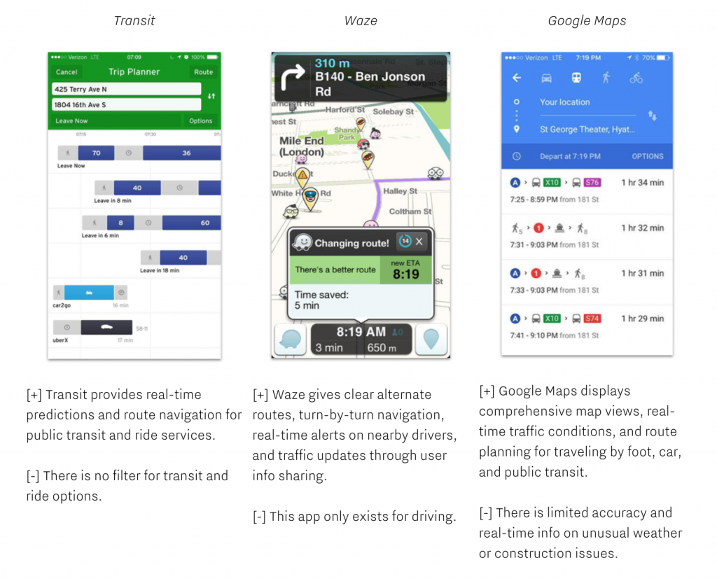
Furthermore, designers should show off that they have a deep understanding of the competition whenever they work on a product; that they know what’s happening in the landscape and how their product fits in. Showing logos or only mentioning names of competitors isn’t anywhere near enough; designers need to discuss in detail what competitors do well, and analyze the areas in which they need improvement. Designers can provide screenshots of competitors’ products, but they need to go further and annotate or comment on them, to show a more detailed analysis.
They can’t ignore out-of-category competitors too, because that research often leads to innovative ideas that can catapult their product over in-category competitors’.

This designer looked at three competitors and called out unique areas of strength and weakness from each one, especially as they led the designer to make design decisions later in the process.
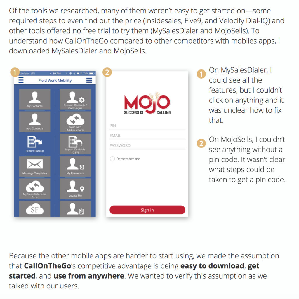
Finally, all that analysis requires synthesis, which means explaining the opportunities the designer saw for their own product after looking at the competition. This helps the designer more formally describe the end of the competitive research phase of a project and how that helped them refocus on their own product.

The designer analyzed competitors’ images in the center of this screen, but the text at the bottom presents what they did with that analysis: They derived an important design principle from it, which heavily impacted the next phase of their work.
Be team-centered in user experience design.
Almost every project done at Designation is done as part of a team because almost every project done as a professional designer is done as part of a team. It’s crucial for designers to reflect that in their case studies. Designers must write “we” when talking about group actions, and “I” when talking about personal design decisions or insights. In other words, we encourage designers to use “I” when they talk about where they led their team, and “we” when they supported another team member leading their team.
This is a great example of team-centered writing, where the designer discusses how the team worked together to generate concepts. She then switches to individual writing to indicate which concept she took charge of. Both extremes of this spectrum are bad in a case study—ones that only say “we” look like the designer didn’t think for themselves, and ones that only say “I” look like the designer isn’t a team player. So that balance has to always be found. Employers look for teamwork skills as much as they look for hard design skills, and a case study can be an excellent place to find records of them.
Don’t designsplain.
This is a big one. A lot of designers fall into the trap of explaining a basic element of the design process or design deliverables to the reader. You might be asking yourself: Why is this problematic? It’s because the intended readership of a designer’s case study is a hiring manager, design director, or someone else looking for evidence the designer will make a good fit for their team.
That means the designer needs to make an educated assumption that the reader is already familiar with design—and write their case study with that in mind. Unless it’s a part of their design process that was extremely unusual or the designer came up with it themselves, a designer has to assume the reader’s already familiar with it. If they don’t, they risk looking like the case study condescends to the reader, and that’s not purposeful writing.
One easy way to avoid this is for a designer to always avoid second-person writing—using “you” and “your”—which is a little too conversational for a case study anyway. They keep the focus on themselves and their work, and tell a stronger story in doing so.
Get the details right.
It might be cheating a little to clump a bunch of little steps together like this, but it’s important at the end of the case study writing process to micro-edit and make sure every detail is taken care of.
That’s why designers utilize tools like Figma to to tell their story in a professional way.
That’s making sure every word is spelled right, every publication title is italicized, and every piece of software is properly capitalized. But it’s also doing tasks like using contractions as often as possible throughout the text, removing extra spaces from between words or in front of paragraphs, knowing when to use a semicolon or an em dash, and making sure all dumb quotes are taken care of. And using writing tools like Hemingway, Grammarly, and GradeProof are a huge gift to anyone who needs a little help to take care of tricky grammar and get rid of run-on sentences.
Though tedious and time-consuming, the best way to take care of these details is to go through the complete draft and look to make one editing change at a time. Trying to edit for multiple needs causes the designer’s attention to be split in many directions—and makes them much less effective as self-editors.
Digital Designer Case Studies Conclusion
Writing effective, powerful case studies is a craft, and like all crafts, it rarely comes naturally to people. It takes skill and work, and staying in practice. The tools, resources, feedback, and processes we give every designer at Designation are able to be used for years and decades to come, so a designer can turn any work they produce into a case study anytime during their long career.
Remember: Hiring managers don’t look for designers with superpowers; they look for designers who are committed to designing better and better for as long as they practice design. And case studies are the absolute best metric for a designer to see how far they’ve come and how much they’ve learned, from tool to tool, project to project, and job to job.


